Book of hand-painted ski maps

When you go skiing or snowboarding, you get a map of the mountain that shows the terrain and where you can go. James Niehues is the man behind many of these hand-painted ski maps around the world, and he has a kickstarter to catalog his life’s work.

This is kind of amazing. I went skiing a lot as a kid, and I have distinct memories of these maps. I would stand at the top of the mountain, rip off one of my gloves with my teeth, and then pull out a folded map from a zipped pocket. I never knew they were by the same man, but in retrospect, it makes sense.

Tags: ,

Synesthesia used to paint numbers through color

Lucy Engelman has synesthesia, which is a perceptual response where one sensory pathway is stimulated, and a secondary sense is triggered. Daniel Mullen, in collaboration with Engelman, paints what she sees through the secondary sense.

In Lucy’s case, when she sees or thinks about time and numbers (days of the week, months, hours, years) as well as letters/words ie a person’s name, she experiences a different colour sequence in her mind’s eye. Additionally, time is spatial and coloured related, as in the days of the week, months, years, all have a coloured location in space and a shifting orientation. Essentially, she has an ever changing complex and luminous filter to view the abstract concepts of our world.

[via @mariuswatz]

Tags: , ,

Microsoft Excel painter

Remember the artist Tatsuo Horiuchi who uses Microsoft Excel to paint scenery? Four years later, he’s still at it. Watch below.

Horiuchi is my favorite example of someone who shows that the tool is secondary to what you want to make. Spend less time debating about what software you should use to visualize your data, and spend more time deciding what you want to show.

Tags: , ,

Color use in paintings, by year

Painting colors over time

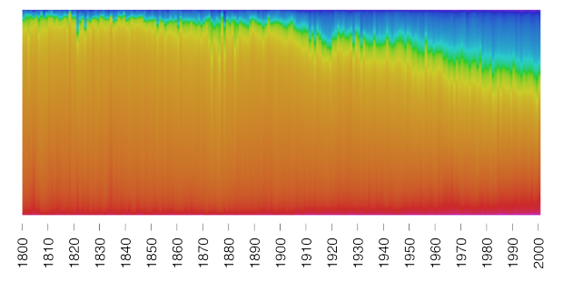
Martin Bellander saw some projects that extracted color from movie posters and trailers, and he grew curious about paintings. So he extracted and plotted the colors used in paintings over several centuries.

I decided to download images of paintings. So there is a bunch of different sites where you can access (photos of) paintings, e.g. BBC, Google Art Project, Wikiart, Wikimedia commons, and various museums. One of my favorites is the BBC:s site where you can browse through over 200K of well organized paintings! An amazing resource. For many of these there is also information on the year they were painted, the artist, etc.

So let’s use them to visualize the colors in paintings over history!

Notice the increased use of blue? Bellander still isn't quite sure why that is, but he does a good job looking for possible answers. And bonus points for posting the R code he used to scrape images and analyze.

Tags: ,