Wide range of data exploration tools

Simon Willison asked a straightforward question about the tools people use:

If someone gives you a CSV file with 100,000 rows in it, what tools do you use to start exploring and understanding that data?

Then he expanded the question asking what people use for files with 1 million rows, 10 million rows, and 1 billion rows.

Browse the thousands of replies, and you quickly see that (1) there are many options to explore a dataset and (2) many people feel that what they’re using is the best option. There’s click-and-play programs, web-based products, programming languages, and command-line options. Some use a combination of whatever works for them at a given time for a certain dataset.

This is why when people ask me what the “best” tool is, I usually have to follow up with what they know already and what they want to do with the tool. It’s also why best-of lists for data exploration are usually not worth your time, unless you account for the assumptions about usage.

Tags: ,

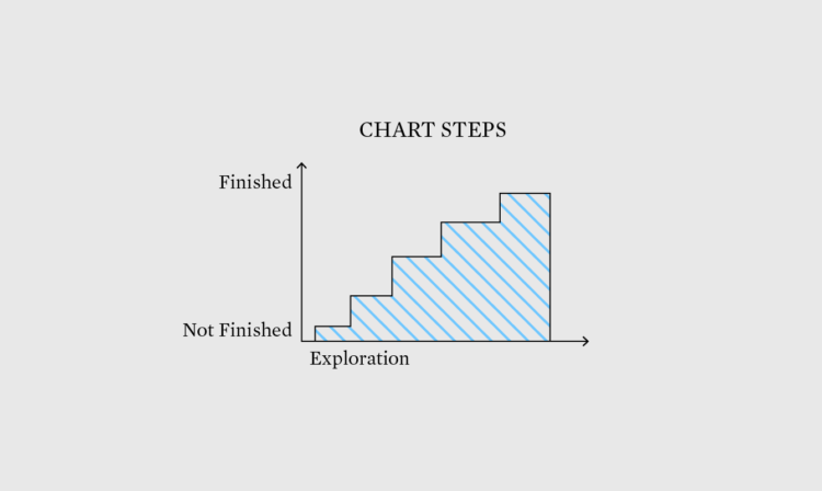
✚ Stepping Towards a Finished Chart – The Process 180

Welcome to issue #180 of The Process, the newsletter for FlowingData members that looks closer at how the charts get made. I’m Nathan Yau, and this week I’m thinking about the tiny steps along the way to making a chart, even a relatively straightforward one.

Become a member for access to this — plus tutorials, courses, and guides.

Exploring data to form better questions

Feeding off the words of John Tukey, Roger Peng proposes a search for better questions in analysis:

The goal in this picture is to get to the upper right corner, where you have a high quality question and very strong evidence. In my experience, most people assume that they are starting in the bottom right corner, where the quality of the question is at its highest. In that case, the only thing left to do is to choose the optimal procedure so that you can squeeze as much information out of your data. The reality is that we almost always start in the bottom left corner, with a vague and poorly defined question and a similarly vague sense of what procedure to use. In that case, what’s a data scientist to do?

Story of my life.

Tags: , , ,

Making useless things

Simone Giertz, bringer of joy and self-described expert in shitty robots, makes machines that succeed in failing. In her TED talk, Giertz talks about her path from “useless” things to expert. It’s all the more relevant after she found out she has a brain tumor.

Giertz’ talk resonates a lot.

During the early years of FlowingData, when there was a comment section on every post, graphics I made would occasionally gain traction over the interwebs. In my own version of Godwin’s law, if a comment thread grew long enough, someone eventually would chime in: “Cool. Someone must have a lot of time on his hands.”

I was in graduate school at the time, with a dissertation staring me in the face, so I didn’t actually have much time. But I made time, because I didn’t know what I was doing, and that was fun for me.

I grasped on to the “cool” part of the comment and discarded the rest in my head. Someone liked something I made enough to tell me so! That turned out to be a great decision.

Tags: , , , ,

Data exploration banned

Statistician John Tukey, who coined Exploratory Data Analysis, talked a lot about using visualization to find meaning in your data. You don’t always know what you’re looking, so you explore it visually. Etyn Adar, who teaches information visualization at the University of Michigan, makes a good case for banning the phrase in his students’ project proposals.

For all the clever names he created for things (software, bit, cepstrum, quefrency) what’s up with EDA? The name is fundamentally problematic because it’s ambiguous. “Explore” can be both transitive (to seek something) and intransitive (to wander, seeking nothing in particular). Tukey’s book seems emphasize the former — it’s full of unique graphical tools to find certain patterns in the data: distribution types, differences between distributions, outliers, and many other useful statistical patterns. The problem is that students think he meant the latter.

I see this sort of thing in my suggestion box too. Data exploration with visualization is good, but when someone describes their project as an exploration tool, it often means it lacks focus or direction. Instead it looks like generic graphs that don’t answer anything particular and leave all interpretation to the reader.

Tags: , ,

Automatic charts and insights in Google Sheets

Sheet explore

So you have your data neat and tidy in a single spreadsheet, and it's finally time to explore. There's a problem though. Maybe you don't know what to look for or where to start. Maybe you're not in the mood for a trip to clicksville to make all those charts. With a new exploration tab, Google Sheets might be a good place to start.

Open the spreadsheet in the browser as usual, and then click the Explore tab in the bottom right corner. A panel opens on the right, and the app tries to find interesting bits and create relevant charts automatically, based on the structure and context of the data.

If the app thinks it found something interesting — such as a correlation, trend, or outlier — it describes the finding in words underneath a chart.

Here's the pitch video:

https://www.youtube.com/watch?v=9TiXR5wwqPs

I tried it on some of my own spreadsheets, and it works pretty much as advertised. Obviously you're not going to get super complex findings from a spreadsheet program, but it seemed to pick out columns and combinations well.

For example, I opened the tab on a spreadsheet of median male and female earnings for various industries that also included male-female ratios, overall medians, and total people. I automatically got back the biggest difference between the male and female column, correlation between the medians, the distribution of the totals, and an outlier for the total.

As might be expected, the automatic generation is not perfect. It stalled at the beginning with my income and expenses spreadsheet. I think it doesn't like dates so much, and mostly wants numeric values. Also, some charts weren't ones that I would use, and not all of the insights were relevant.

That said, it seems a good way to start the exploration phase. I imagine this being useful for business-related data. And this by the way is part of a bigger Google Docs update, which had the classroom in mind. Google Sheets would've been sweet for my sixth grade science fair project.

Tags: ,

Science for The People: Extreme Medicine

#268 - Extreme Medicine

#268 – Extreme Medicine

This week, Science for The People is on the frontiers of medicine, from the fabulous to the foolhardy. They talk to Dr. Kevin Fong, co-director of the Centre for Aviation Space and Extreme Environment Medicine at University College London, about his book “Extreme Medicine: How Exploration Transformed Medicine in the Twentieth Century.” And they’re joined by Dr. Sydnee and Justin McElroy, hosts of the podcast “Sawbones: A Marital Tour of Misguided Medicine.”


Filed under: This Mortal Coil Tagged: exploration, medicine, Podcast, science for the people