Educational statistics illustrations

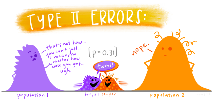
Allison Horst often illustrates data science concepts and tools with anthropomorphized shapes and animals. She recently cataloged her illustrations, which are open source and entertaining if you are a nerd.

Tags: , , ,

Catching students cheating with R

Matthew Crump, a psychology professor who discovered high volume cheating in his class via WhatsApp, outlines the saga in five parts. Bonus points for use of R to analyze the evidence:

I do a lot of teaching on using computational tools for reproducible data analysis. I can input some data and run it through a script for analysis. When the data changes I can run it through the same script and get the new analysis. The chat archive had changed and this time it was easier to do the analysis all over again. I redid all the counts of academic integrity violations and rewrote the forms spelling out sanctions for each student. So many forms, I died a little inside once for every form.

Tags: , , ,

Understanding Covid-19 statistics

For ProPublica, Caroline Chen, with graphics by Ash Ngu, provides a guide on how to understand Covid-19 statistics. The guide offers advice on interpreting daily changes, spotting patterns over longer time frames, and finding trusted sources.

Most importantly:

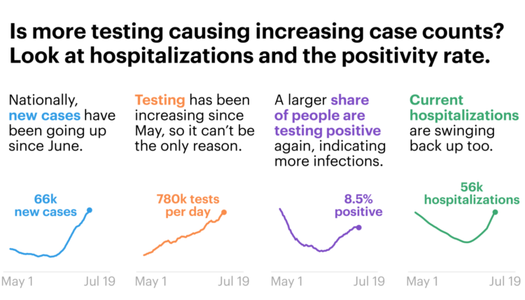
Even if the data is imperfect, when you zoom out enough, you can see the following trends pretty clearly. Since the middle of June, daily cases and hospitalizations have been rising in tandem. Since the beginning of July, daily deaths have also stopped falling (remember, they lag cases) and reversed course.

I fear that our eyes have glazed over with so many numbers being thrown around, that we’ve forgotten this: Every day, hundreds of Americans are dying from COVID-19. Some days, the number of recorded deaths has reached more than 1,000. Yes, the number recorded every day is not absolutely precise — that’s impossible — but the order of magnitude can’t be lost on us. It’s hundreds a day.

Cherrypicking statistics is at an all-time high. Don’t fall for it.

Tags: , , ,

Teaching kids data visualization

Jonathan Schwabish gave his fourth-grade son’s class a lesson on data visualization. He wrote about his experience:

I’d love to see a way to make data visualization education a broader part of the curriculum, both on its own and linked with their math and other classes. Imagine adding different shapes to maps in their Social Studies classes to encode data or using waterfall charts in their math classes to visually demonstrate a simple mathematical equation or developing simple network diagrams in science class. The combination of the scientific approach to data visualization and the creativity it sparks could serve as a great way to help students learn.

Maybe I should introduce Schwabish’s Match It Game to the Yau household. My five-year-old has been asking why I keep “doing data.”

Tags: ,

Datasets for teaching data science

Rafael Irizarry introduces the dslabs package for real-life datasets to teach data science:

[I] try to avoid using widely used toy examples, such as the mtcars dataset, when I teach data science. However, my experience has been that finding examples that are both realistic, interesting, and appropriate for beginners is not easy. After a few years of teaching I have collected a few datasets that I think fit this criteria. To facilitate their use in introductory classes, I include them in the dslabs package.

Tags: ,

Q&A with Di Cook

Statistics professor Di Cook was one of the first people I ever talked to about visualization. She has a short Q&A over at StatsChat.

I spent a few years doing that [a research assistant] and then realised I’d really like to make art, because some of the research-assistant work I was doing was computer graphics for data online. It fed into my art instincts from teenage years, so I spent some time as an artist before finding a graduate programme in statistics in the US that focused on data visualisation.

Tags: ,

Visual explainer for hierarchical modeling

Hierarchical models, or multilevel models, are used to represent data that might vary on, you guessed, different levels. Michael Freeman, from the University of Washington Information School, provides an introduction to the method using a scrolling format. The transitions give a good sense of how the model can change, depending on your approach.

Tags: , ,

Data exploration banned

Statistician John Tukey, who coined Exploratory Data Analysis, talked a lot about using visualization to find meaning in your data. You don’t always know what you’re looking, so you explore it visually. Etyn Adar, who teaches information visualization at the University of Michigan, makes a good case for banning the phrase in his students’ project proposals.

For all the clever names he created for things (software, bit, cepstrum, quefrency) what’s up with EDA? The name is fundamentally problematic because it’s ambiguous. “Explore” can be both transitive (to seek something) and intransitive (to wander, seeking nothing in particular). Tukey’s book seems emphasize the former — it’s full of unique graphical tools to find certain patterns in the data: distribution types, differences between distributions, outliers, and many other useful statistical patterns. The problem is that students think he meant the latter.

I see this sort of thing in my suggestion box too. Data exploration with visualization is good, but when someone describes their project as an exploration tool, it often means it lacks focus or direction. Instead it looks like generic graphs that don’t answer anything particular and leave all interpretation to the reader.

Tags: , ,

Teaching materials for visualization

Enrico Bertini, who has taught information visualization at New York University for the past few years, put up his class materials for open use. There are lecture slides, exercises, and a course diary of his own teaching experiences. Should be useful if you want to teach or learn on your own.

Back in my day, I didn’t have formal visualization courses. I checked out paper books from the library, pieced together tidbits of Flash tutorials meant for games, and walked in the snow for five miles to and from school. Consider yourself lucky.

Tags:

DrawMyData lets you plot points manually and then download the data

DrawMyData

When you have graphs to draw or statistical concepts to teach, you need your data and you need it now. You can look for a suitable dataset, or you can simulate a result, but that can be annoyingly tedious. DrawMyData by Robert Grant is a simple tool that lets you click an x-y plot to draw points, and then you can just download the the x-y coordinates as a CSV file.

Tools like this always seem kind of frivolous at first, but then you use it a few times and becomes indispensable. [via @albertocairo]

Tags: