Which color scale to use for your charts

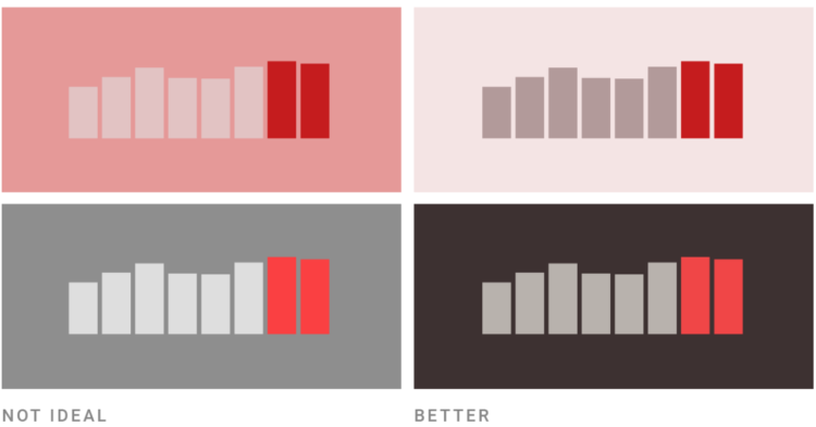
On a superficial level, color scale selection seems like a straightforward task. Pick a sequence of colors that looks like it goes from light to dark. Done. But right when you get into it, you might find the process isn’t so straightforward. Different color scales can represent different aspects of your data, and poor selection can lead to poor communication. So, Lisa Charlotte Rost for Datawrapper wrote a four-part practical guide to help you figure it out.

See also Rost’s equally useful guide on what colors to pick for your scales.

Tags: , ,

Data visualization crossword puzzle

This is fun. Lisa Charlotte Rost made a data visualization crossword puzzle. Print the PDF and win all eternal glory of your household.

Tags: , ,

Picking the right colors for your charts

Picking colors for your charts can be tricky, especially when you’re starting a palette from scratch. For Datawrapper, Lisa Charlotte Rost has been writing guides on color as it pertains to political parties, gender, and more recently, colorblindness. Rost put the pieces together for a single, more comprehensive guide on the subject.

Be sure to check out Rost’s other guides on making better charts. She has a knack for explaining visualization methods in a practical and concrete way.

Tags: , ,