Visualizing time-based data

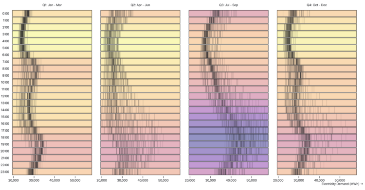
Zan Armstrong, Ian Johnson, and Mike Freeman for Observable wrote a guide on analyzing time series data. Using an energy dataset, they show how asking different questions can lead to different findings and visualizations:

These are stories about analyzing data that changes over time. While most of us don’t dig into data about energy day-to-day, we hope the feel of this data and these questions will be familiar to anyone who regularly faces questions like “what changed?”, “what happened?”, “was that normal?”, “what is typical?”, and “did things go as expected?” We hope that this will spark an idea about how to look at your own data in a new way.

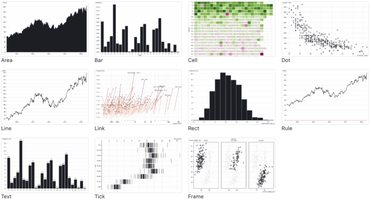
I will never tire of the multiple-views-from-the-same-dataset teaching device.

Tags: , ,

Observable Plot, a JavaScript library for more straightforward visualization of tabular data

If you’re into the notebook workflow, Observable Plot is a JavaScript library built for you:

We created Plot to better support exploratory data analysis in reactive, JavaScript notebooks like Observable. We continue to support D3 for bespoke explanatory visualization and recommend Vega-Lite for imperative, polyglot environments such as Jupyter. Plot lets you see your ideas quickly, supports interaction with minimal fuss, is flexible with respect to data, and can be readily extended by the community. We believe people will be more successful finding and sharing insight if there’s less wrestling with the intricacies of programming and more “using vision to think.”

In case you’re curious how Plot compares to D3, which was used to build Plot, you can find that information here.

Tags: ,