Statistical detection of potential child abuse cases

Dan Hurley, reporting for The New York Times, describes the use of statistical software to assist call screeners:

[T]he decision to screen out or in was not Byrne’s alone. In August 2016, Allegheny County became the first jurisdiction in the United States, or anywhere else, to let a predictive-analytics algorithm — the same kind of sophisticated pattern analysis used in credit reports, the automated buying and selling of stocks and the hiring, firing and fielding of baseball players on World Series-winning teams — offer up a second opinion on every incoming call, in hopes of doing a better job of identifying the families most in need of intervention. And so Byrne’s final step in assessing the call was to click on the icon of the Allegheny Family Screening Tool.

I’m glad Hurley highlights the challenges of the inherent biases in the data and the algorithms later in the article. It’s one thing to use data to estimate player value in sports. It’s another thing to use data to decide whether or not to send help to someone calling the police. [Thanks, Jennifer]

Tags: ,

Download comprehensive police shootings data

Data for police shootings is usually the subset that only includes fatalities. Vice News made requests nationwide to get data on people who were shot but not killed by police. To accompany their story, Vice News made the data and code available for download:

Ultimately, we obtained some data from 47 departments — with 4,099 incidents in all. Departments in New York’s Suffolk and Nassau Counties didn’t provide us with any data. Maryland’s Montgomery County Police Department gave us only partial incident-level information and no total number of police shootings, so we excluded them from the analysis.

We put all this information together to analyze trends across the departments and to compare them with one another — the first time this has ever been done for both fatal and nonfatal shootings.

Get the data and look for yourself.

Tags: , ,

Predictive policing

Predictive policing

Crime and data have an old history together, but because there are new methods of collection and analysis these days, there are new decisions to make. The Marshall Project, in collaboration with the Verge, looks at the current state of predictive policing and the social issues that surround it.

As predictive policing has spread, researchers and police officers have begun exploring how it might contribute to a version of policing that downplays patrolling — as well as stopping, questioning, and frisking — and focuses more on root causes of particular crimes. Rutgers University researchers specializing in “risk terrain modeling” have been using analysis similar to HunchLab to work with police on “intervention strategies.” In one Northeast city, they have enlisted city officials to board up vacant properties linked to higher rates of violent crime, and to advertise after-school programming to kids who tend to gather near bodegas in high-risk areas.

Of course, then there's the whole action-reaction stuff. More time required.

Tags: , ,

Police violence incident data

Police violence

There isn't a complete government record for people killed by police, which is why efforts such as the Guardian's The Counted project exists. Mapping Police Violence is another source to look at, and they have a dataset for download for shootings from 2013 to present.

We believe the data represented on this site is the most comprehensive accounting of people killed by police since 2013. The most liberal estimates project the total number of people killed by police in the U.S. to be about 1,200-1,300 per year. And while there are undoubtedly police killings that are not included in our database, these estimates suggest that our database captures at least 90-98 percent of all police killings that have occurred since 2013. We hope these data will be used to provide greater transparency and accountability for police departments as part of the ongoing campaign to end police violence in our communities.

The data includes each victim's name, location, race, agency responsible, news source, and more.

Tags: ,

Fudging the crime statistics and police misconduct

CompStat is a program that started in the New York Police Department, and several other departments have implemented it since. Officers are held accountable by tracking crime over time. Crime goes up, based on the data, and you can ask why. It seems like a fine idea, but problems arise when humans game the system to fill quotas. FiveThirtyEight highlights one such case within the NYPD.

Garbage in, garbage out, as they say.

Tags: ,

Counting people killed by police

The Counted by The Guardian

The US government doesn't keep a complete record of fatal shootings by police, but with recent events, it's become increasingly obvious why such data is important. So instead of waiting, the Guardian built their own database.

The database will combine Guardian reporting with verified crowdsourced information to build a more comprehensive record of such fatalities. The Counted is the most thorough public accounting for deadly use of force in the US, but it will operate as an imperfect work in progress — and will be updated by Guardian reporters and interactive journalists as frequently and as promptly as possible.

In May 2015 alone, the data counts 80 people.

Search and filter to areas of interest. Or, download the data.

Tags: , ,

Race distributions of police departments versus residents

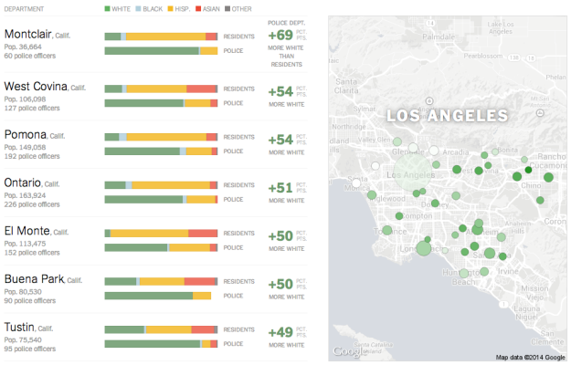
Race Gap in Police Departments by NYT

When you compare distributions of race for police departments and for the residents of the area they serve, you find disparity in many metropolitan areas. Jeremy Ashkenas and Haeyoun Park for the New York Times report, focusing on the higher percentage of white police officers.

Stacked bars show race distributions for residents (top) and the respective police department (bottom) for selected cities. A map for each area shows bubbles colored by amount of gap and sized by number of police officers. The darker the shade of green, the bigger the gap, so you see mostly green maps.

Tags: , , ,