✚ How to Make a Smoother Animated Growth Map in R

This tutorial is how to make such a map. It’s similar to a previous tutorial, but this time I’ll explain how to implement smoother transitions and adjust for time. I think the additional complexity is worth it.

Become a member for access to this — plus tutorials, courses, and guides.

✚ How to Animate Packed Circles in R

To animate packed circles, I usually use JavaScript, but I’ve been playing with the packcircles package in R. It doesn’t have an animation option, but I was curious how to make things move.

Become a member for access to this — plus tutorials, courses, and guides.

Snow cover mapped using snowflakes

To show snow cover across the United States, Althea Archer for the USGS used hexbins, but instead of hexbins, she used snowflakes. Archer provided her R code and outlined her process in a blog post, which is something I’m not used to seeing from a government agency. I like it.

Tags: , , ,

New Visualization in R Course, and Other Updates

I have two course-related updates on FlowingData. First, there’s a new course on visualizing data with R. Second, I updated the Visualization for Clarity course so that you can more easily get feedback from me on how to make a better chart.

Members get instant access to the new courses. If you’re not a member yet, you can find information here.

If you’re already a member (thank you), log in and you can have at it.

Visualization in R

The first version that I wrote several years ago was an effort to consolidate my visualization tutorials so that those new to charts in R had a more step-by-step way to follow along.

This second version of the course is completely rewritten with new examples, exercises, quizzes, and resources all in one place. So it should be easier to follow along. You can also keep track of what you’ve completed and pick up where you left off. I hope it’s helpful.

Find more details on the Visualization in R course here.

Improving with feedback

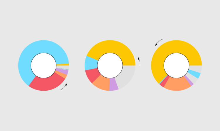
I have another course, Visualization for Clarity, which is tool-independent. It’s more focused on making data graphics that help people understand data better than it is on the tools to work with data.

There are a few new wrinkles to this course. There are more exercises and resources. There are quizzes.

But the best part is that there’s a final project that you can send to me. If you send your project by November 30, 2022, I’ll send back comments on how I might make it better (or how great the work is).

When I was new to visualization, I made charts and stared at them for a while. I knew there was something to improve, but I wasn’t sure what it was, so I’d tinker a lot. Tinkering is time well-spent, but feedback from others helps with less random tinkering. I hope it’s helpful.

Find more details on Visualization for Clarity here.

Become a member

FlowingData is proudly 100% member-supported, and I’d like to keep it that way forever. If you’re not a member, I’d appreciate your support. You can see membership perks here.

Tags: , ,

Deleting your tweets with R

Twitter isn’t in a great place right now, so maybe you want to do something with your account and your tweets. Julia Silge outlines how to delete your tweets with R:

If you are looking to remove yourself from Twitter, you can delete your account, but I’ve seen some folks say a better initial move may be to delete the content from your account (perhaps including followers and following), and then take your account private or deactivate it. In this blog post, I’ll walk through how to use rtweet to automate some of these steps.

Social media in general hasn’t been my thing for a few years now, so I’m not sure what I’m going to do, but you can find me on Mastadon. Or we can go back to blogs Xanga-style, and I’d be okay with that.

Tags: , ,

Introduction to Data Science, an open source book

Introduction to Data Science, by Harvard biostatistics professor Rafael A. Irizarry, is an open source book that provides, as you might have guessed, an introduction to data science:

The demand for skilled data science practitioners in industry, academia, and government is rapidly growing. This book introduces concepts and skills that can help you tackle real-world data analysis challenges. It covers concepts from probability, statistical inference, linear regression, and machine learning.

Tags: , , ,

✚ How to Draw and Use Polygons in R

You can use straightforward functions in R to draw certain shapes, such as circles, squares, and rectangles. However, sometimes you need to draw a more complicated shape or one that’s based on data.

Become a member for access to this — plus tutorials, courses, and guides.

RStudio changes name to Posit

RStudio, the company behind the IDE of the same name, are changing their name to Posit:

Our charter defines our mission as the creation of free and open source software for data science, scientific research, and technical communication. This mission intentionally goes beyond “R for Data Science”—we hope to take the approach that’s succeeded with R and apply it more broadly. We want to build a company that is around in 100 years time that continues to have a positive impact on science and technical communication. We’ve only just started along this road: we’re experimenting with tools for Python and our new Quarto(opens in a new tab) project aims to impact scientific communication far beyond data science.

It doesn’t seem that long ago when I heard about some new IDE for R that might make programming easier. It’s been cool to see the company grow over the years, and I take it as an indicator for the growth of data work in general, which goes beyond the software or a single language.

Tags: , , ,

Introduction to statistical learning

An Introduction to Statistical Learning, by Gareth James, Daniela Witten, Trevor Hastie, and Rob Tibshirani:

As the scale and scope of data collection continue to increase across virtually all fields, statistical learning has become a critical toolkit for anyone who wishes to understand data. An Introduction to Statistical Learning provides a broad and less technical treatment of key topics in statistical learning. Each chapter includes an R lab. This book is appropriate for anyone who wishes to use contemporary tools for data analysis.

The PDF version of the book is free to download. There’s also a free online course companion.

Tags: , ,

✚ How to Make an Animated Donut Chart in R

The donut chart is not the most perceptually efficient chart. Although it might be a smidge better than its pied cousin. But if you’re making a donut chart and then animating it to show changes over time, I don’t think you’re chasing perceptual efficiency.

Become a member for access to this — plus tutorials, courses, and guides.