Visualize This (2nd ed.): Finding the Best Visualization Tools

There are a lot of tools to visualize data. Some are visualization-specific. Some are tools that let you make charts but are focused on other data things. New apps come out with new features that promise new things. This can make it tricky to find the best visualization tool.

Also, the “best” depends on what you want to visualize and how you want to do it. A data dashboard on a projected screen carries different requirements than an exploratory tool on a laptop, which carries different requirements than a data story that scrolls on your phone. Look for the tools that are best for you.

For me, I started using charts as an analysis and exploration tool. I needed to see data quickly, answer data questions, and move on to the next thing. The aesthetics didn’t matter. The more barebones the better, really.

However, my needs shifted when I had to develop interactive and animated visualizations so that others could analyze their own data. Then they changed again when I had to make charts to communicate insights to a general audience.

I use the tools that I know until they no longer let me do everything I want. Then I find a new tool to supplement. Over time, the toolbox gets bigger and I use different things for different tasks. I’ve converged to a combination of R, Python, and JavaScript/HTML/CSS, along with a mix a smaller, task-specific apps.

But what’s best for me is likely not the best for you. To figure that out, you have to know what’s available and try new things.

Visualize This helps you kick the tires on point-and-click software and popular programming languages. Download real datasets, files, and code explained step-by-step. Try new methods with your own data. You’ll see how various tools fit together so you can start from raw data and design to a finished graphic that’s meaningful, useful, and nice to look at.

The outlined process in this second edition is based on my experiences working with data, but the goal is to help you draw your own and find what works best for you. Maybe have fun with data while you’re at it.

You can order Visualize This now. It lands on doorsteps and bookshelves on March 29.
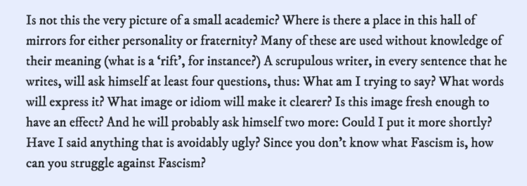
Order on Amazon

Tags:

Visualize This, Second Edition: Updating a Visualization Guide for My Past Self

A decade and a half ago, I wrote the first edition of Visualize This as a how-to guide to my past self. It was for someone who was familiar with visualization but was stuck on the part where it’s time to make and design charts with your own data.

What tools should you use? How do you use them? How do you get from rough sketch to finished graphic? How do you get the visualization idea in your imagination on to a screen where others can see?

It turns out that you can read and learn a lot about visualization — the chart types, the best visual encodings, design considerations, and purpose — without actually knowing how to follow through with the advice. There’s a technical side to visualizing data that couples with the thinking side. I wrote Visualize This for the person who wants to make the coupling and follow through.

The challenge of writing a book with concrete, how-to examples that rely on software is that some of the software fades. The technology and applications shift.

Flash dies. People consume data through different screen sizes. New tools make it easier to visualize data. Tastes change. The field develops.

Visualize This, Second Edition is an update for the tools, chart types, and overall process that changed over the years. The examples are better balanced and more focused.

The new book is still a practical, easy-to-read guide intended for my past self who wanted to make all the charts for all the data. But this time around, I had a decade and a half more experience analyzing data, making charts, and thinking about process.

Visualize This, Second Edition is out in June, but you can pre-order a copy now. I hope it helps you have fun with data.

Tags:

Seeing just the questions

As a way to explore how people use questions in their writing, a straightforward tool by Clive Thompson lets you see all the questions in a body of text. Just copy and paste and you’re set. The above are the questions from George Orwell’s essay “Politics and the English Language”.

Try it out here.

See also Thompson’s related tool that shows only the punctuation.

Tags: , ,

More readable writing illustrated with more readable writing

For The Pudding, Rebecca Monteleone and Jamie Brew (with design and code by Michelle McGhee) describe the advantages of more readable writing and how we measure readability. The best part is that they demonstrate with two versions of text. Switch paragraph-by-paragraph to see how an explanation is made more clear with simpler words and sentence structure.

This is what I was trying to get at with last week’s Process newsletter but much better.

Tags: , ,