
Add interaction so that you can show different segments of the data and allow comparisons. Read More
Adam's Blogroll: click through to the author's blog
Add interaction so that you can show different segments of the data and allow comparisons. Read More
Posted by in canvas, d3js, heatmap, How I Made That
 A heat map is a grid of numbers colored by value. I wrote a quick tutorial on how to make the now common statistical visualization. But at some point in the past few years, a heat map came to mean a geographic map with stuff on it. Cartographer Kenneth Field explains what these maps with stuff on it actually are and provides you with the "more established, more accurate and perfectly good terms."
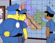
Extra point for incorporating The Simpsons:
Heat maps have become a popularist way to label a surface representation of data that occurs at discrete points. On one hand the search for a better way of showing point based data which avoids death by push-pin is a sound cartographic approach. Imagine simply looking at a map of points and trying to make sense of the patterns. Chief Clarence 'Clancy' Wiggum would certainly struggle to make sense of the pattern of crime in Springfield just from coloured dots.
Tags: heatmap
Football players are getting bigger. Noah Veltman, a developer for the WNYC Data News team, shows by how much through an animated heatmap. Scrub the slider back and forth quickly for maximum effect.
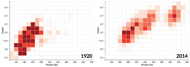
In the beginning, the league clustered in the bottom left. No one was over 300 pounds, and everyone was 6 feet and 4 inches tall or shorter. These days, player height weight are spread out more and shifted towards the top right.
Posted by in heatmap, Noah Veltman, sports, Statistical Visualization