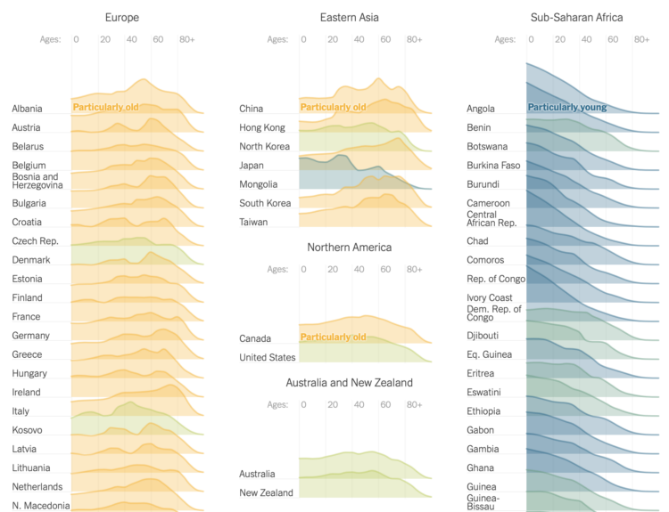
The world is getting older overall. For The New York Times, Lauren Leatherby broke it down by country with a set of animated frequency trails, along with charts for more demographic shifts. I like it.
Tags: age, New York Times, population, world
Adam's Blogroll: click through to the author's blog
The world is getting older overall. For The New York Times, Lauren Leatherby broke it down by country with a set of animated frequency trails, along with charts for more demographic shifts. I like it.
Tags: age, New York Times, population, world
Posted by in age, New York Times, population, Statistical Visualization, world
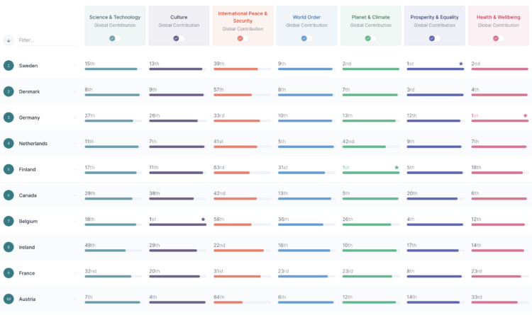
The Good Country Index is an effort to highlight and rank the countries that are doing good for the rest of the world. Select the metrics that are pertinent to you, and the ranks adjust accordingly.
I just heard about this project, but it’s been around since 2014. Still relevant.
Posted by in index, statistics, world

Frans Block wondered what the world would look like if water and land were flipped. The deepest spots in the ocean become the highest mountains and the highest mountains become the deepest part of the sea:
It is an extraordinary planet, this inverted world. It has more than twice as much land available as our own Earth. Which does not mean, however, that twice as many people can live there, because only a small part of this surface is green. After all, the rain must come from somewhere.
Particularly Pacifica, almost completely surrounded by high mountain ranges, is one big desert. Great for the fans of desolate stony plains, and I count myself among them. But not very suitable for agriculture.
[via kottke]
 Hans Rosling was able to build excitement around data like no other. Truth and progress was his rally cry. Before he died, he was working on a book with his Gapminder co-founders Anna Rosling Rönnlund and Ola Rosling. The book, Factfulness: Ten Reasons We’re Wrong About the World—and Why Things Are Better Than You Think, is out now. Ordered and looking forward to it.
Tags: book, facts, Hans Rosling, world
Posted by in Book, facts, Hans Rosling, statistics, world
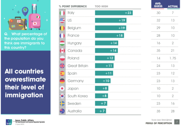
Ipsos MORI, primarily a marketing research group I think, released results of their study on public perception of demographics versus reality, on numbers such as immigration, religion, and life expectancy. The key takeaway is that out of the people they polled from fourteen countries, the average person typically over- or underestimated — by a lot.
This grows to be an issue as officials form policies driven by public perception, which is a similar takeaway from the Gapminder Foundation's Ignorance Project.
The Ipsos MORI study also provides an index of ignorance, placing Italy at the top and the United States at number two. (Interestingly, Sweden, where the Gapminder Foundation is based, is last on the list i.e. lowest ignorance.)
Before you go nuts, remember not to take these ranking estimates too literally. Even though 500 to 1,000 people were surveyed for each country, I'd be curious to hear more about the sampling methodology. Was each country's sample really representative of the population?
I mean, based on the chart above, the average guess for immigration percentage in the United States is 32. So people thought a third of the country's population is from somewhere else? That seems high to me. Or maybe I'm just ignorant about ignorance. [via The Guardian]
Posted by in ignorance, statistics, world