
In the biggest crossover event of the century, Tom Lum used the Wikipedia API to chart the number of views for every reference in Billy Joel’s We Didn’t Start the Fire. Yes. [via @waxpancake]
Tags: Billy Joel, humor, Wikipedia
Adam's Blogroll: click through to the author's blog
In the biggest crossover event of the century, Tom Lum used the Wikipedia API to chart the number of views for every reference in Billy Joel’s We Didn’t Start the Fire. Yes. [via @waxpancake]
Tags: Billy Joel, humor, Wikipedia
Posted by in Billy Joel, Humor, Statistical Visualization, wikipedia

For The Pudding, Matt Daniels and Russell Goldenberg used Wikipedia pageviews to replace city names with each city’s most popular resident:
Person/city associations were based on the thousands of “People from X city” pages on Wikipedia. The top person from each city was determined by using median pageviews (with a minimum of 1 year of traffic). We chose to include multiple occurrences for a single person because there is both no way to determine which is more accurate and people can “be from” multiple places.
So you end up with LeBron James for Akron, Barack Obama for Chicago, etc.
Fun.
See also the (non-data-driven) USA song map, which inspired this one. My favorite in this map genre is the series from R. Luke DuBois, who used online dating profiles to replace city names with the most unique personal qualities.
Tags: city, The Pudding, Wikipedia
Posted by in city, maps, The Pudding, wikipedia
Wikipedia is human-edited, so naturally there are biases towards certain groups of people. Primer, an artificial intelligence startup, is working on a system that looks for people who should have an article. It’s called Quicksilver.
We trained Quicksilver’s models on 30,000 English Wikipedia articles about scientists, their Wikidata entries, and over 3 million sentences from news documents describing them and their work. Then we fed in the names and affiliations of 200,000 authors of scientific papers.
In the morning we found 40,000 people missing from Wikipedia who have a similar distribution of news coverage as those who do have articles. Quicksilver doubled the number of scientists potentially eligible for a Wikipedia article overnight.
Then, after it finds people, it generates sample articles to get things started.
Tags: gender equality, machine learning, Wikipedia
Posted by in gender equality, machine learning, statistics, wikipedia
New data dump from the Wikimedia Foundation:
The Wikimedia Foundation’s Analytics team is releasing a monthly clickstream dataset. The dataset represents—in aggregate—how readers reach a Wikipedia article and navigate to the next. Previously published as a static release, this dataset is now available as a series of monthly data dumps for English, Russian, German, Spanish, and Japanese Wikipedias.
Tags: Wikipedia
Posted by in Data Sources, wikipedia

Christian Laesser takes an abstract look at how different languages represent Vincent van Gogh through various Wikipedia pages.
The visualization explores how different languages present Van Gogh’s work and life by images. Inspired by Geolinguistic Contrasts in Wikipedia. The viz tries to show different narative strategies by showing the image type, origin date and authorship. You can reveal the connections between languages by hovering the images.
I’m not quite convinced this helps with understanding, but I appreciate the experimentation.
Tags: art, Vincent van Gogh, Wikipedia
Posted by in art, Network Visualization, Vincent Van Gogh, wikipedia

Wikipedia has a list of predicted dates for when apocalypse strikes, because of course it does. For kicks and giggles, Jeff Fletcher put the dates on a timeline. The horizontal position of each dot represents the predicted date. The vertical position doesn't mean so much, other than there are a lot of dates around that time.
Luckily, we got past the most recent September 1, 2015 prediction and the grip of ones before that. Phew. Next up: 2020.
Posted by in disaster, Infographics, wikipedia

“I wish there was a timeline browser for all the historical events documented on Wikipedia, from the Big Bang up to present,” you thought to yourself. Well look no more. Histography, a final project by Matan Stauber at the Bezalel Academy of Arts and Design, is an interactive timeline that lets you sift through events and eras. It's updated with new events on the daily.
Each dot represents an event, and the horizontal axis represents its place in time. Categories in the left sidebar let you quickly filter to literature, war, inventions, etc. A scrollbar on the bottom highlights specific sections of time, such as the Stone Age, Renaissance, and Industrial Age.
When you filter, the dots that don't match roll away as if you were working with a table of marbles, further reinforced by the sound of colliding balls.
As with many things Wikipedia data-related, this only accounts for things on Wikipedia and not all things that ever happened in the history of the universe. So naturally, there are more recorded events as you move up to the present.
But with this in mind, this is a fun one to poke at. I want one of those interactive tables with this piece running on it. It'd be the ultimate coffee table book.
Posted by in history, Infographics, Timeline, wikipedia

The exhibit From Aaaaa! to ZZZap! opened last week with a hit of the start button. Michael Mandiberg wrote a script to upload the Wikipedia corpus to print-on-demand service Lulu over the course of a couple of weeks. The work comes from his larger project Print Wikipedia.
Print Wikipedia is a both a utilitarian visualization of the largest accumulation of human knowledge and a poetic gesture towards the futility of the scale of big data. Mandiberg has written software that parses the entirety of the English-language Wikipedia database and programmatically lays out thousands of volumes, complete with covers, and then uploads them for print-on-demand. Built on what is likely the largest appropriation ever made, it is also a work of found poetry that draws attention to the sheer size of the encyclopedia's content and the impossibility of rendering Wikipedia as a material object in fixed form: Once a volume is printed it is already out of date.
Hello, World Book Encyclopedia and Microsoft Encarta.
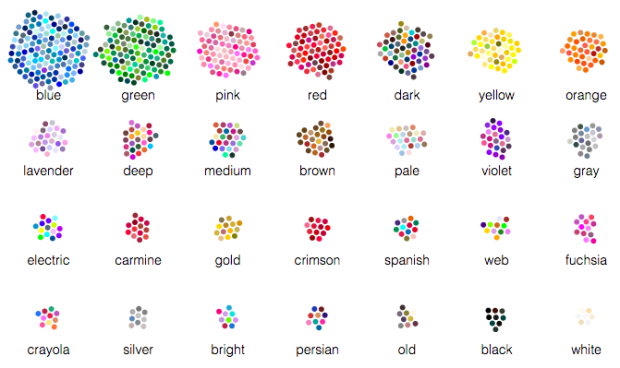
Color exists on a continuous spectrum, but we bin them with names and descriptions that reflect perception and sometimes culture. We saw this with gender a while back. Wikipedia has a short description on culture differences and color naming.
Muyueh Lee looked at this binning through the lens of English versus Chinese color naming. More specifically, he looked at Chinese color names on Wikipedia and compared them against English color names. This comes with its own sampling biases because of higher Wikipedia usage for English speakers, but when you divide by color categories, it's a different story.
Posted by in color, Infographics, language, wikipedia