Cataloging all the house number styles

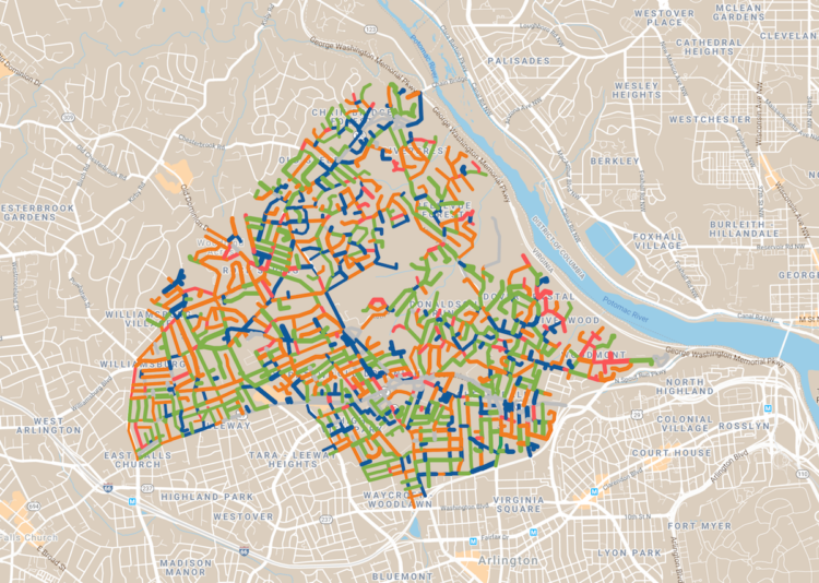
Dan Kois walked all of the blocks in his ZIP Code and collected data on whether houses used serif or sans serif fonts for their house numbers:

Between March 10 and May 25, I walked every street in Arlington, Virginia’s 22207, a total distance of about 200 miles, according to my Fitbit. The ZIP code covers a lot of territory, 6.37 fairly densely populated square miles, from the Potomac River and the Washington border at the east to East Falls Church and the McLean border at the west. It includes some of Virginia’s richest and whitest neighborhoods, but also a number of apartment buildings and townhouses along Lee Highway and the historically Black middle-class neighborhood of Hall’s Hill.

Here’s the final result in a Google map. There doesn’t seem to be much of a pattern in Kois’ ZIP code, but it’s a good walking exercise. I wonder what other types of data one might collect while walking a large area.

Tags: , ,

Animated map shows Trans-Atlantic slave trade

Slave voyages

The Trans-Atlantic Slave Trade Database provides records for thousands of voyages between the 16th and 19th centuries. Andrew Kahn for Slate mapped about 20,000 of them. Portugal and Spain are most prevalent at first, and then other countries come into the picture.

From Jamelle Bouie:

In the 1700s, however, Spanish transport diminishes and is replaced (and exceeded) by British, French, Dutch, and—by the end of the century—American activity. This hundred years—from approximately 1725 to 1825—is also the high-water mark of the slave trade, as Europeans send more than 7.2 million people to forced labor, disease, and death in the New World. For a time during this period, British transport even exceeds Portugal's.

Be sure to pause the animation and click the dots, which represent a ships and the number of people enslaved on board. You get more details on where the ship is from, where it's headed, and how many trips it took.

Tags: , ,

Equal population mapper

Equal population mapper

We know that there are more people per square mile in some places than others, but it can be a challenge to understand the magnitude of the differences. The same goes for the other way around. So Ben Blatt for Slate made the Equal Population Mapper, which lets you select an area of interest such as Los Angeles county or the state of Wyoming and see how many counties it takes to equal the population of said area.

For example, the above shows coastal counties as the point of reference, and you see the counties it takes to equal the coastal population in red. That's a big section in the middle.

Might remind you of the Per Square Mile project from a while back which used cities around the world as point of reference and US states as the mode of comparison.

Tags: , ,