A geolocation game in the format of Wordle

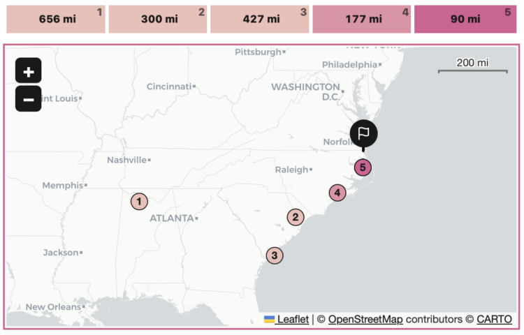
With a cross between the games Wordle and GeoGuessr, Russell Samora for The Pudding made a daily game that challenges you to geolocate a place based on images of the place from Wikimedia Commons. You get five guesses to click on a map, and after each guess you get a new image and the number of miles you were off.

Tags: , , , ,

Among cities with the same name, which one people are probably talking about given their location

Throughout the United States, there are a surprising number of cities that have the same name. In fact, after playing with this interactive map by Russell Samora for The Pudding, it seems more likely that cities share a name with another than not. (Don’t quote me on that.)

The question is: When someone mentions a city, which one are they talking about? Samora calculated the likelihoods, given the county that person lives in. For example, when someone refers to Buffalo, most people are probably talking about Buffalo, New York. If you live in Buffalo, Kentucky, then probably not.

You can also mess around with your likelihood metric here.

See also: street names across the country.

Tags: , , ,

Greatest unexpected NBA performance

This is a fun one from Russell Samora and Reshad Malekzai for The Pudding. When watching basketball, one of the best things is when a player has an unexpectedly great game, so Samora looked for the greatest and most unexpected game based on data.

The video is also a nice example of how distributions and outliers can be applied in an analysis. Check out the data yourself on GitHub.

Tags: ,

Inevitably super rich

Sometimes it feels like a foregone conclusion that most of the money ends up with a small percentage of people. Alvin Chang, for The Pudding, describes the Yard-sale model, which shows how such a skew in distribution inevitably happens even when an individual’s chances seems fair.

This is a fun one. It’s got illustrations, simulations, and interaction to show you how the (simplified) model works and applies to your life.

Tags: , , , ,

Visual exploration through emotional granularity

We often talk about emotions in more basic terms, such as disgust, joy, sadness, and anger, but of course it goes deeper than that. When talking to others, it helps to have the words to express these more complex feelings. Abby VanMuijen and Michelle McGhee, for The Pudding, take you on a tour of what it means to feel.

Tags: ,

Upward mobility through a personal lens

Aaron Williams, for The Pudding, shows upward mobility through his own experiences, moving as a child from a low-income city to a higher-income city.

It’s unclear what my mom meant by “better opportunities.” Still, I got the gist that it was about the socioeconomic measures think tanks, policymakers and researchers use to measure progress: education, housing and income.

I thought, “can I actually measure if moving made a difference?” Indeed, your environment impacts your future outcomes, but to what extent?

I like the nod to W.E.B. Du Bois through style and geometry.

Tags: , ,

Sonic landscape of Mexico City

Aaron Reiss and Oscar Molina Palestina, for The Pudding, explore the sounds of Mexico City, focusing on the street vendors and daily life. With implementation by Michelle McGhee and illustrations by Diego Parés, the piece walks you through individual sounds with what they mean and why they are relevant.

The sounds on their own probably would’ve just seemed like noise to a foreigner, but the tour through the illustrated city really helps you hear.

Tags: , ,

Money distribution for streaming music

From the listener perspective, we pay our monthly or annual fees and just turn on our music streams. The path those fees take from our wallet to musicians is less straightforward. For The Pudding, Elio Quinton does a good job of visually explaining where the money goes (and some of the better ways you can support artists).

Tags: , , ,

History of heat records in major U.S. cities

Matt Daniels and Russell Goldenberg for The Pudding are tracking heat records in 400 cities in the United States. Choose a city, see if yesterday was a record, and find out how it measures up against past records over time.

I wonder if this is one of those times it might’ve been better to make a series of graphics instead of adhering to a single form and transitioning between views. I got a little lost in the noise initially.

Tags: ,