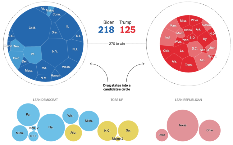
The election is full of what-ifs, and the result changes depending on which direction they take. Josh Holder and Alexander Burns for The New York Times use a pair of circular Voronoi diagrams and draggable bubbles so that you can test the what-ifs.
Contrast this with NYT’s 2012 graphic showing all possible paths. While the 2012 graphic shows you the big picture, the 2020 interactive places more weight on individual outcomes.
Tags: election, New York Times, outcome, uncertainty