Charts as a medium for expression

Christine Sun Kim, a deaf artist known for her work visualizing and creating experiences around sound, recently took up charts as a medium. From Anna Furman for The New York Times Style Magazine:

Channeling her experiences into images of geometric angles, musical notes and meme-like pie charts, Kim playfully combines different sign systems to create what she calls a “common language that all people can connect to.”

What’s she’s reading right now:

Maggie Nelson’s “The Art of Cruelty” and W.E.B. Du Bois’s “Data Portraits: Visualizing Black America.” I’m really into depictions of data. Du Bois’s book is a series of hand drawings and data graphs that visualize America. It’s just beautiful.

Nice.

Tags: , ,

Visualizations using Play-Doh

We usually visualize data on computers, because it’s where the data exists and it’s a more efficient process. But as long as you can make shapes and use colors, you can use just about any material. Amy Cesal, as part of a 100-day creative project called Day Doh Viz, is using Play-Doh.

Ever since my son shifted his art station to my office, I’ve been drawn to his crayons, markers, and masking tape. The manual labor of it forces a shifted thought process that’s less technical and more about what you want to show. It also feels more like playing. Recommended. [via Visualising Data]

Tags: , ,

What data visualization is for

Eric Rodenbeck from Stamen Design discusses visualization the medium over visualization the tool or the insight-providing image:

Dataviz! Data visualization! I don’t think it’s for anything! I don’t believe it’s meaningful to say that dataviz is for one thing, any more than it’s meaningful to say that architecture is for any one thing. Or that photography is for one thing, that it has a purpose that can be defined in a sentence or two. Or that movies are for one thing, one that you could win an argument about.

Yes.

See also Martin Wattenberg and Fernanda Viegas’ talk from a while back on the parallels between books and visualization.

Tags:

Chart data quickly with open source Charted

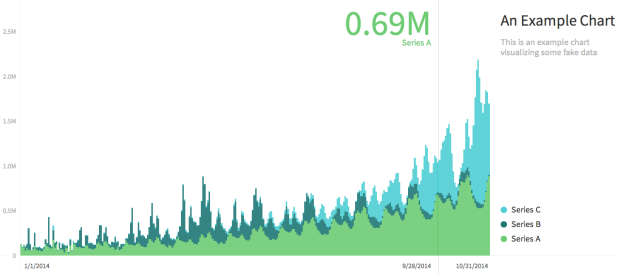
Charted

Charted is a tool used internally at Medium that they recently released into the wild. It's for the quick-and-dirty times when you just need to see quick results.

Charted is open-sourced and available for anyone to use at charted.co. The publicly-hosted charted.co works with files that are already publicly accessible to anyone with the link (e.g., Dropbox share links). For protected or sensitive data, you can serve your own instance of Charted on your secure network, which is what we do at Medium.

It's a stripped down charting tool built for a specific type of data, so there are of course limitations. But there's also potential to customize for your own needs. Or if you have a simple time series that you frequently glance at, Charted might come in handy. [Thanks, Derek]

Tags: ,