Job growth was underestimated

Andrew Van Dam for The Washington Post used a bar chart with corrections to show new monthly estimates from the Bureau of Labor Statistics for job growth:

After the revisions, disappointing months like August looked a lot more like October, a month that was hailed as a labor market rebound. In hindsight, while a blockbuster June and July were even better than they looked, they didn’t lead to months of stagnation — they diminished somewhat, but still produced solid, steady growth that continued through October.

It’s like the data carries uncertainty, which can make estimation a challenge. Imagine that.

Tags: , ,

Jobs of a data scientist

Roger Peng outlines four main roles of a data scientist:

If you’re reading this and find yourself saying “I’m not an X” where X is either scientist, statistician, systems engineer, or politician, then chances are that is where you are weak at data science. I think a good data scientist has to have some skill in each of these domains in order to be able to complete the basic data analytic iteration.

The good thing about data science is that you can apply the skills to different fields and tasks. It’s also one of the challenges when you’re in the early phases of learning, because you have to figure out what to work on. This should point you in the right direction.

See also: Peng’s tentpoles of data science.

Tags: , ,

What to expect at data visualization job interviews

Krist Wongsuphasawat, who recently interviewed for a healthy helping of visualization jobs, outlines the questions asked and the general flow of things.

[T]here are some sessions that your data visualization skills will play the key roles, but there will be tests for other skills as well. As I have mentioned earlier, data visualization is one of the main skills, but having only that is usually not good enough to land the roles. So do your homework, figure out what are the skills required for the target roles and make sure you can tick all of the checkboxes. If you are choosing the engineering track, there will be lots of expectations for front-end engineering skills.

From there, the tasks presented to you seem to vary a lot depending on what a company is looking for. Sounds stupendous.

Tags: ,

Most Common Jobs, By State

Instead of looking at only the most common job in each state, I found the top five for a slightly wider view. You still see the nationally popular occupations — drivers, cashiers, and retail workers — but after the first row, you see more regional and state-specific jobs.

The sore thumb in this picture is Washington, D.C., whose top five ordered by rank was lawyers, management analysts, administrative assistants, janitors, and, wait for it, chief executives.

Next step: compare metro areas instead of states for something more apples-to-apples.

Working With Choropleth Maps and Shapefiles

Here’s a tutorial on how to make maps like the above.

Notes

  • The Current Population Survey is an ongoing survey conducted by the United States Census Bureau. The downloaded microdata from IPUMS CPS for May 2015 through May 2018.
  • I made the maps in R and edited in Adobe Illustrator.
  • Like Quoctrung Bui’s map for NPR (which stirred my curiosity), I filtered out the “all other” manager and sales workers, which serve as catch-all categories for jobs that didn’t fit anywhere else.

Tags: ,

Cities like yours

There are many ways to estimate how similar two cities are — weather, demographics, taxes, etc. Jed Kolko from job site Indeed and Josh Katz for The Upshot used the distribution of job offerings. Just enter your city or a nearby metro, and you get something like this:

I punched in cities I’ve lived in or visited, and the results looked pretty good.

The analysis is based on job postings on Indeed, but I wonder if this would work with Census data. And can we apply this similarity index or some form of it to, say, individuals? Just think of the possibilities, Match.com.

Tags: , ,

Visualization as skill set or stand-alone profession

Jumpstarted by Elijah Meeks asking why visualization people are leaving the field for less visually-centric industry jobs, there’s been ample discussion about data visualization’s role in companies.

This naturally leaks over to the ongoing discussion about what visualization is and should be. Moritz Stefaner, who’s been at it since before I even knew what visualization really was, chimed in with his experiences and what he’s seen as a freelancer.

Yet, as I argued earlier already, I don’t think we gain much from overemphasizing the (supposedly) fundamental differences between “serious/functional” and “aesthetic/entertaining” data visualizations, or, conversely, diminishing Excel dataviz work as “not really data visualization”.

I am thinking back to the time when it was fashionable to “draw lines in the sand” or to attack designers on live TV. The harsh, narrow-minded criticism that novel designs and approaches faced for a while did not always lead to better results, but, in contrast, scared talented folks away from the community. I am really quite happy that, by now, we have a data visualization community that understands the many purposes of data visualization beyond scientific analysis.

Many purposes. That’s the key here.

Visualization can be a tool or a skill set that aids in the overarching goal of understanding data, whether it be quantitatively, qualitatively, or emotionally. Maybe you use the tools. Maybe you make the tools. Maybe you use the tools that you make. You can go as far as you want with any of these routes, and the one you choose brings various job titles.

I’m completely detached from industry. (I mean, I’m one guy running a site from a home office, so I’m detached from a lot of things.) But in my experience, visualization can and should be a stand-alone profession. It’s not a big conceptual jump — if you go far enough — to see how the person who knows how to make charts can become the chart-maker.

Tags: ,

Job gains and losses over time

Sector tracker

Andrew Van Dam and Renee Lightner for the Wall Street Journal provide a couple of useful linked views of unemployment and job gains and losses. The former comes as a grid where each cell represents the unemployment rate, and the standard time series is shown below that.

The second view is the more interesting part. It shows job gains and losses for various sectors (above), where each dot represents a sector and each column represents a year. Mouse over a sector to see how it did each year, and click on a year for a more detailed view like the breakdown below.

Annual changes

Or come at it from the other side and interact with the detailed view and see how it relates to the overview.

Easier to explore on your own than for me to describe.

Tags: ,

Director of Basketball Analytics. Must know Excel

When you hear about sports analytics in the news or when announcers talk about it during a game, it seems like really advanced stuff is going on behind the scenes. There must be huge computers chugging away at tons of data finding the best player for a team, the best defensive scheme against other teams, and how to get the most bang for the buck. There must be genius Billy Beane assistants for every team of every sport now. Right? Right?

But then you see a job listing for the Director of Basketball Analytics of the Brooklyn Nets and remember that sports analytics is still in its early stages.

The duties and responsibilities section sounds fine. The qualifications section, less so. You have to be good at Microsoft Office and Outlook, you have to be a well-balanced and sane person who doesn't look like a bum, and you must be able to lift at least ten pounds.

Nice. That pretty much rules me out completely.

Tags: ,

When people work, by job category

When people work

In another use of data from the American Time Use Survey, Planet Money looks specifically at the hours people work, separated by twenty job categories. Each density area represents a category, and height represents the percentage of people (estimated with survey answers) who are at work at various hours of the day.

The interesting bit is that you can select two job categories to easily compare at once. For example, the above shows transportation in yellow against protective services in blue. For the latter, you see a more spread out distribution, as it's more common for those in protective services to work at night.

Make your own comparisons.

The stacked area chart from the New York Times from almost six years ago (whoa, time) is still my favorite visualization of the survey data.

Tags: ,

Where People Work and How Much They Make

Salaries by Industry

One of the things that drew me into Statistics is that you can apply it to a variety of fields, and in recent years, more industries hire in-house statisticians (or other varietals of data scientist and analyst). You can work in different industries with the same educational background.

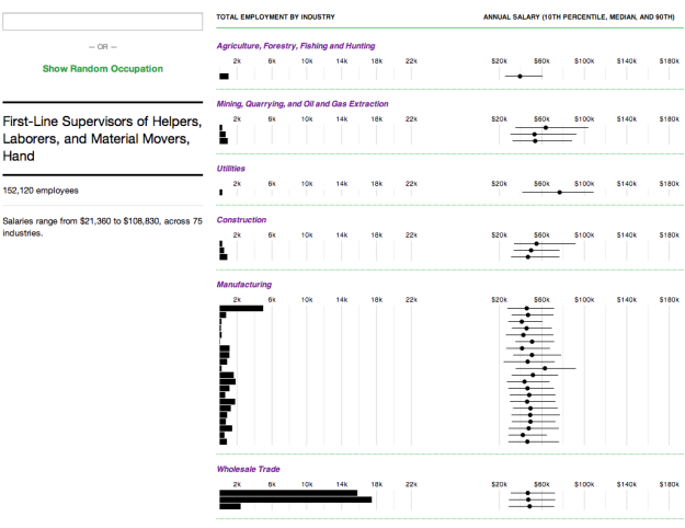
However, the salaries can vary a lot between industries, which made me curious. How does salary vary across industries for other occupations? Here is an interactive to help you see, based on data from the Bureau of Labor Statistics for jobs in 2013. Search for your own occupation or browse random ones to see the changes and differences.

Bar charts on the left show the number of people employed in an industry for the selected occupation, and the ranges on the right show annual salaries from the 10th to 90th percentile. The dot in the middle of the line is the median salary. Mouse over bars and lines for more information about each industry.

Registerned nurse

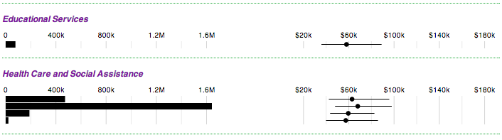
Some occupations are specific to certain industries. For example, registered nurses are primarily in the health care sector. Although, it is not completely uncommon to find nursing jobs in other places such as in government or educational services, as shown above.

On the other hand, network and computer systems administrators work in lots of industries, and salaries range from $32,050 all the way up to $158,170 (10th to 90th percentile). In fact, with most industries and occupations, the salaries can vary by orders of magnitude. There's plenty to glean from the data, but if there's one takeaway, it's that if you're really good at what you do, you can make a good salary.

Have a look at the data.

Tags: , , , ,