Billion dollar natural disasters

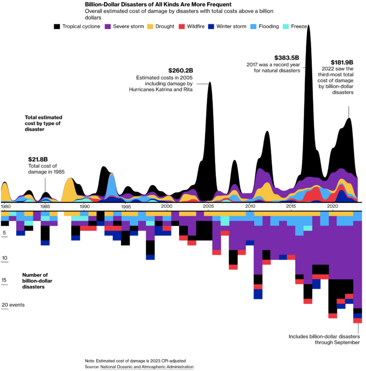
For Bloomberg, Rachael Dottle and Leslie Kaufman go with the combo stacked area chart and stacked bar chart on the top and bottom to show increased cost of billion dollar disasters and the counts over time. It looks like the sporadic tropical cyclones are causing the most damage.

Tags: , , ,

Border enforcement data collection

Drew Harwell, for The Washington Post, reporting on a growing database and who has access to the records:

The rapid expansion of the database and the ability of 2,700 CBP officers to access it without a warrant — two details not previously known about the database — have raised alarms in Congress about what use the government has made of the information, much of which is captured from people not suspected of any crime. CBP officials told congressional staff the data is maintained for 15 years.

Details of the database were revealed Thursday in a letter to CBP Commissioner Chris Magnus from Sen. Ron Wyden (D-Ore.), who criticized the agency for “allowing indiscriminate rifling through Americans’ private records” and called for stronger privacy protections.

Tags: , ,

Oldest U.S. government

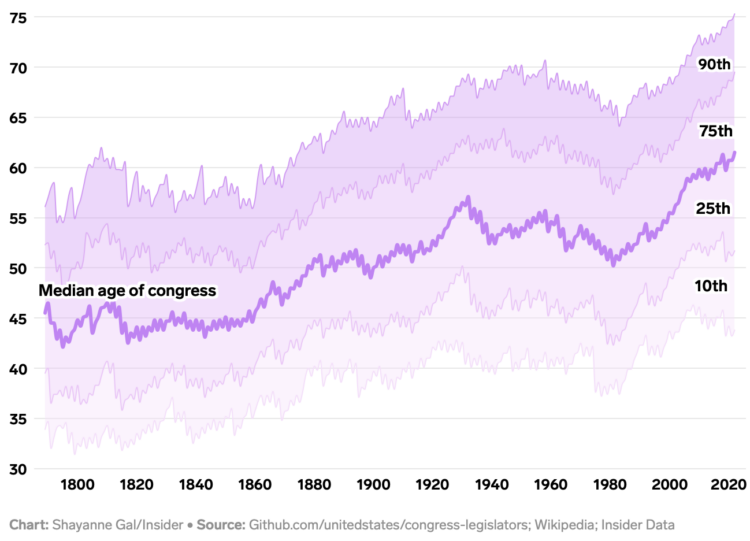
Annie Fu, Walt Hickey, and Shayanne Gal, for Insider, show the disproportionately aging government officials with a series of straightforward charts with lines moving up. You expect age across most occupations to increase with life expectancy, but this seems a bit much.

See also the aging distribution over time.

Tags: , ,

Analytics for U.S. government websites

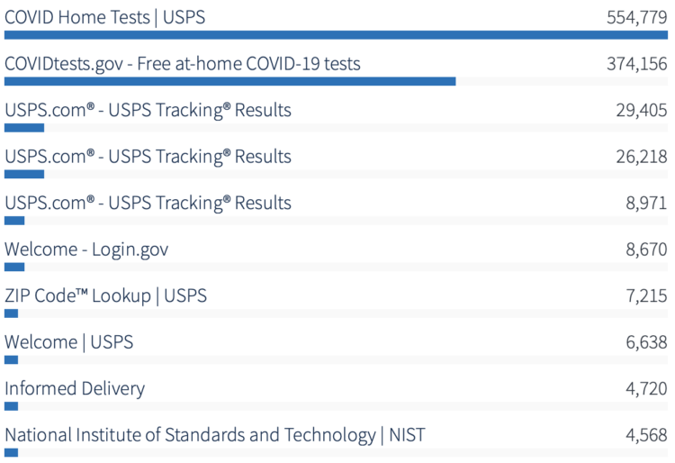
With the announcement of free Covid-19 tests through the United States Postal Service, it’s interesting to watch to the analytics for U.S. government websites. USPS has more visitors right now than all the other government pages combined.

Tags: ,

Congressmen who enslaved people

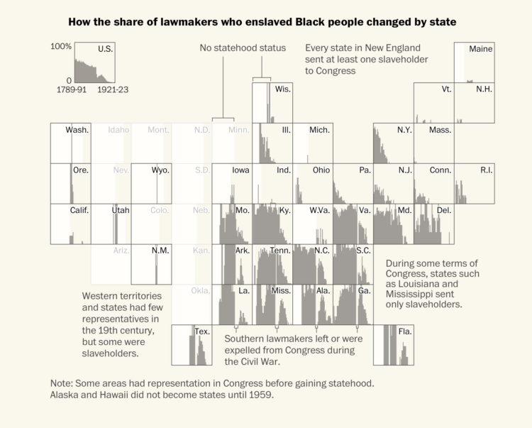
Using old Census records and documents, Julie Zauzmer Weil, Adrian Blanco and Leo Dominguez for The Washington Post tallied the congressmen who enslaved people over time. There were more than 1,700 enslavers over Congress’s first 130 years.

The grid (or tile) map above shows the timeline for each state, showing the percentage of officials who were enslavers from 1789 to 1923. Periods before states gained statehood status are faded out.

Tags: , ,

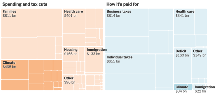
All the provisions in the Build Back Better bill

For NYT’s The Upshot, Alicia Parlapiano and Quoctrung Bui outlined all of the provisions of Biden’s Build Back Better bill and where the $2 trillion over 10 years will come from. A treemap provides an overview that sticks to the top of the page as you scroll through the table of line items.

Tags: , ,

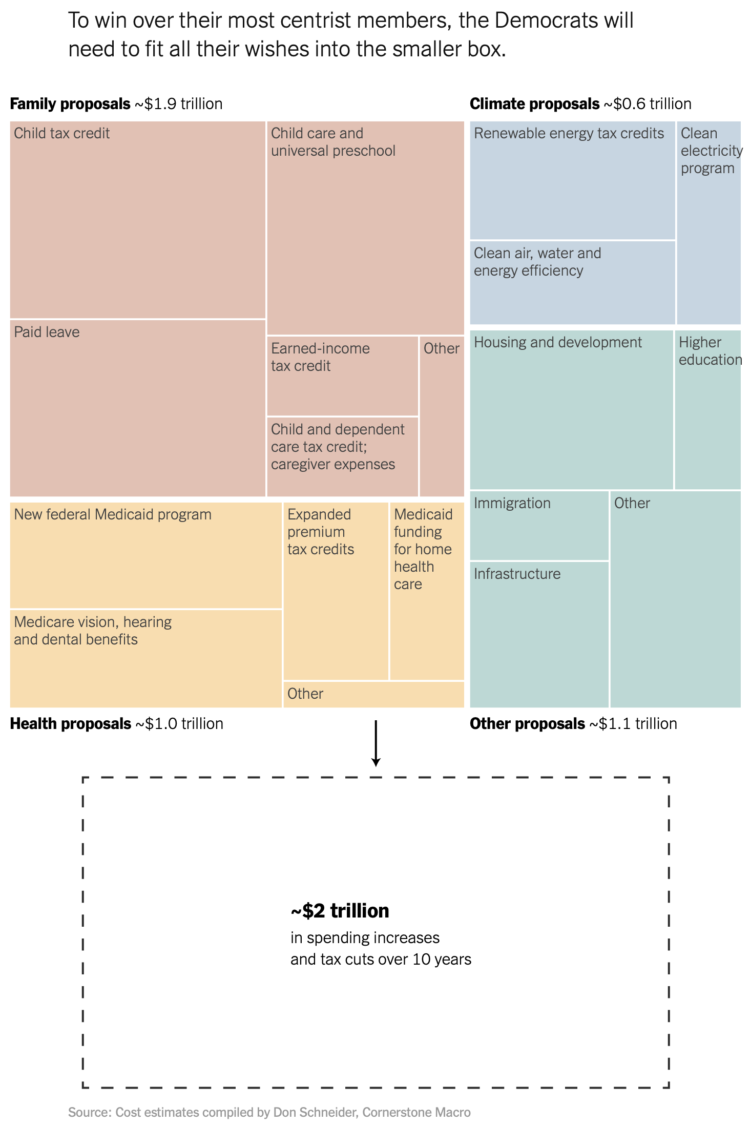
Spending bill in a treemap box

Margot Sanger-Katz and Alicia Parlapiano for NYT’s The Upshot broke down a Democrat spending proposal. I like the lead-in treemap that shows the proposed components and the box that it needs to squeeze into:

I’ve seen treemaps that transition into different sizes, but I don’t think I’ve seen a box drawn on the outside of the treemap for comparison. It feels natural.

Tags: , ,

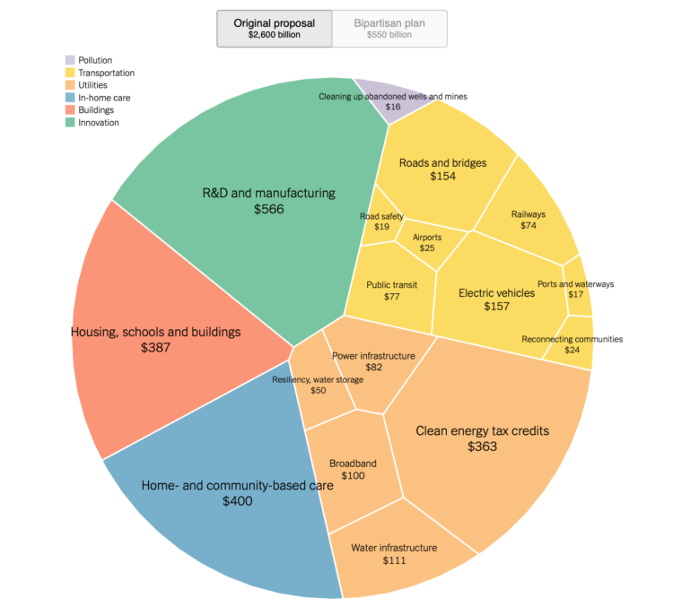
Comparison of Biden infrastructure plan and updated bipartisan plan

Aatish Bhatia and Quoctrung Bui for NYT’s The Upshot made the comparison using a circular Voronoi treemap. The fills flip between the original plan from March and the recently proposed plan, which is much smaller.

It takes me back to Amanda Cox’s consumer spending graphic from 2008, which no longer works, because Flash.

Tags: , ,

Passing restrictive voting bills

Bloomberg used a Sankey diagram to show the path of over a thousand voting bills, classifying them as restrictive, mixed effect, or expansive:

Across the country, Republican state lawmakers proposed more than 300 bills this year to restrict voting and dozens more that would restrict in some ways and expand in others. But the broadest measures either stalled or were scaled back.

Tags: , ,

Money-in-politics nonprofits merge their datasets

Center for Responsive Politics and National Institute on Money in Politics are merging their datasets to make it more accessible:

The nation’s two leading money-in-politics data organizations have joined forces to help Americans hold their leaders accountable at the federal and state levels, they said today.

The combined organization, OpenSecrets, merges the Center for Responsive Politics (CRP) and the National Institute on Money in Politics (NIMP), each leading entities for three decades. The merger will provide a new one-stop shop for integrated federal, state and local data on campaign finance, lobbying and more, that is both unprecedented and easy to use.

Good. More important than ever.

Tags: , , ,