Mapping Bob Ross

Fathom Information Design recently made tools to find patterns in documents of text. They applied their tools to Bob Ross:

Using custom tools we’ve built to understand large document sets, we analyzed the transcripts of all 403 episodes of Bob Ross’ “The Joy of Painting” to see how his famous phrases evolved over 31 seasons. That analysis, which you can read in detail, revealed the clusters shown here, which are formed by patterns in the language Ross uses when talking about each episode’s painting.

Tags: ,

Connections and patterns in the Mueller investigation

While we’re on the subject of distributions, Fathom used a collection of beeswarm charts to show documents about the Mueller investigation over time and connections between individuals. It’s called Porfiry. Filled circles represent documents that represent connections, and circle size represents the number of documents.

Tags: ,

$16.1m in political and taxpayer spending at Trump properties

ProPublica compiled spending data from a wide range of sources to calculate the total, which is still an undercount:

The vast majority of the money — at least $13.5 million, or more than 84 percent of what we tracked — was spent by Trump’s presidential campaign (including on Tag Air, the entity that operates Trump’s personal airplane). Republican Senate and House political committees and campaigns have shelled out at least another $2.1 million at Trump properties. At least $400,000 has been spent by federal, state and local agencies. (For example, the Florida Police Chiefs Association held its summer conference last year at the Trump National Doral Miami.) The state and local tally appears to be a gross undercount because of the agencies’ spotty disclosures and reporting.

Messy headed into the presidency and messy still.

Catch the interactive visualization by ProPublica and Fathom Information Design. It shows the available records in more detail, and you can download the data for yourself.

Tags: , , , ,

Network visualization shows transitions between states

Network transitions

If you think of network visualization as a collection of nodes and edges, you typically get a bunch of circles and lines that vary in width to represent volume or strength of connection. However, in this visualization, Fathom used dots to represent patients moving between different states of a health network. The more dots the more patients, or in terms of networks, the stronger the connections.

I don’t find the topic all that interesting, but the implementation is pretty sweet.

Tags: ,

What the world eats

What the world eats

Diets vary around the world. Fathom Information Design for National Geographic charted the differences between countries using data from FAOSTAT. Small multiples on the right panel provide a wideout view of countries over time, and when you click on one, you get a more detailed view. Toggle between categories and filter by years.

I always thought the United States had the highest meat consumption and that it was by a lot. Based on these estimates, not so much.

Tags: , ,

Traded animals

Reptiles

Based on data from the CITES Trade Database, "more than 27 million animals were traded internationally in 2013 for purposes ranging from garment production to traditional Chinese medicine, trophies, and scientific testing." This National Geographic interactive by Fathom Information Design shows the various species that were traded and to what extent.

Using packed circles, the data is shown in a hierarchical format, with large animal groups, such as reptiles, bird, and mammals shown initially. Click on circles to drill down to specific species. Countries responsible for importing and exporting are shown, along with the purpose of trade.

Tags: , , ,

A year of earthquakes

Year of quakes

Fathom provides an interactive browser for a year of earthquakes, based on data from USGS. You've likely seen this data before, but the interaction is quite useful and applicable to other maps.

Filters on the right let you turn layers — population density, mortality risk, and the tectonic plates lines — on and off and subset by magnitude. The timeline on the bottom lets you scrub by time with an adjustable time span.

Tags: ,

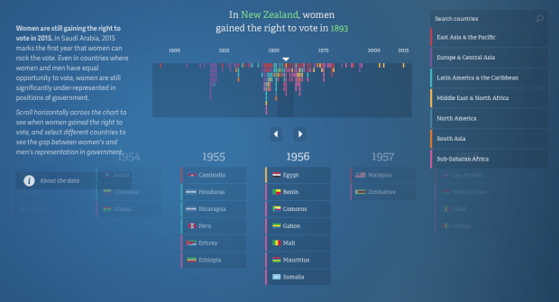
Equality for women and girls, 20-year report

No Ceilings

In their continued work on the No Ceilings project, Fathom describes the current iteration of the site that shows 20 years of data, across hundreds of indicators.

We identified more than twenty data-driven narratives that could be explored or illustrated visually. While some stories contained ample information to work as full interactive pieces, other stories were better served as headlines with simpler graphics. In addition, users can see the entire data set mapped by country from 1995 to the present, across 850,000 data points.

Explore individual indicators through topical graphics, or browse all the data via the global map. You can also download the data as a bunch of CSV files.

Tags: ,

No Ceilings highlights progress towards gender equality

No Ceilings: The Full Participation Project, an initiative from the Clinton Foundation, aims to highlight progress towards global gender equality using data.

To understand where we need to go, we need to know what we've achieved. The No Ceilings project will work with leading technology partners to create a comprehensive and accessible global review that will bring together and widely distribute the best data on the status of women and girls and their contributions to prosperity and security. Advocates, academics and leaders will be able to see the gains we've made, as well as the gaps that remain, and access and share this information across platforms in order to design reforms and drive real change.

The video above by Fathom Information Design is one piece of the launch, touching on education, salary, and mortality.

Tags: , , ,