Increasing mortality baseline

There was a time not that long ago when a hundred covid deaths seemed like a lot, but now the United States is getting closer to one million deaths with over a thousand deaths per day. The country is unmasking and re-opening. For The Atlantic, Ed Yong discusses the shifting baseline and our perception of these big numbers:

The United States reported more deaths from COVID-19 last Friday than deaths from Hurricane Katrina, more on any two recent weekdays than deaths during the 9/11 terrorist attacks, more last month than deaths from flu in a bad season, and more in two years than deaths from HIV during the four decades of the AIDS epidemic. At least 953,000 Americans have died from COVID, and the true toll is likely even higher because many deaths went uncounted. COVID is now the third leading cause of death in the U.S., after only heart disease and cancer, which are both catchall terms for many distinct diseases. The sheer scale of the tragedy strains the moral imagination. On May 24, 2020, as the United States passed 100,000 recorded deaths, The New York Times filled its front page with the names of the dead, describing their loss as “incalculable.” Now the nation hurtles toward a milestone of 1 million. What is 10 times incalculable?

Tags: , , ,

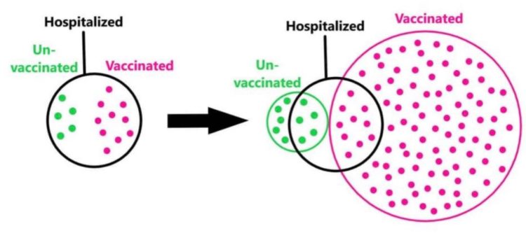
Euler diagram to illustrate base rate fallacy

Some people point out that vaccinated people are still hospitalized as a defense against getting vaccinated. But they ignore the inverse which compares the number of those who are not hospitalized. Someone (source?) made this Euler diagram to illustrate the inverse.

It’s about making a fair comparison. People who wear seat belts can still die in a car collision. People who use contraception can still get STIs. People who eat healthy can still have high cholesterol. But we know these things reduce the chances of dying in a car crash, of getting an STI, and having high cholesterol, so we adjust our choices.

[via @visualisingdata]

Tags: , ,

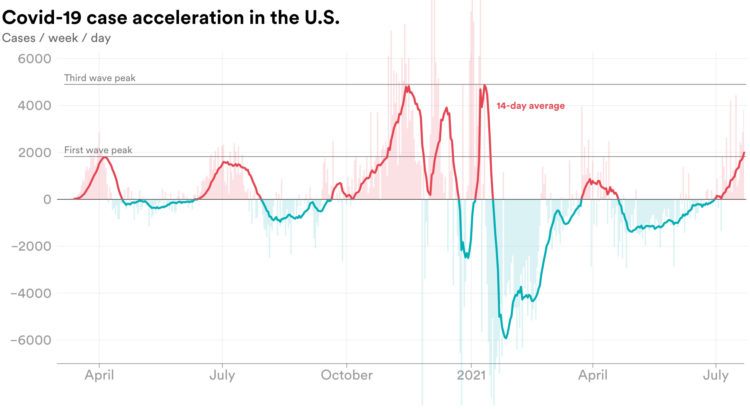
Rate of change in Covid-19 cases

We’re all familiar with the Covid-19 line charts that show cases over time, which highlights absolute counts. There are peaks. There are some valleys. Emory Parker for STAT shifted the focus to how quickly the rate is changing, or acceleration, to emphasize which direction rates are headed.

Tags: , , ,

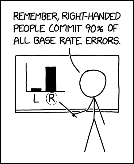
xkcd: Base Rate

xkcd points out the importance of considering the baseline when making comparisons:

Tags: , ,

Missing deaths

The daily counts for coronavirus deaths rely on reporting, testing, and available estimates, which means the numbers we see are probably lower than the real counts. So, for The New York Times, Jin Wu and Allison McCann plotted overall deaths against historical averages for a better sense of what’s really happening.

The contrasting red lines provide an obvious figure against the “would have died anyways” argument.

Tags: , ,

Misleading Medicaid funding with the baseline

The administration tweeted a chart that shows the Senate Republican health care bill increases Medicaid funding. The line moves up, so it must be true, right? Well, it depends on what you compare to. The original simply compares over time — against the past. Vox compared it against what spending would be under current law.

Tags: ,

Trump bar chart baselines are the worst baselines. Sad.

Trump bar chart baseline

The Donald Trump campaign has a habit of highlighting poll results with a bar chart that just shows the top portion. The bottom baseline fades away somewhere or the values follow a random scale. They’re supposed to start at zero.

John Muyskens for the Washington Post highlights the campaign’s bar chart usage, and why it’s problematic. Sometimes if the bars were placed correctly, the results would show more favorable for Trump. The bar charts are just decorative, basically.

Tags: , ,

Sometimes the y-axis doesn’t start at zero, and it’s fine

It's true. Sometimes it's okay for the y-axis to start at a non-zero value, which is why Johnny Harris and Matthew Yglesias for Vox tell people to shut up about the y-axis.

The video might seem contradictory to what I said about bar chart baselines, but we basically say the same thing. The context must match the visual, charts that don't use length as the visual encoding can start at non-zero baselines, and take a second before you sputter a knee-jerk reaction.

Tags: ,

Serial views

Price of Tea

Like many, I've been listening to Serial every week, but I always just listened through my podcast app. So I missed this little bit from Adnan Syed way back in the second episode. He sent the two graphs above to the host Sarah Koenig. The graphs show tea price changes over time for two stores and Syed asks Koenig which store she would get her tea from. She says the first one, which has a more steady price.

Look again, Adnan said. Right. Their prices are exactly the same. It's just that the graph of C-Mart prices is zoomed way in — the y-axis is in much smaller cost increments — so it looks like dramatic fluctuations are happening. And he made the pencil lines much darker and more striking in the C-Mart graph, so it looks more...sinister or something.

This was Adnan's point: See how easy it is to look at the same information, but, depending on how it's presented, come to two different conclusions about what it means? The 7-11 graph is the "innocent" graph. The C-Mart graph is the "guilty" graph. But they contain the same information.

See also: the baseline.

Tags: ,