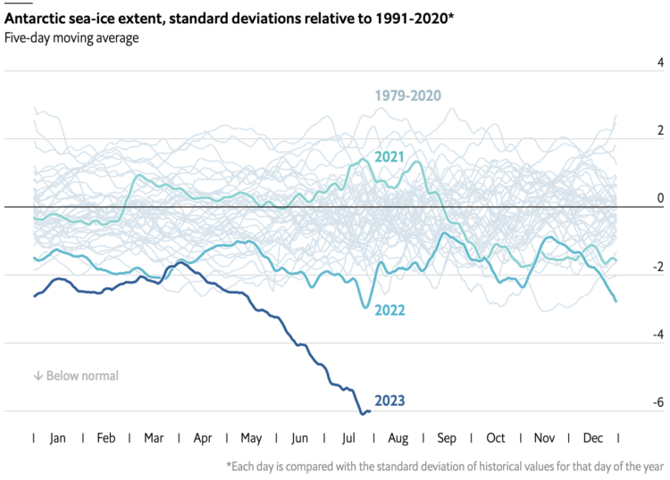
In this chart from The Economist that shows ice extent from 1972 up to present, that falling line for 2023 looks not good.
Tags: Antarctic, Economist, global warming, ice
Adam's Blogroll: click through to the author's blog
In this chart from The Economist that shows ice extent from 1972 up to present, that falling line for 2023 looks not good.
Tags: Antarctic, Economist, global warming, ice
Posted by in Antarctic, Economist, global warming, ice, Statistical Visualization
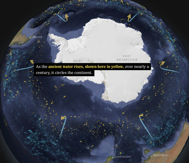
Based on data from autonomous sensors floating in the oceans, researchers are able to model the flows and characteristics of ocean currents in more detail than ever before. For The New York Times, Henry Fountain and Jeremy White show how the shifts have unwelled centuries-old water deep in the ocean, which releases carbon into the air.
The scrollytelling format of this piece works well to show sensor estimates over time. You get a sense of the currents without needing to see animated lines.
Tags: Antarctic, climate change, ice, New York, scrollytelling, water
Posted by in Antarctic, climate change, ice, maps, New York, scrollytelling, water