Millions of peopled died during World War II, but it's difficult to grasp what all the big numbers associated with the war mean. Neil Halloran explains in The Fallen of World War II, a hybrid between interactive visualization and documentary.
With the style in mind, it starts how you might expect, using a lot of icons and a few charts accompanied by a voiceover. But then it really gets into storytelling mode a few minutes in, focusing on casualties. Photographs lend a human connection to the otherwise stoic people icons. Transitions and zooming highlight various aspects of the war and are used effectively to keep you oriented in both the scale and individual events.
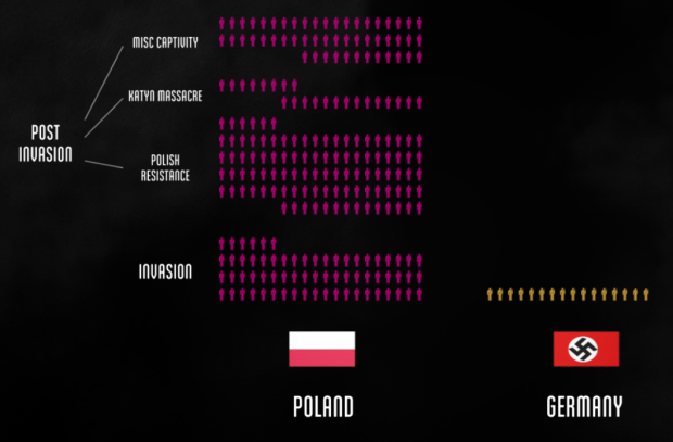
If you watch the interactive version on a computer, the video pauses around the 7-minute and 16-minute marks so that you can interact with the charts. The interaction doesn't go too deep. It's just tooltips that list events, but it's an interesting mechanism to provide you more details without explaining them orally.
Nice work. Be sure to watch through to the end.
Tags: documentary, World War II