Most people have a job and receive wages in return, but that starts to change when you get into the higher income groups.
Adam's Blogroll: click through to the author's blog
Most people have a job and receive wages in return, but that starts to change when you get into the higher income groups.
Posted by in Data Underload, income, work
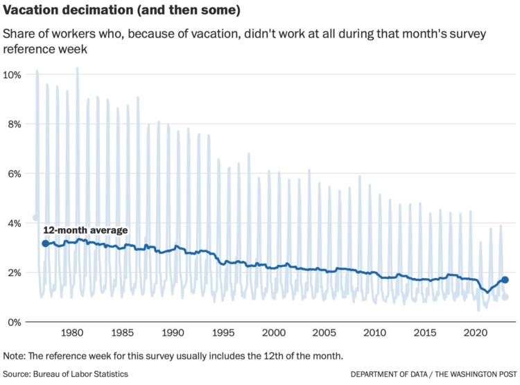
Despite available vacation days, it appears that American workers are taking less and less vacation. Andrew Van Dam, for The Washington Post’s Department of Data, has the demographic breakdowns:
It does not seem to be a matter of vacation-day supply. It is true that the United States is the only advanced economy without guaranteed paid vacation. However, BLS data on employee benefits suggests that more than 90 percent of full-time, private-industry workers have access to paid vacation time, a figure that has remained relatively steady for decades. And the number of paid vacation days offered by the typical employer has ticked up in recent years.
So we looked instead at vacation-day demand: Who uses the most? Has that changed?
Tags: vacation, Washington Post, work
Posted by in Statistical Visualization, vacation, Washington Post, work
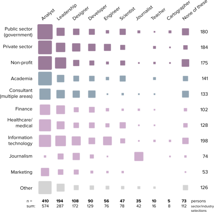
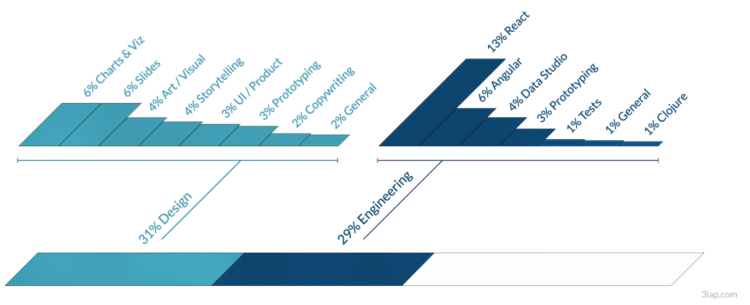
The 2022 results from the State of the Industry survey, run by the Data Visualization Society, are out. Among 1,218 respondents, see the roles, the salaries, and the responsibilities:
The overall median of the annual compensation graphs is at $60,000 to $79,999 per year, with very few respondents reporting over $159,000 per year, and a small but notable increase in the number of respondents reporting annual compensation in the $240,000 per year or more category.
I’d have to look at the actual data, which you can get for this year and previous, but my hunch that the split distribution in salary is between non-tech and tech workers.
Tags: Data Visualization Society, industry, work
Posted by in Data Visualization Society, industry, Visualization, work
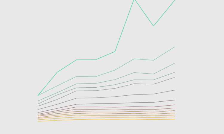
The rich continue to get richer, and everyone else either only kind of earns more or stays where they’re at. This chart shows how Americans in the 99th percentile, or the top 1%, separated from the bottom more over the years.
Posted by in Data Underload, income, wealth, work
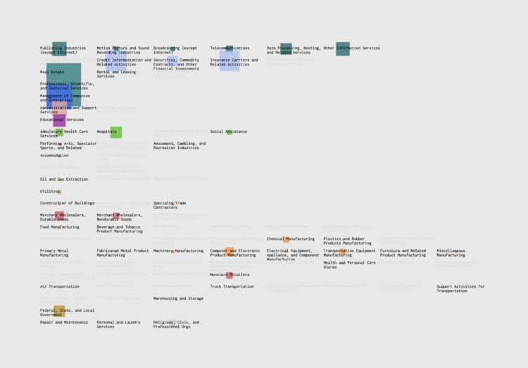
If you’re searching for a new job, it’s worth looking in different industries — instead of doing more of the same elsewhere, or in the other direction, switching to a completely new occupation. Maybe your current industry is saturated, but a different industry might require your skills.
This searchable chart shows the industries that people work in, given a specific job.
Posted by in Data Underload, industry, work
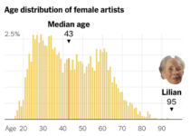 Tom Brady, the quarterback for the Tampa Bay Buccaneers, is 45 years old, which makes him the oldest player in the National Football League. Francesca Paris, for NYT’s The Upshot, places Brady’s age under the perspective of other occupations. For example, Lilian Thomas Burwell, who is an artist at 95 years old, is well in the upper percentile for those in her field (and the general population).
See also: the distributions of age and occupation.
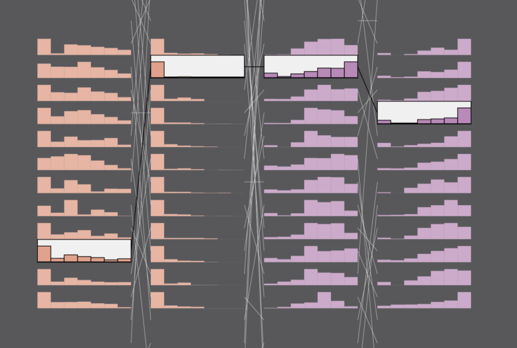
Are people happy at work? The American Time Use Survey asks people to score their happiness from 0 to 6, where 0 is not happy at all and 6 is very happy. Here’s how people answered
Posted by in Data Underload, time use, well-being, work
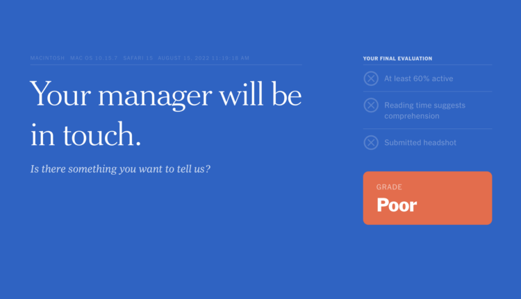
While reading this NYT article, by Jodi Kantor and Arya Sundaram, on the drawbacks of activity and time tracking for work, the article itself tracks your reading behavior. You see counters for the time you spend reading and scrolling, clicks, keystrokes, idle time, and active time. It comes complete with snippy comments and a final grade — and a bitter taste for productivity tracking.
Tags: New York Times, privacy, productivity, tracking, work
Posted by in Infographics, New York Times, privacy, productivity, tracking, work
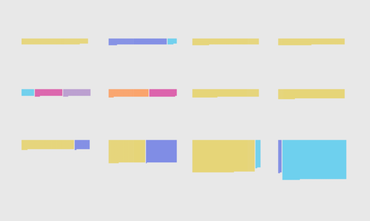
Eli Holder shows how he split his freelance time across various projects and categories. With visualization work, a lot of your time is spent doing non-visualization things:
As expected, at 16 percent, data wrangling and analysis takes a significant chunk of total time. This includes data prep, which I’ve categorized as fairly mindless data engineering or spreadsheet maneuvering (nine percent) or data pulls (three percent). More interesting data work was more fragmented: ~two percent of the time was exploratory analysis (e.g., for storytelling), ~one percent of the time was spent designing metrics (e.g., exploring different calculations that might best tell a given story) and another one percent was creating mock datasets (e.g., to compensate for data security constraints or clients who are slow to provide real data).
I don’t track my time with FlowingData, but if I were to guess, I spend at least half my time on analysis and wrangling. If you consider the many potential visualization projects that I scrapped because nothing panned out in analysis, that analysis/wrangling percentage goes up a lot more.
Sometimes you gotta dig a lot before you find anything worth showing.
Tags: Eli Holder, freelancing, time use, work
Posted by in Eli Holder, freelancing, Self-surveillance, time use, work
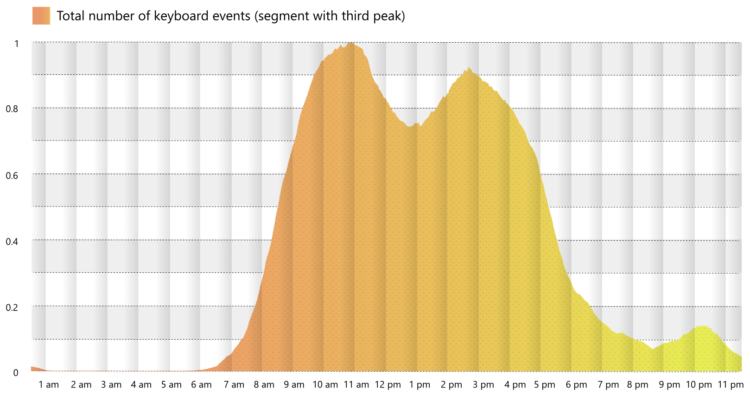
Microsoft researchers analyzed keystrokes by time of day, for a sample of Microsoft employees during this past summer. You can see the typical peaks during work hours with a dip for lunch. But among 30% of workers in the sample, there was a third peak starting around 9 o’clock in the evening.
That third peak felt too close to home for me.
Tags: keystrokes, Microsoft, work
Posted by in keystrokes, Microsoft, Statistical Visualization, work