Climate change and uncertainty

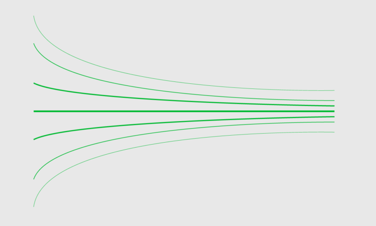
In his new data-driven documentary, Neil Halloran digs into the uncertainty attached to estimates for climate change. Halloran’s argument is that we have to understand the limitations of forecasting the future before we can change it.

Tags: , , ,

✚ Uncertain Words and Uncertain Visualization, Better Together

People's interpretation of a chart can change if you use differents words to describe it, even if the data stays the same. Read More

Election needles are back

The NYT election needles of uncertainty are back, and they’re about to go live (if they haven’t already). I’m not watching, but in case that’s your thing, there you go.

It’s a little different this time around, because of the pandemic and mail-in voting. There’s no national needle this time. Instead, there are three needles for Florida, Georgia, and North Carolina, because they’re battleground states and the necessary data to run the estimates is available.

Tags: , , ,

Presidential Plinko

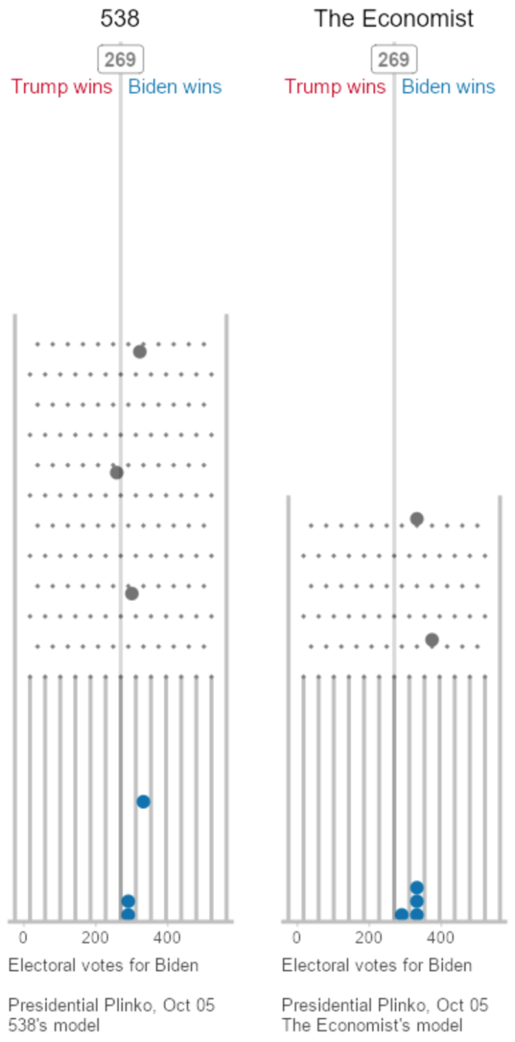
To visualize uncertainty in election forecasts, Matthew Kay from Northwestern University used a Plinko metaphor. The height of each board is based on the distribution of the forecast, and each ball drop is a potential outcome. The animation plays to eventually shows a full distribution.
See it in action.

(And Kay made his R code available on GitHub.)

Tags: , , , ,

✚ The Process 108 – Expected Value

Look only at uncertainty and it can feel overwhelming. Look at just averages and it's not enough information. So, smoosh them together. Read More

Choose your own election outcome

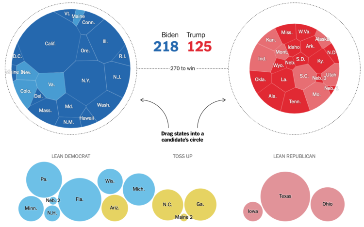
The election is full of what-ifs, and the result changes depending on which direction they take. Josh Holder and Alexander Burns for The New York Times use a pair of circular Voronoi diagrams and draggable bubbles so that you can test the what-ifs.

Contrast this with NYT’s 2012 graphic showing all possible paths. While the 2012 graphic shows you the big picture, the 2020 interactive places more weight on individual outcomes.

Tags: , , ,

FiveThirtyEight launches 2020 election forecast

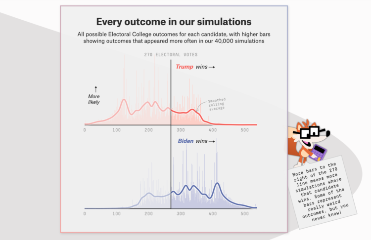
The election is coming. FiveThirtyEight just launched their forecast with a look at the numbers from several angles. Maps, histograms, beeswarms, and line charts, oh my. There is also a character named Fivey Fox, which is like Microsoft’s old Clippy providing hints and tips to interpret the results.

One thing you’ll notice, and I think newsrooms have been working towards this, there’s a lot of uncertainty built into the views. It’s clear there are multiple hypothetical outcomes and there’s minimal use of percentages, opting for fuzzier sounding odds.

Remember when election forecasting went the opposite direction? They tried to build more concrete conclusions than talking heads. Now pundits frequently talk about the numbers (maybe misinterpreted at times), and the forecasts focus on all possible outcomes instead of what’s most likely to happen.

Tags: , , ,

Understanding Covid-19 statistics

For ProPublica, Caroline Chen, with graphics by Ash Ngu, provides a guide on how to understand Covid-19 statistics. The guide offers advice on interpreting daily changes, spotting patterns over longer time frames, and finding trusted sources.

Most importantly:

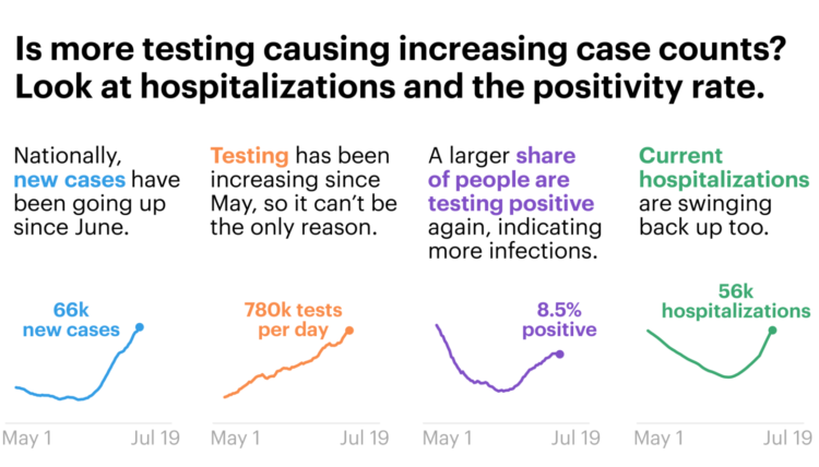
Even if the data is imperfect, when you zoom out enough, you can see the following trends pretty clearly. Since the middle of June, daily cases and hospitalizations have been rising in tandem. Since the beginning of July, daily deaths have also stopped falling (remember, they lag cases) and reversed course.

I fear that our eyes have glazed over with so many numbers being thrown around, that we’ve forgotten this: Every day, hundreds of Americans are dying from COVID-19. Some days, the number of recorded deaths has reached more than 1,000. Yes, the number recorded every day is not absolutely precise — that’s impossible — but the order of magnitude can’t be lost on us. It’s hundreds a day.

Cherrypicking statistics is at an all-time high. Don’t fall for it.

Tags: , , ,

How experts use disease modeling to help inform policymakers

Harry Stevens and John Muyskens for The Washington Post put you in the spot of an epidemiologist receiving inquiries from policymakers about what might happen:

Imagine you are an epidemiologist, and one day the governor sends you an email about an emerging new disease that has just arrived in your state. To avoid the complexities of a real disease like covid-19, the illness caused by the novel coronavirus, we have created a fake disease called Simulitis. In the article below, we’ll give you the chance to model some scenarios — and see what epidemiologists are up against as they race to understand a new contagion.

Fuzzy numbers, meet real-world decisions.

Tags: , , , ,

Not making Covid-19 charts

Will Chase, who specialized in visualization for epidemiological studies in grad school, outlined why he won’t make charts showing Covid-19 data:

So why haven’t I joined the throng of folks making charts, maps, dashboards, trackers, and models of COVID19? Two reasons: (1) I dislike reporting breaking news, and (2) I believe this is a case of “the more you know, the more you realize you don’t know” (a.k.a. the Dunning-Kruger effect, see chart below). So, I decided to watch and wait. Over the past couple of months I’ve carefully observed reporting of the outbreak through scientific, governmental, and public (journalism and individual) channels. Here’s what I’ve seen, and why I’m hoping you will join me in abstaining from analyzing or visualizing COVID19 data.

There’s so much uncertainty attached to the data around number of deaths and cases that it’s hard to understand what it actually means. This takes a high level of context in other areas on the ground. On top of that, people are making real life decisions based on the data and charts they’re seeing.

So while I think a lot of the charts out there are well-meaning — people under stay-at-home trying to help the best way they know how — it’s best to avoid certain datasets. As Chase describes, there are other areas of the pandemic to point your charting skills towards.

See also: responsible coronavirus charts and responsible mapping.

Tags: , , ,