✚ How to Make an Animated Donut Chart in R

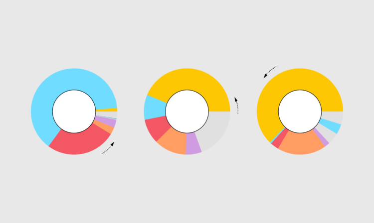
The donut chart is not the most perceptually efficient chart. Although it might be a smidge better than its pied cousin. But if you’re making a donut chart and then animating it to show changes over time, I don’t think you’re chasing perceptual efficiency.

Become a member for access to this — plus tutorials, courses, and guides.

How long it takes a ball to drop on various Solar System bodies

James O’Donoghue made this straightforward animation that shows how long it takes for a ball to drop one kilometer on different planets:

It might be surprising to see large planets have a pull comparable to smaller ones at the surface, for example Uranus pulls the ball down slower than at Earth! Why? Because the low average density of Uranus puts the surface far away from the majority of the mass. Similarly, Mars is nearly twice the mass of Mercury, but you can see the surface gravity is actually the same… this indicates that Mercury is much denser than Mars.

Okay, sure, but what’s heavier on Mars: a ton of feathers or a ton of bricks? [via kottke]

Tags: , ,

Pandemic timeline as animated dot density map

As a lead-in and backdrop to a timeline of the past year by The Washington Post, an animated dot density map represents Covid-19 deaths. “Every point of light is a life lost to coronavirus.”

Tags: , , , ,

✚ How to Make an Animated Beeswarm Chart

Beeswarm charts are useful to highlight individual categories or entities. Animating them can help highlight change over time. Read More

Waves of distraction

I’ve been distracted lately, so instead of making regular charts, I’ve been making animated GIFs using various visual encodings. It hits the sweet spot of producing something without having to access the part of my brain for longer thinking sessions.

Tunnels:

Round and round:

Needles of uncertainty made certain:

I hope this brings some calm and predictability to your day.

Tags: ,

Two.js for two-dimensional drawing and animation in modern web browsers

“Two.js is deeply inspired by flat motion graphics. As a result, two.js aims to make the creation and animation of flat shapes easier and more concise.” It also renders in webgl, canvas2d, and svg, with not much change in your code. Two.js is definitely going on my list of things to try.

Tags: ,

Visualizing periodicity with animations

Pierre Ripoll provides several ways to visualize periodicity using animation. Moving dots, rotating spheres, concentric circles, oh my. He uses D3.js and it’s an Observable notebook, so you can see what’s going on under the hood.

Tags: , , ,

Break the chain

For The Spinoff, Toby Morris illustrates how individuals can break a chain of events:

The good news is, we can do things that will reduce the chances of us spreading the virus. That means we can break these chains and potentially stop hundreds or even thousands of people getting Covid-19. Check out The Spinoff cartoonist Toby Morris’ excellent illustration to understand how individual discipline can have an outsize impact.

Of course infection between people in a community is more complex. Just because one chain is broken doesn’t mean people further down won’t be infected by others in some other way. The goal though is to break as many chains as possible.

Tags: , , ,

How to Flatten the Curve, a Social Distancing Simulation and Tutorial

Using R, we look at how your decreased interaction with others can help slow the spread of infectious diseases. Read More

SVG and CSS animations, without JavaScript

Andrew Wang-Hoyer built over 200 animations on and off over two years. They are satisfyingly hypnotic. They also only use SVG, CSS, and HTML, and you can get the code on GitHub.

I feel like sans-JavaScript is becoming a thing. Is this becoming a thing?

Tags: , ,