Your place in the world population

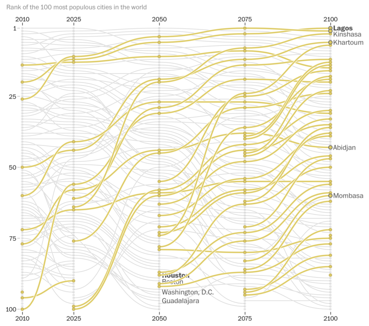
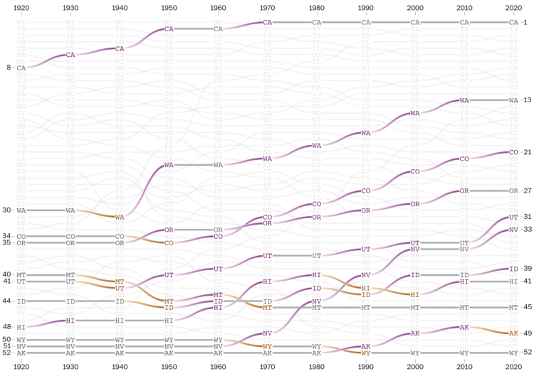
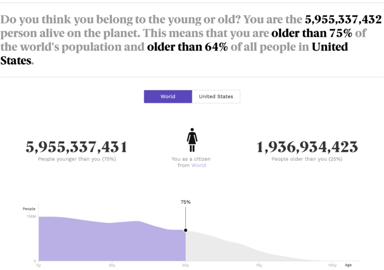
Population.io by World Data Lab asks your birthday, country of residence, and gender. It spits out tidbits comparing your age to the rest of the world population, such as how old you are compared to others and how many people you might share a birthday with. Fun.

It also provides a few back-of-the-napkin calculations for life expectancy based on averages, with maybe a bit too much certainty for your expected date of death. For more uncertainty but more accuracy for what is known, see also this look at mortality.

Tags: , ,

Rapidly growing African cities

In a multi-faceted piece, The Washington Post described the rapidly growing cities in Africa that are projected to be the most populated cities in the world:

In three projections by the University of Toronto’s Global Cities Institute, Africa accounted for at least 10 of the world’s 20 most populous cities in 2100. Even in the institute’s middle-of-the-road development scenario, cities that many Americans may seldom read about, such as Niamey, Niger, and Lusaka, Zambia, eclipse New York City in growth.

Many U.S. cities such as Atlanta, Houston, and Washington, D.C. are projected to fall out of the top 100 by 2100.

Tags: , ,

Census Mapper, a tool to visualize population and racial shifts

Pitch Interactive and the Census 2020 Data Co-op, supported by the Google News Initiative, made a tool that lets you easily map population shifts since 2010. It’s called Census Mapper.

Built with journalists in mind, you can zoom in to the tract level and select any set of racial groups. The map updates. Once you’ve found what you’re looking for, you can embed the tool on a website. You can only embed the entire tool for now, as opposed to just the map of a specific geographic area and level, but it looks promising.

Tags: , , , ,

Where Americans Live

Everyone gets a dot. You get a dot. And you get a dot. And you.

Read More

Race and ethnicity map of dots

CNN goes with the dot density map for their first pass on the 2020 decennial. Each dot represents a certain number of people depending on your zoom level. Color represents race or ethnicity.

Does CNN have a limited color palette that they’re allowed to use? I would’ve gone for more contrast between the light blue for white and darker-but-still-light blue for American Indian/Alaskan Native.

See also: Dustin Cable’s racial dot map from 2013 and Erica Fischer’s dot maps of the same flavor from 2010.

Tags: , , ,

Historical shifts in where people live

The places in the United States with the highest populations weren’t always like that. There were shifts over decades. With the recent Census release for state populations, Harry Stevens and Nick Kirkpatrick for The Washington Post go all in with a series of bump charts to show the changes in state population rankings since 1920.

They point out historical markers along the way, split it up by region, and provide an explorer at the end to look at your states of interest. In the end, it all comes down to weather and air conditioning.

Still deciding what I think about those gradient connections.

Tags: , , ,

Map of nighttime lights normalized by population

You’ve probably seen the composite map of lights at night from NASA. It looks a lot like population density. Tim Wallace adjusted the map for population, so that you can see (roughly) the areas that produce more light per person.

Tags: , ,

Game: How many US cities can you name?

How many US cities can you name? Here’s a quick and fun game by Ian Fisher to find out. Simply start entering as many as you can think of and rack up population counts as a sort of point system.

Tags: , ,

Searching for the densest square kilometer in different cities

Based on data from Gridded Population of the World, geographer Garrett Dash Nelson calculated the square kilometers in major cities with the highest population density.

On CityLab:

In the interactive visualization, I’ve taken GPW data for a curated selection of American cities. Some have old, historic cores, and others are dominated by more recent development; some have constricting physical geographies and others lie on relatively flat, open plains; some were built for horse transportation and others for the automobile era.

Tags: ,

Population mountains

You’ve seen the maps of population density. You’ve seen the jokes. But you haven’t seen population at high granularity in a 3-D view. Matt Daniels for The Pudding used a mountain metaphor to show the peaks and valleys of population around the world.

You get more out of the data in this view than you would the overhead, which tends to obscure the variation in large cities. Although if you must, Daniels also provides the typical view to reference.

Tags: , ,