Mapping the cool spots in hot cities

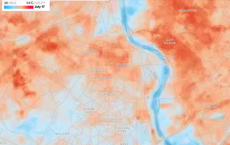
As city centers heat up, people search for cooler areas. For Bloomberg Green, Laura Millan, Hayley Warren and Jeremy Scott Diamond mapped the neighborhoods for a handful of hot cities that have something to cool the area:

Satellite images produced by the European Space Agency, working in part with data from NASA and the US Geological Survey, now have a high enough resolution to allow for temperature variations to be parsed on a street-by-street level. These snapshots of heat differences offer clear evidence of cooling strategies that can counteract what researchers term the “urban heat island effect,” in which city temperatures get that extra boost.

Bodies of water, greenery, and reflective surfaces.

Tags: , , ,

A plea to stop climate change from the guy who makes maps

For Washington Post Opinion, a struggling mapmaker makes a plea to stop climate change, because there are no more suitable colors left in the spectrum to show hot:

My point is, unless you are here with some kind of innovative new color that is clearly hotter than red and won’t create these ambiguities, our only alternative is to stop climate change. If you won’t do it for the charismatic megafauna or the less charismatic fauna of normal size, or for your grandchildren, or for yourselves, do it for me, the guy who designed the heat scale for weather maps.I know this is a stupider reason than the reasons that already exist for you to take action, but people often do things for asinine reasons that they would not do for good ones, so maybe if you think about me having to color the map a confusing shade of vermilion or cochineal or, I guess, go back around? I have nothing! you will take pity in a way that you didn’t when human beings were literally dying? I don’t know, man. I’m not sure how many more heat waves like this my map can take. And that is the problem, of course. My map.

This is very important.

Tags: , , ,

Timelines for record temperatures

Speaking of the heat wave in Europe, Pierre Breteau for Le Monde charted record high temperatures using a step chart for each weather station in France:

These graphs represent, for a part of the 146 stations for which Météo-France provided us with the data, the level of the most extreme temperatures ever recorded and their date.

The data are fragmentary because it is difficult to go back beyond the 1990’s, or even the August 2003 heat wave, and only those with a historical record of at least 20 years are shown below.

Tags: , , ,

Melting popsicles to visualize a heat wave

Many European countries are experience record high temperatures, so The Washington Post used melting popsicles to attach something relatable to the numbers and standard heatmap. But:

It turns out that it takes popsicles much longer to melt than we had expected. In this unscientific experiment, the shortest melt time was around 12 minutes, in 90 degrees Fahrenheit, under Madrid’s beating sun. It took as long as 50 minutes earlier in the day and in the shade.

I wish they’d taken it one or two steps further with a more scientific method. Try to use the same color or type of popsicle, put the popsicles out at the same time of day, or get a time-lapse of a control popsicle so that there’s a way to compare something. As it was made, the melting popsicles are just background images.

I’m sure there were time and resource constraints across countries, but it was such a good idea.

Tags: , , ,

Pollution by the rich versus poor

Based on estimates from the World Inequality Lab, Bloomberg shows how wealthier individuals’ habits — not just countries’ activities — contribute more to overall carbon emissions.

There’s a 3-D grid map with a square for each country. It transitions from the usual way of looking at national carbon emissions to carbon emissions from the wealthy who live everywhere. You can always count on Bloomberg to keep their graphics spicy.

Tags: , ,

Days since record-high temperatures

Here’s a fun/alarming weather map from The Pudding. Using data from the Applied Climate Information System, they show the number of days since a record-high temperature in hundreds of U.S. cities. The counters are in the style of those signs in factories that show days since the last injury.

Tags: , ,

Mapping the probable heat around the world

Earth is getting warmer, and the previously abstract concept seems to grow more concrete every day. Probable Futures mapped increasing heat, decreasing cold, and shifting humidity under different warming scenarios.

You have the global view shown above, and then when you zoom in enough, you can click on grid cells for the model estimates. Dots on the map point to a handful of short stories on how warming has changed daily life, which I feel like could use more attention.

Next to the zoom navigation buttons is a camera button, which lets you download the view that you’re looking at. This feature is probably new to me but has been around a for a while. I like it.

Tags: , , ,

Climate normals mapped over time

Every decade the National Oceanic and Atmospheric Administration releases climate normals to provide a baseline to compare current weather against. NOAA just released the estimates for 1991 to 2020. As you might expect, and shown in the maps above, it’s getting hotter.

Tags: , ,

Cooling Gulf Stream

This is quite a dive by Moises Velasquez-Manoff and Jeremy White for The New York Times. They look at the potential danger of melting ice from Greenland flowing into the Gulf Stream.

An animated map of currents and temperature, reminiscent of NASA’s Perpetual Ocean from 2011, shows what’s going on underwater. The piece flies you through as you scroll with a familiar view as if you’re in space looking down.

Keep reading though, and you’re taken underwater 800 feet below the surface. It’s like seeing the currents from a fish’s point of view.

Tags: , , , , ,

Low temperatures map of the United States

Based on data from the Global Forecast System, The New York Times mapped the lowest temperatures across the country between February 14 and 16.

The blue-orange color scale diverges at freezing, which creates a striking image of a very cold country. The dotted lines and temperature labels make the patterns especially obvious.

As someone who lives in an orange area, I was shocked by all of the blue. Stay safe.

Tags: , , ,