June 15 Webinar: What’s new with NCBI Virus?

Join us on June 15 , 2022 at 12PM US eastern time learn about the NCBI Virus resource – a community portal for viral sequence data that has been important in supporting SARS-CoV-2 research and management of the COVID-19 pandemic. Enhancements to NCBI Virus that support these efforts include: SARS-CoV-2 specific filters, a dedicated web … Continue reading June 15 Webinar: What’s new with NCBI Virus?

The post June 15 Webinar: What’s new with NCBI Virus? appeared first on NCBI Insights.

New NCBI Datasets home and documentation pages provide easier access

NCBI Datasets, the new set of services for downloading genome assembly and annotation data (previous Datasets posts), has redesigned and reorganized web pages to make it easier to find and access the services and documentation you need. NCBI Datasets has a fresh new homepage (Figure 1) highlighting the types of data available through our tools. Available … Continue reading New NCBI Datasets home and documentation pages provide easier access

Rooted phylogenetic networks for coronaviruses

In a previous post, Guido constructed trees for coronaviruses in the SARS group to search for evidence of recombination. He also constructed unrooted data-display networks using SplitsTree. Here, we discuss our attempts to construct rooted genealogical phylogenetic networks for the same dataset [6] but with some modifications.

In particular, we deleted some sequences, giving a smaller data set with only 12 taxa. These taxa include, next to SARS-CoV-2 (the virus causing COVID-19) and SARS-CoV (responsible for the SARS epidemic in 2002/2003), the viruses MP789 and PCoV_GX-P1E sampled from Malayan pangolins from two different Chinese provinces and several viruses found in different bat species in the horseshoe bat genus (Rhinolophus), all from China.

This research was done by Rosanne Wallin, an MSc student at VU Amsterdam and UvA. Her full thesis as well as all data and results can be found on github.

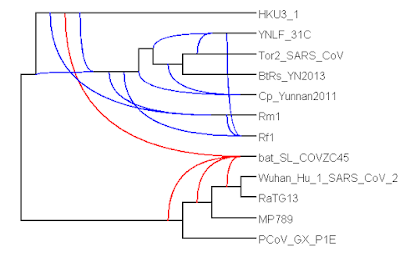
The first algorithm we applied to this data set was the TreeChild Algorithm [1], which is one of the methods that take a number of discordant (rooted, binary) trees as input and finds a rooted network containing each input tree, minimizing the number of reticulate events in the network. To filter out some noise, we contracted some poorly-supported branches and then resolved multifurcations consistently across the trees (using a tool within the TreeChild Algorithm). This gave the network below. Note that the method is restricted to so-called tree-child networks, meaning that certain complex scenarios are excluded (where a network node only has reticulate children). Also note that this is not necessarily the only optimal tree-child network and not all topological differences can be distinguished based on the trees [5].

Figure 1: Phylogenetic network constructed by the Tree-Child algorithm (blocks_A_len0.01_supp70).

The network shows no reticulation in the SARS-CoV-2 clade (the bottom four taxa) and puts SARS-CoV-2 right next to RaTG13. Furthermore, it shows a reticulation between an ancestor of HKU3-1 and a common ancestor of SARS-CoV-2 and RaTG13 leading to bat-SL-CoVZC45. However, it cannot exactly identify which common ancestor of SARS-CoV-2 and RaTG13 is the parent, leading to multiple branches (in red) leading into this reticulation. All these observations are consistent with previous research [2].

Importantly, we cannot directly conclude that each reticulation corresponds to a recombination event. See Table 2.1 of David’s book [10] for a nice overview of possible causes of reticulation. Nevertheless, based on [2], it does look like at least the reticulation leading to bat-SL-CoVZC45 corresponds to a recombination event.

The second algorithm we applied was TriLoNet [3], which constructs a rooted network directly from sequence data. It is restricted to so-called level-1 networks, meaning that it cannot construct overlapping cycles. This method produced the network below.

Figure 2: Phylogenetic network constructed by TriLoNet.

At first sight, the network may look a bit different from the previous one (Figure 1). However, note that the three observations above also hold for this second network. Moreover, the SARS-CoV-2 clade is identical in both networks. This network contains only one reticulation, which is most likely due to the level-1 restriction.

Nevertheless, we can still use this method to find more putative recombination events. To do so, we simply exclude the recombinant bat-SL-CoVZC45 from the analysis and rerun the algorithm. This gives the following network.

Figure 3: Phylogenetic network constructed by TriLoNet, after omitting bat-SL-CoVZC45.

We have now found a second putative recombination event with Rf1 as recombinant. Note that this is also consistent with the network in Figure 1. On the other hand, also note that the branching order in the SARS-CoV clade (the bottom 7 taxa in Figure 3) has changed a bit. This could mean that more recombination events are present in the SARS-CoV clade, as we also see in Figure 1.

One interesting follow-up question is whether the two (or more) networks produced by TriLoNet can be combined into a single higher-level network, in order to show multiple reticulations simultaneously (see [4] for an algorithm that could be useful).

Another interesting observation from these networks is that there is no sign of recombination involving the pangolin coronaviruses MP789 and PCoV_GX-P1E. It rather looks like these viruses evolved from common ancestors of SARS-CoV-2 and RaTG13, but it is important to note that we cannot exclude a recombination event on the basis of these networks. The relationship between SARS-CoV-2 and pangolin coronaviruses is still being debated in the literature [2,7,8,9].

Some limitations of the algorithms were noticed during this study. Firstly, the depicted networks are purely topological, i.e., the branch lengths do not represent anything. Adapting these algorithms to take branch length information into account could possibly improve their accuracy for this data set since the extant taxa have precise time stamps and for recent divergence events these times can be estimated quite accurately, see [2].

Another limitation is that we had to remove several taxa from the original data set [6] before the TreeChild algorithm could find a solution. By removing taxa, we reduced the number of reticulations needed to display the trees, making the TreeChild algorithm run in reasonable time. We made sure to include a diverse set of taxa (based on their pairwise distances [6]) to represent as much of the subgenus as possible. 

Rosanne used several other algorithms, taxon selections and also used trees based on genes rather than fixed-length blocks (which we did above, following Guido’s post), see her thesis on github.

Conclusion
Although rooted phylogenetic network methods are often limited in the number of taxa that can be analysed and/or the complexity of the networks that can be constructed, we have seen that these methods can be useful for constructing hypothetical evolutionary histories. Moreover, although the constructed networks are not identical, we have seen that they share certain key properties, which are also consistent with previous research.  

Rosanne Wallin, Leo van Iersel, Mark Jones, Steven Kelk and Leen Stougie


[1] Leo van Iersel, Remie Janssen, Mark Jones, Yukihiro Murakami and Norbert Zeh. A Practical Fixed-Parameter Algorithm for Constructing Tree-Child Networks from Multiple Binary Trees. arXiv:1907.08474 [cs.DM] (2019).

[2] Maciej F. Boni, Philippe Lemey, Xiaowei Jiang, Tommy Tsan-Yuk Lam, Blair W. Perry, Todd A. Castoe, Andrew Rambaut and David L. Robertson. Evolutionary origins of the SARS-CoV-2 sarbecovirus lineage responsible for the COVID-19 pandemic. Nat Microbiol 5, 1408–1417 (2020). https://doi.org/10.1038/s41564-020-0771-4

[3] James Oldman, Taoyang Wu, Leo van Iersel and Vincent Moulton. TriLoNet: Piecing together small networks to reconstruct reticulate evolutionary histories. Molecular Biology and Evolution, 33 (8): 2151-2162 (2016). http://dx.doi.org/10.1093/molbev/msw068 (postprint)

[4] Yukihiro Murakami, Leo van Iersel, Remie Janssen, Mark Jones and Vincent Moulton. Reconstructing Tree-Child Networks from Reticulate-Edge-Deleted Subnetworks. Bulletin of Mathematical Biology, 81(10):3823–3863 (2019).

[5] Fabio Pardi and Celine Scornavacca. Reconstructible phylogenetic networks: do not distinguish the indistinguishable. PLoS Comput Biol, 11(4), e1004135 (2015).

[6] Grimm, Guido; Morrison, David (2020): Harvest and phylogenetic network analysis of SARS virus genomes (CoV-1 and CoV-2). figshare. Dataset. https://doi.org/10.6084/m9.figshare.12046581.v3

[7]  Lam, Tommy Tsan-Yuk, Marcus Ho-Hin Shum, Hua-Chen Zhu, Yi-Gang Tong, Xue-Bing Ni, Yun-Shi Liao, Wei Wei, et al. Identifying SARS-CoV-2 Related Coronaviruses in Malayan Pangolins. Nature, 583, 282–285 (2020). https://doi.org/10.1038/s41586-020-2169-0

[8] Wang, Hongru, Lenore Pipes, and Rasmus Nielsen. Synonymous Mutations and the Molecular Evolution of SARS-Cov-2 Origins. [Preprint] Evolutionary Biology, April 21, 2020. https://doi.org/10.1101/2020.04.20.052019

[9] Li, Xiaojun, Elena E. Giorgi, Manukumar Honnayakanahalli Marichannegowda, Brian Foley, Chuan Xiao, Xiang-Peng Kong, Yue Chen, S. Gnanakaran, Bette Korber, and Feng Gao. Emergence of SARS-CoV-2 through Recombination and Strong Purifying Selection. Science Advances, Vol. 6, no. 27 (2020). https://doi.org/10.1126/sciadv.abb9153 

[10] David Morrison, Introduction to Phylogenetic Networks. RJR Productions, Uppsala, Sweden (2011). http://www.rjr-productions.org/Networks/index.html


Coronavirus patterns of spread


Following on from my previous posts about the SARS-CoV-2 virus, and Covid-19, the human disease that it causes, there are a number of miscellaneous topics that could also be discussed. So, here are a few topics about the spread of the pandemic, which may be of interest.

Networks of cases

I have so far not presented a phylogenetic network related to the current pandemic. I may one day do so, although collating the data I would like to use will not be easy. In the meantime, the folks over at Fluxus Engineering did publish a network of genomes back in April: Phylogenetic network analysis of SARS-CoV-2 genomes.

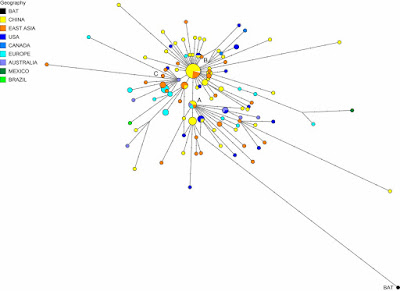
Network of SARS-COV-2 genomes

The authors identified:
... three central variants distinguished by amino acid changes, which we have named A, B, and C, with A being the ancestral type according to the bat outgroup coronavirus. The A and C types are found in significant proportions outside East Asia, that is, in Europeans and Americans. In contrast, the B type is the most common type in East Asia, and its ancestral genome appears not to have spread outside East Asia without first mutating into derived B types, pointing to founder effects or immunological or environmental resistance against this type outside Asia.
Needless to say, their paper generated some controversy, with three published responses criticizing the methodology (these are shown at the link above). However, the Global Initiative on Sharing All Influenza Data (GISAID) uses an expanded version of their cladistic classification.

Networks can also be used much more locally, to illustrate spread, although in an epidemic this will almost always be tree-like rather than reticulating. Here is a recent example from China: Large SARS-CoV-2 outbreak caused by asymptomatic traveler. The authors comment about the wide spread from a one individual:
An asymptomatic person infected with severe acute respiratory syndrome coronavirus 2 returned to Heilongjiang Province, China, after international travel. The traveler’s neighbor became infected and generated a cluster of >71 cases, including cases in 2 hospitals. Genome sequences of the virus were distinct from viral genomes previously circulating in China.


Different patterns of infection among communities

Pandemics are actually a series of local epidemics, and are therefore rarely simple things, in terms of when people become infected. For example, there are often a series of alternating "waves" of new cases, in response to the behavior of either the pathogen or the people themselves.

In the case of the Covid-19 disease, the virus has so far apparently produced a series of at least seven variant strains (Geographic and genomic distribution of SARS-CoV-2 mutations), but the waves are mainly the result of people's implementation of infection control measures. Depending on the pathogen, these measures can include: social distancing, fewer / smaller crowds (especially indoors), working from home, closing social venues such as restaurants and bars, as well as mass testing and infection tracking. Reducing the spread of breath aerosols also works well for SARS-CoV-2, including careful cleaning of surfaces, and wearing gloves and masks or visors.


So, early on in most epidemics, people get infected because they are not ready to deal with things; and the number of cases increases, as shown in the above graph of Covid-19 cases in the USA this year — this is the First Wave. The number of cases then usually decreases for a while, in response to the effectiveness of the control measures. However, if the measures do not remain effective, or the people get sick of implementing them, then the number of cases increases again, creating the Second Wave. The graph above makes it clear that for the USA the Second Wave has been much more serious than the First, in terms of the number of cases.

However, this picture is often much too simple, because the USA is a pretty big place. In this example, there are 50 main jurisdictions in the country, and there is no reason to expect any epidemic to proceed in the same way in every state and territory. Here are equivalent graphs for four different US states, each showing a different pattern of waves.


So, New York (and several other north-eastern states) got the SARS-CoV-2 virus early on, and most of the at-risk people got infected at that time, so that there has not yet been a Second Wave. Rhode Island, on the other hand, has actually had a small Second Wave. From here on in the north-east, infections are likely to be mostly local outbreaks (eg. New York city mayor says rise in Covid-19 cases in Brooklyn not a cluster), such as is now also being observed in Europe.

By contrast, Louisiana, the state with the highest percent of cases (per population) so far, had a relatively small First Wave, and it is the Second Wave that has been much more problematic for epidemic control. Even more extreme, Florida (and other states like California) had the virus spread much later, so that there was not really a First Wave at the same time as the other states, and it is the Second Wave that is producing the high percentage of infected people.

So, the country's pattern of pandemic spread is made up of a series of different sub-patterns of epidemics, with different jurisdictions having very different degrees of success in controlling virus spread. This matters very much for any national response to the pandemic, because it is not the same epidemic everywhere.

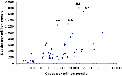
In a similar manner, deaths have been concentrated in those places that got the SARS-CoV-2 virus early on. We expect for most pandemics that the number of deaths will rise as the number of infection cases rises. This next graph shows the case rates (proportion of people infected) and death rates (proportion of people who have died) in each US state (each point represents one state, plus DC).

Covid-19 death rates in the states of the USA

The proportion of cases varies from a low in Vermont to a high in Louisiana, and the proportion of deaths rises along with this — 44% of the variation in deaths between states is correlated with the difference in case rate. However, there are four states in the north-east of the country (as labeled on the graph) where the death rate has been much higher than expected (about double). These states all got their virus infections early in the pandemic, so that one or more of these has been happening:
  • the deaths predominantly occurred before effective treatment strategies were developed;
  • the at-risk groups are now being protected more effectively; or
  • the currently predominant strains of the virus are less deadly than those circulating originally.
As I noted in my previous post: It is about time we started behaving rationally in response to Covid-19?. A rational response needs to take into account geographical variation in the current state of the pandemic. A one-size-fits-all response cannot be particularly effective in the face of large variation.

Comparing lock-downs to voluntary isolation

Many governments have responded to the spread of SARS-CoV-2 by instituting economic lock-downs as a form of quarantine, to keep their populace apart from each other. This is expected to be effective biologically, because the virus is spread by aerosol droplets, and keeping people apart reduces the risk of infection (eg. 1 m when breathing, 2 m when sneezing, 4 m when coughing).

However, lock-downs have not been universal. In particular, Sweden has become well-known for leaving social distancing as a voluntary exercise, although along with strict recommendations — see my post: Media misunderstandings about the coronavirus in Sweden for an explanation of the actual situation. The essential difference is between a government mandated and enforced response and a response based on social co-operation.

The economic consequences of lock-downs have been very serious, and we have constant media reports about how dire the situation has been for various industries. So, it is interesting to compare the spread of the virus in Sweden with the spread elsewhere, as a simple means of estimating how effective the lock-downs have been.

One possible comparison is with the United Kingdom. The pandemic started in both countries at the same time (first reports on 26-27 February), and the current total death rates (attributed to Covid-19) are similar (Sweden: 576 people per million, UK: 611 people per million). The case rates are quite different, however (Sweden: 8,305 people per million, UK: 4,897 people per million), and this might be attributed to the two different strategies. [Note: the USA also has a similar death rate (564 per million) but a much high case rate (18,495 per million).]

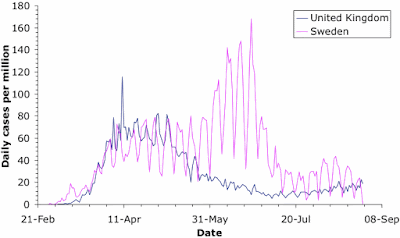
Coronavirus case-rates for Sweden and the UK
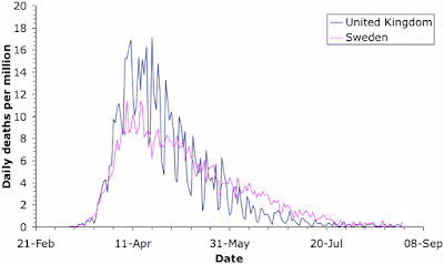
Coronavirus death-rates for Sweden and the UK

For a meaningful comparison, we need to look at the rates, not the raw data, because the two populations are very different in size (Sweden; 10 million, UK: 68 million). These two graphs show the case rate and death rate through time for the two countries. The comparison is quite revealing. [Note: the saw-tooth patterns in the graphs come from the fact that medical reports in most countries are notably fewer on weekends.]

As expected, the cases initially increased faster in Sweden. However, the case rates were very similar in the two countries by the last week of March; and they remained so until Sweden started serious virus-testing in late May. Just at the moment, the case-rates are similar again, although the UK has actually done twice as much virus testing as Sweden (240,000 tests per million people versus 110,000). Anyway, the two different government responses did not produce much difference in the number of cases for the first 3 months of the pandemic.

The death rates show quite a different pattern. The rates started off very similar, but by the end of March the UK actually had a higher death rate than Sweden. This situation was maintained until the end of May, after which Sweden had the higher rate until the end of July. Once again, the two countries are now very similar. Overall, the time-course of deaths is highly correlated between the two countries (79% shared variation), while the case rates are not (7%).

Of particular note here is that the differences in case rates have not resulted in differences in death rates. Apparently, Sweden's voluntary response has allowed a greater proportion of the population to become infected but this has not resulted in more deaths. I am fairly sure that the authorities will attribute this to the development of herd immunity (which I will talk about in my next post on the coronavirus) (WHO expert praises Swedish strategy - urges other countries to follow suit). [Note: a direct comparison with the USA would be pointless, given the geographical variation discussed above.]

The consequences are far-reaching. As but one example of the unfortunate consequences of the UK lock-down, you could read up on the fiasco concerning the final-year school exams (A coronavirus lesson about the modern state) — without a lock-down, Sweden avoided such problems for its young people.

Conclusion

There is a wealth of data in this pandemic, enough to keep data analysts busy for a very long time. I am sure that we will be inundated with reports for many years to come. In the meantime, like all pandemics, the geography of the local epidemics is a vital point in implementing effective control strategies.

Isn’t it about time we started behaving rationally in response to Covid-19?


I have written a few blog posts recently about the current Covid-19 pandemic, caused by the arrival of the SARS-CoV-2 virus in our lives. This interests me as a biologist with some background in the study of pathogens (disease-causing organisms).
There have been two extreme responses to the current pandemic. There are all sorts of variants in between, of course, but I will start by characterizing the extremes, and then move on to some practical examples. The point here is that we need a reasoned response to this pandemic, based on the effect of the virus on people, and the make-up of the populations being affected. The current one-size-fits-all approach used by most governments is not going to work, long-term.

The future of having to live with the virus is becoming clearer. Actions can be individual, but they need to be co-ordinated, with each of the risk groups being treated appropriately. Even if you personally feel secure, those around you might experience risks very differently. An all-purpose set of mandated behaviors might work short-term, but we cannot continue to live that way. Behavior needs to make all risk groups feel safe at all times, by being targeted appropriately.


Behaviors

At one extreme, people are trying to hide from the virus. By this, I mean that they are trying to keep away from it. Obviously, many people are doing this individually, but whole countries have also been trying to do it, notably Australia and New Zealand, which are geographically isolated by virtue of being islands. At the other extreme, people are trying to "crush" the virus, like they are playing poker against some weak opponent.

The problem with the first extreme is that you can never come out of hiding, because the virus does not go away, it just sits there (like viruses do) until you finally come past, and then it will get you, after all. This is what the so-called Second Wave of infections is currently showing us. The First Wave of infections occurs because people do not know about the pathogen, and therefore catch it inadvertently. In response to the rapid increase in case rates, people go into self-quarantine, trying to prevent themselves from encountering the virus. This works, but they eventually get tired of doing it, and they come back out again — and that is the Second Wave of infections. It is nothing new as far as the virus is concerned, it simply reflects changing human behavior (out, in, out again).

A prime example of the other extreme is expressed by this recent New York Times article: Here's how to crush the virus until vaccines arrive, or even the Wall Street Journal: The treatment that could crush Covid. You can't crush a pandemic, as we know from the seemingly endless series of previous pandemics in recorded history, and presumably many more of them before we learned to write. Naturally, Wikipedia has a List of epidemics, for you to peruse.

However, at some stage, people are going to have to start treating the current pandemic like the influenza virus — a natural part of their environment, where they take standard precautions to minimize their risk. In response to the perennial threat of flu, old people take vaccines in winter, middle-aged people stay away from public transport during flu season, and young people simply get on with their lives (because a bit of flu will not kill them). These are rational responses, taken by people after evaluating the perceived risk of infection to themselves.

To do this for Covid-19 we need to consider what we have learned so far this year.


We need to learn

During the First Wave of any pandemic we need to over-react, while we find out how the new pathogen behaves and what effects it can have. So, we try everything from social distancing to lock-downs, to see what seems to work in practice. The objective is to reduce the rate of spread of the virus — in biological terms, we are trying to work out what things will flatten the curve (see: Coronavirus: What is 'flattening the curve,' and will it work?).

For example, one current debate is: do face-masks provide protection, in the community setting? They work in hospitals, for sure (Face masks really do matter: the scientific evidence is growing), but that is a specialist environment, where they are used by professionals in conjunction with other methods (hand scrubbing, special clothing, etc). We need to find out whether people can routinely wear face-masks properly, so that the masks do what they are designed to do. We may actually be better off with perspex visors, for example, which are also effective at preventing the spread of breath aerosols (which is the main problem), and they can be worn effectively even by a novice — and they do not make us all look like we are involved in a bank hold-up.

We also need different groups of people to try different approaches, to see how effective they are. If everyone does exactly the same thing, strictly following World Health Organization recommendations for example, then we do not learn much, as a global community. That is, a pandemic is simply a widespread (global) series of epidemics, one in each local area. Since countries are all different, culturally, this cultural diversity creates the ideal environment to maximize learning-by-doing, by treating the pandemic as a set of epidemics, to which we might respond differently.

For example, the Buddhist-dominated communities of South-East Asia have done things in a very community-cooperative manner (these people do not work alone, by choice); and they collectively have the lowest infection rates on the planet. The Muslim-dominated countries of the Middle East do not worry much about life threats (whether they die or not is the Will of Allah), and they collectively have the worst rates. The individual creed of Americans does not encourage them to act co-operatively (resulting in draconian government-mandated lock-downs), and so they also have a very high rate. Sweden is one of the few remaining socialist cultures, where governments give advice rather than issuing instructions (resulting in this case in co-operative self-quarantines), and they have a middling-to-high infection rate.

We learn many things about alternative effective actions from this cultural diversity. In particular, media criticism of the different national reactions to the pandemic is now dying down, as the critics slowly come to realize that uniformity always results in an all-or-none outcome.


What have we learned?

Okay, so after the First Wave we know that this new virus can do everything from: apparently nothing (there are plenty of people with antibodies who have never felt any symptoms of having had the virus), to creating flu-like symptoms (key symptoms: fever, cough, skin rash, loss of taste & smell), on to hospitalization (with usually c. 7 days to get rid of the symptoms but 5 weeks to get rid of the actual virus), or even intensive care (as a result of what is medically called a cytokine storm). For the elderly, and others with pre-existing medical conditions, the virus seems to be one thing too many for their body, the proverbial straw that breaks the camel's back — which can lead to death sooner rather than later.

So, not only does SARS-CoV-2 infection not mean death for the vast majority of people (globally, < 3.6% of reported infections have resulted in death), it does not even necessarily mean sickness at all (eg. a Swedish study showed that 46% of those study people with antibodies had never reported clinical symptoms). This should mean something for our future responses.

Notably, in those countries where a significant Second Wave is now occurring, the new infections are often not resulting in deaths (except notably in Australia). This is a very important difference between the First and Second Waves, in most places. There is speculation that the SARS-CoV-2 variants currently widespread are less deadly than were those common at the beginning of the pandemic; but it is equally likely that those people who were most susceptible to the virus have already succumbed during the First Wave.

So, we now know about the risk groups, roughly, which is as good as we ever know such things; and we have a good idea about the outcomes of the various risks. This means we can start to do some reasoned things, as a pandemic response. The Second Wave is a perfect time to start treating the Covid-19 situation rationally.


The time for some new action?

This means that it is time to start targeting actions to the degree of risk for each person, rather than having over-arching actions that affect everyone equally. Our individual responses to the virus are not equal, so why are most government actions still predicated on the idea that we are all equal?

The point is, we have to respond to what we have learned about relative risks. For example, I have argued before that the biggest mistake Sweden has made was letting Covid-19 get into the aged-care facilities, which is where most of the country's deaths have now occurred. Has anyone learned from this mistake? Apparently not in the USA: Untested for Covid-19, nursing-home inspectors move through facilities. Come on people — get your act together.

The response to the First Wave always needs to assume equality, because anything else would be irresponsible, in the face of our initial ignorance. During the Second Wave, however, we are no longer quite so ignorant, and we can tailor our actions to suit the conditions. When are we going to start doing this?

In order to think about this question, it is worthwhile to consider a few topics that seem to be on the agenda, and look at some practical examples of three relevant situations.


Trying to hide

Any country that successfully hides from the virus has to keep hiding, forever. New Zealand has recently been crowing about having gone 100 days without a new coronavirus case. That record was destroyed this week (New Zealand on alert after 4 cases of COVID-19 emerge from unknown source); and it will get even worse on the day they allow the first visitor into their country. Their current Alert Level 3 response cannot change this — you cannot hide from a virus.

New Zealand's near neighbor, Australia, has demonstrated this point even more strongly. In one sense, the Australians understand quarantine, because it is a big part of keeping plant and animal diseases out of their country. For example, international visitors are regularly surprised to have biological products (notably wood) confiscated at the arrival airport — better safe than sorry.

So, dealing with Covid-19 should be straightforward for them — you just apply the same idea to the people, themselves. Sadly, it took them some time to realize that you have to take people straight from the airport to a quarantine hotel, if the quarantine strategy is to work. One of my nephews returned to Sydney (Australia) from Copenhagen (Denmark) at the beginning of the First Wave, and he had to make his own long way by public transport from the airport to the quarantine house that his father had arranged!

So, it should not be a surprise that quarantine has not been effective everywhere in Australia — one mistake is all it takes. This mistake was made in the quarantine hotels in Melbourne (Victoria), where the quarantine security turned out to be a joke (see: New coronavirus lockdown Melbourne amid sex, lies, quarantine hotel scandal). Perhaps the security guards should have read the earlier article on: Sex in the time of coronavirus.

The issue here is that Australians are no better than Americans at following government instructions — individual rights take precedence (see: Individual choice is a bad fit for Covid safety). Even my local newspaper here in Uppsala (Sweden) reported (Regel brott ger böter) the news that military personnel were sent to visit 3,000 Australians who were supposed to be in self-quarantine at home (due to having tested positive for the virus), and 800 of them (one-quarter!) were not at  home. I lived in Australia for 40 years, and this situation surprises me not at all.

So, hiding does not work, long-term, because you have to keep it up for too long to be practical for most people. The Second Wave in Victoria is actually worse than the First Wave, in terms of number of Covid-19 cases. The ensuing lock-down is now even worse than it has been in most other places (see: 'Very dead': army and police patrol the deserted streets of coronavirus-stricken Melbourne); and Victoria itself has been quarantined from the rest of the country.


Schools

We have all been told that the effect of Covid-19 is age-related; and the global data shows that this is true everywhere — the older you are, the more likely you are to seriously affected. One outcome of this knowledge is that actions can be tailored to age groups. Notably, we can consider the idea that massively disrupting the lives of very young people may be doing more them harm than good, due to stress if nothing else (Lockdowns and school shutdowns may make youngsters sicker).

Most countries mandated the closure of schools, and instituted some form of working from home for the pupils. This move was predicated on the idea that children will catch the virus in the crowded schools, and bring the disease home to their elders. This scenario seemed to be the case, for example, in the early spread of the SARS-CoV-2 in northern Italy.

Recent evidence, however, suggests that, while the youngsters do catch the virus, they are much less infectious than older people (see: COVID-19 study confirms low transmission in educational settings). We are talking about pre-teenagers here, not older children. This does not mean that they can't spread the virus (see: Latest research points to children carrying, transmitting coronavirus), but merely that this is a much lower risk.

It has therefore been suggested that a rational response would involve a trade-off between disrupting the lives of very young people versus the risk of viral spread (see: Why it’s (mostly) safe to reopen the schools). Notably, this issue was explicitly considered in Sweden, and during the First Wave it was decided to keep the junior schools open, but to close the senior schools (ie. high school). So, the younger children have all been trundling off to school every week-day, just as usual, the whole time. As far as I know, there has not been even one reported outbreak involving any of the open schools.

This is why I emphasize the importance of culturally diverse responses to a pandemic. In this case, the Swedes seem to have got it right; and everyone else could learn from this.


Young people

It is a different matter for somewhat older (but still young) people. The so-called Millennial generation has had a pretty tough time, especially financially. This is the second financial down-turn that they have experienced in a dozen years, just when they are trying to get themselves onto their own two feet (see: Millennials slammed by second financial crisis fall even further behind).

So, none of us should be surprised that these people are thoroughly sick of restrictive pandemic responses by now. Indeed, it is becoming widespread news that case rates are increasing among 20-29 year olds (or 15-25, depending on how people are grouped) (see: WHO urges young people to help control the spread of coronavirus). This has become particularly obvious in Europe (see: Coronavirus cases rise in Europe as youth hit beaches and bars), but also in North America (see: B.C. hospitalizations, deaths steady as latest wave hits mostly young people) and Australia (see: Coronavirus Australia: Why young people are spreading COVID-19).

This is not necessarily as bad as it might sound, because the effect of the virus is age-related, and these people will probably mostly be safe (but not all). The same thing is true for somewhat younger people — youth is a social time, and mandated restrictions about distancing may not be very effective (see: Why the teenage brain pushes young people to ignore virus restrictions).

Places like Japan and Spain are now cracking down on bars, and the like (eg. Spain cracks down on outdoor drinking, smoking in renewed push against COVID-19). If you want some survey data on what activities U.S. people currently feel comfortable doing, then check out: Weekly updates on consumers’ comfort level with various pastimes.

In this situation, Sweden has not been exempted; and recent coronavirus cases have become prevalent in the 20-29 year old group, just like elsewhere else. Once again, this emphasizes that our knowledge cannot all come from one place. No-one gets it all right, but they may get some things right; and we should learn from both success and failure. This is the rational approach, not the one-size-fits-all approach.

Adding to this scenario, as I write this blog post, Europe is having a warm spell (up to 40 °C in the south), and my local newspaper has the headline: Chaos on Europe's beaches in the heatwave. All governments are warning about the need to continue keeping people apart, for those who wish to avoid infection. Fortunately, the summer holidays are nearing their end in the northern hemisphere.


Concluding comments

From the biological perspective, for the future to be bearable, we need to reach herd immunity, which refers to public safety in the presence of a pathogen. This is determined by the proportion of the (local) population that needs to become immunized (either by becoming infected or by being vaccinated) in order for the infection to stop spreading (see: A new understanding of herd immunity).

We can achieve herd immunity by responding rationally based on the make-up of the population, in terms of the relative risks. At-risk groups need to be protected, while the rest of the people get on with their lives. For example, Stockholm, in Sweden may now be getting close to herd immunity (or flock immunity, as the locals would call it), the Swedes having foregone the lock-downs imposed elsewhere, and thus allowing immunity to arise naturally.

Herd immunity can be achieved without rationality, of course — we simply wait for the weakest people to die, and the rest are likely to be safe. You might not like the moral implications of doing this, but it is biologically effective, nonetheless. For example, India may potentially end up with the world's worst case-rate for infections, given its population size and large degree of poverty in many areas (where social distancing is not feasible). However, its saving grace, in terms of deaths, may well be the consequent fact that poor people are usually young, because poor people do not live long in the first place. Herd immunity to SARS-CoV-2 is easy to achieve under these circumstances (see: Herd immunity seems to be developing in Mumbai’s poorest areas).

I vote for the rational approach, myself, among the many biological alternatives.
Coronavirus statistics are (almost) all misleading


There are plenty of places on the internet where we can access statistics about the current Covid-19 pandemic, caused by the rapid global spread of the SARS-CoV-2 virus — notably Johns Hopkins University (formally described here), and Worldometer. These are compilations of official government statistics, comparing different countries, or states within a country. These are potentially interesting, because we can see how things are progressing in our own location, and compare it to other places. If nothing else, this might inform our own actions for protecting ourselves.

The basic problem is that these data are often not comparable between jurisdictions, in the sense that they will have been collected in different ways and with different degrees of success. For example, consider these two recent articles about the country that is very likely to end up being the worst hit:
The second one contains this quote that sums up the issue: "India is the third-worst hit country in the world, but there are concerns a lack of testing could mean the true figure is far higher." Government organizations usually do their best to collate their local data, but their relative success in a situation like this will vary from "okay" to "abysmal". We cannot really know where any given dataset fits into that continuum, and this profoundly affects how we interpret the data.

ourworldindata.org/coronavirus

Data must be comparable if we are to compare them. This is an obvious truism, especially in science; but achieving comparability is often very difficult in practice, and scientists spend much of their time trying to achieve it in their own work. I would hate to be the person delegated the job of summarizing this pandemic globally, because they will really be us against the wall. But someone will have a go at it, believe me, and I wish them every success.

In this post, I summarize the main data-collecting issues, as they are currently understood. The two main statistics reported are the number of infection cases and the number of resulting deaths, which have separate issues.

Case numbers

Deciding whether a particular person is a Covid-19 case is not straightforward. Three main criteria have been used to date:
  • disease symptoms (which are similar to influenza)
  • detection of a viral genome in the body (meaning the person currently has the virus)
  • detection of virus antibodies in the body (meaning the person has previously had the virus).
These three criteria will yield different estimates of the number of cases.

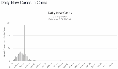
Since the virus seems to have originated in China, the Chinese were the first to officially count cases. They started by including only those people who had been tested for the virus itself (after they showed symptoms), but soon realized that this caused a delay before these people received medical treatment. So, the official data show a massive spike in case numbers, when the authorities switched to using symptoms alone to count cases. You can see in this graph (from Worldometer) which day that was.

Coronavirus cases in China

Using symptoms alone presumably over-estimates the number of cases, because of the similarity of coronavirus symptoms to those resulting from influenza viruses. Clearly, symptoms need to be confirmed by a direct test for each particular type of virus.

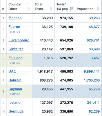
However, without a concerted testing effort for SARS-CoV-2, the number of cases will be under-estimated, probably by a large margin. We now know that many people show few or no symptoms of this coronavirus, and will therefore not be detected if we test only those people with explicit symptoms, and who visit a testing center. Some countries have made massive testing efforts, relative to their population size, while many other countries have been much less active. This table shows the top data from Worldometer, counted as the number of tests per million people.

Coronavirus testing per million people

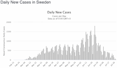
Clearly, the more of your population you test, the more likely you are to correctly detect all of your cases. The effect of this can be seen in this next Worldometer graph, for Sweden. The apparent burst in cases after June 5 was due to the government finally implementing large-scale virus testing, which naturally increases the detection rate for this type of situation. That is, the data were greatly under-estimated before June 5, and the official data were corrected during June, by catching up with many of the as-yet-undetected cases. This increased testing has continued, which means that the drop in cases during July is cause for optimism, as in any situation where you search for something bad and don't find it. Nevertheless, these tests cover only 8% of the population, to date, and so even now the data may still (theoretically) be under-estimates.

Coronavirus cases in Sweden

So, between-country comparisons are misleading, unless the same amount of virus testing has been conducted. This is the point I made about India, above, where testing is a real challenge given the size of the population. Those of you in the USA might like to contemplate just how many cases you really have — your officials have conducted more tests than anyone else except China, but you still have covered only 17% of your population (the table above is cut off at 30% coverage).

Alternatively, antibody testing is a good way to detect people who have had the virus without knowing it, since this studies their body's reaction to the virus rather than looking for the virus itself. As this sort of testing proceeds around the world, the number of official cases will continue to increase. However, the number of false positives and false negatives of the antibody tests means that even they are not entirely reliable (see False positive and false negative coronavirus test results explained). Indeed, a review article assessing the range of currently available antibody tests shows remarkable variation in their success rates (Diagnostic accuracy of serological tests for Covid-19: systematic review and meta-analysis).

As a final point, which has been very obvious here in Sweden, is just how long a person is considered to be a Covid-19 case. As far as Sweden is concerned, there were apparently a lot of "active cases" early in the pandemic. However, what was happening was that most other jurisdictions were declaring cases as "recovered" after the person's symptoms receded, which takes about 7 days, and were then removed from the official list of cases. On the other hand, Sweden did not officially declare a case recovered until the person was completely free of the virus, which takes about 5 weeks. So, Sweden's reported number of active cases remained much higher than for most other places, for a much longer time. The number of Swedish cases was actively criticized by the foreign media, but the cause was never mentioned — the data were not comparable to elsewhere.

Similarly, the reporting of cases is obviously not equal throughout any given week, so that daily reports are unreliable — there are obvious weekly cycles in almost all of the national datasets, with fewer reported cases or deaths on Saturdays and Sundays. The same thing applies to regional (geographic) patterns, of course. For example, both Spain and the United Kingdom have noted that their current outbreaks are all regional, with the majority of their countries being much less affected.

Coronavirus test results

Number of deaths

This brings us a consideration of counting deaths due to Covid-19. We all know what death is, but it is not so easy to assign a particular cause to any particular death. A death certificate signed by a professional medical practitioner will assign an official "cause of death", and possibly list other "contributing factors". So, when does a death count as a coronavirus death?

The simplest solution is to say that any dead person who has a virus genome in their body counts; and it is clear that some of the statistics around the world have counted Covid-19 deaths this way. Unfortunately, as has been pointed out ironically, this counts people who are carrying the virus when they get run over by a car; and this may not be what most people mean when referring to "a coronavirus death".

Just as importantly, some jurisdictions have clearly tested, and thus counted, only those people who died in hospital. Similarly, there are clear differences in counting due to social circumstances, especially in countries with large poor communities. These factors will under-estimate the actual death rate.

The main issue, however, is that most of the people severely affected by this new virus are elderly persons with pre-existing medical conditions. For example, 7.3% of the reported Covid-19 cases in Sweden have resulted in death, to date, but 89.1% of those deaths have been in the 70+ age group. This is a bit more extreme than elsewhere, as early on in the pandemic the virus got into several aged-care facilities in Sweden. In most of these cases, the SARS-CoV-2 virus was simply one thing too many, for people whose health was already declining — this is called co-morbidity (the presence of one or more additional conditions co-occurring with a primary medical condition).

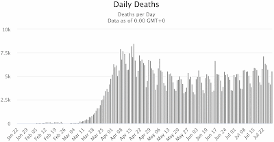
So, where is the border between a main cause and a subsidiary factor? The answer to this question clearly differs around the world; and this makes the officially reported death data non-comparable. Some data will be over-estimates and some will be under-estimates, compared to some global standard definition. So, what does the following graph, from Worldometer, really tell us?

Reported coronavirus deaths gloabally

The generally accepted solution to this conundrum is to consider what is called excess mortality, which assumes that there has been a temporary change in the number of deaths during some specified period of time. That is, we do not assign deaths to particular causes, but simply compare the total number of deaths now to the total number of deaths in previous years. The difference can be attributed directly or indirectly to the current circumstances. This is not perfect, but it is the best we have got.

So, we should compare the number of deaths during the current pandemic period with some estimate of a baseline number of deaths under more normal circumstances. The baseline is commonly taken as the equivalent data from the immediately preceding 3–5 years, or so — how many more people have died during the pandemic, compared to the average deaths during the same months of prior years?

The U.S. Centers for Disease Control and Prevention has a compilation of these data for the states of the USA, updated daily: Excess deaths associated with COVID-19. The data are still provisional, but it would be nice to think that they are directly comparable. Whether the data are actually meaningful for the current pandemic is a point I discuss at the end of this post.

Similarly, the EuroMOMO collaborative network is supported by the European Centre for Disease Prevention and Control, and provides weekly data for public health threats in 24 European countries. If you look at their graphs, you can see the age-related effects of seasonal flu in every winter since 2016, as well as the magnitude of current pandemic. Here is a graph of their current data, pooled across all age groups and countries. Roughly speaking, deaths are 80% greater than in previous years.

Excess mortality in Europe since 2016

Elsewhere in the world, data are a bit more scarce. The principal problem is lack of suitable prior data — not everywhere on the planet has accurate estimates of the local death rate, for some combination of social, economic or political reasons. Nevertheless, we have data for all of the expected places; and some of the groups who are collating the excess mortality data for the current pandemic are listed by the Our World in Data site: Excess mortality from the coronavirus pandemic (COVID-19).

These groups include three newspapers, each of which is covering the current pandemic across c. 10 countries:
All three of these make their compiled data publicly available on GitHub.

Conclusion and final point

The world is a complex place, and biology is one of the most complex parts of it. Do not over-interpret simplistic data, no matter how prettily it is presented. In particular, for data to be meaningful, all parts of it need to be directly comparable; otherwise the conclusions are likely to be wonky.

Sadly, as a final point to emphasize the issues, I will note that the USA itself apparently has rather big practical problems, as discussed in: Covid-19 data in the US is an ‘information catastrophe’. According to this media report, there are serious problems with the hospitalization data:
Covid-19 data in the US — in fact, almost all public health data — is chaotic: not one pipe, but a tangle ... Every health system, every public health department, every jurisdiction really has their own ways of going about things ... It's very difficult to get an accurate and timely and geographically resolved picture of what's happening in the US, because there's such a jumble of data.
The issue seems to be the National Healthcare Safety Network, as used by the Centers for Disease Control and Prevention, which is responsible for collating the data nationally. The Department of Health and Human Services has now taken over direct responsibility for data concerning Covid-19 infections in hospitalized patients, much to the dismay of many people.

New GenBank submission options for SARS-CoV-2 submitters

NCBI is pleased to announce ongoing enhancements to submission of SARS-CoV-2 assembled genomes to GenBank, including a streamlined workflow on the web and a new API option. Both new options mean that you can receive accessions for SARS-CoV-2 data submissions … Continue reading

Hack and fish … for recombination in the SARS group


Following the current flow, we have had a few recent coronavirus posts here on the Genealogical World of Phylogenetic Networks. In this post, I'll show the results of a little experiment coming back to David's original post on the topic. Can we use trees to "fish" for evidence of recombination?

As David pointed out, even when we use a phylogenetic-tree inference method to analyze virus genomes, we don't really end up with a phylogenetic tree. Instead, we have a tree reflecting genetic similarity, which will reflect the phylogeny to some unknown extent. The main problem with virus genomes, however, is that they easily recombine — and thus different parts of a virus genome may have different evolutionary histories. A single tree cannot reflect this.

This does not mean that trees cannot tell is something about virus evolution. However, these trees become part of a fishing exercise, looking for different possible historical pathways, which may reflect recombination events.

The tree

Our SARS harvest matrix includes about a dozen sequence groups, which we have labeled Type 1 (the original SARS-CoV) to 9b. Type 7 is the new SARS-CoV-2. For my experiment here, I picked one place-holder sequence per main type (to speed up calculation time). I added two more types: the newly found direct sister of SARS-CoV-2; and some "unclassified" SARS-like viruses from pangolins, which earlier were proposed as sisters, as shown in this tree from the GISAID web page.

The phylogenetic neighborhood of SARS-CoV-2 (GISAID, screenshot captured 3/6/2020). Note the flatness of the CoV(-1; yellow) and CoV-2 (red) subtrees.

GISAID doesn't give the GenBank accession numbers, so we cannot easily say whether our sample matches theirs. However, the tree we can infer from the complete genomes (high-divergent, non-alignable regions excluded) looks very similar, as shown next, and some of the labels match up.

Fig. 1 Maximum likelihood (ML) tree inferred for our sample using (old, v.8.0.20) RAxML. Roman numbers refer to earlier defined Types 1–9 (Tree and viruses – the SARS group), Arabic numbers give nonparametric bootstrap (BS) support based on 100 BS pseudoreplicates (number of neccessary BS replicates determined by the extended majority rule criterion). Branches without Arabic number are unambiguous (BS = 100).

Most importantly, all but three branches have unambiguous support: the phylogeny of this sample is resolved. Unfortunately, as our recurring readers already know, this nearly resolved tree simplifies a much more complex situation.

The Neighbor-net with recombinations and mutational trends (arrows, connectives; cf. Tree and viruses – the SARS group).

Hack and slash

A simple method to fish for different evolutionary histories in a genome is to cut the virus genomes into sub-sequences, infer a tree for each sub-sequence, and then compare the trees. Most researchers compare trees by showing them and discussing which one makes most sense. Here is an example from Corman et al. (2014), who searched for the root of MERS (Middle East Respiratory Syndrome) virus, an illness closely related to SARS.

Reprint of Corman et al. 2014, fig. 3 with colors added to EriCoV (green) and HKU/BtCoV (olive) groups

Each tree in their Fig. 4A and B (Bayesian majority rule consensus trees) was inferred from a different part of the genome. Corman et al.'s focus was to root the MERS viruses by identifying a better outgroup. However, note that the new sister-group (red, green stars – sister to MERS; orange stars – sister to someone else) moves, and so does the green EriCoV clade and the olive HKU/BtCoV group (clade in some trees and grade in others). Do some of these trees get it wrong? Or is, eg. NeoCoV the product of reticulate evolution (here: ancient recombination)? Some parts of its genome might be derived from a common ancestor with MERS (blues), and others from a common ancestor with KW2E (black) and EriCoV (green).

Our complete matrix has 27,333 characters, providing nearly 6,000 distinct alignment patterns (abbreviated DAP, below), which is a lot — the GISAID link above also provides a graphical representation of site divergence. However, probabilistic tree inference methods (ML, Bayes) can handle moderate to high levels of divergence in the data. On the other hand, they also need a certain amount of data to perform well (see also: Inferring a tree with 12000 [or more] virus genomes). So, for my experiment, I hacked the matrix into nine bits of equal size, ie. each submatrix has a bit more than 3,000 nucleotides, providing between 615 (bit #5) and 1029 (bit #1) DAPs.

Fig. 2 Nine ML trees with BS support annotated along branches, each based on a ~3000 nucleotide long bit of the genomes (ordered left-right, top-bottom). Purple highlights branches conflicting with the complete genome tree.

Our nine trees (shown above) are not badly resolved, as most branches get substantial support. But they are not congruent. If we are dealing with recombination, then we might assume that all of these trees do show an actual aspect of the evolutionary history of the genomes. That is, they are all right and wrong, at the same time.

Moreover, we have high supported clades conflicting with the complete genome tree's (Fig. 1) topology. The signal issues, due to recombination (see Trees and viruses...), did not decrease branch support. That is, 6,000+ DAP is a lot, and recombination only affects a part of the complete genome, possibly quite a small part.

Non-trivial evolution needs more than trivial graphs

To depict the reticulate phylogeny of the virus sample, we need to consider the differences seen in the hacked-and-slashed matrix trees. This can easily be illustrated using a network, instead of a set of trees, as shown here.

Fig. 3 A (strict) consensus network of all nine trees, in which the edge lengths give the sum of the branch lenghts in the tree sample. The gray brackets give the topology of the near-fully resolved complete genome tree.

The graph above is a phylogenetic network: the competing edge bundles represent the different inferred histories of bits of the genomes. The SARS-CoV-2 lineage seems to be the product of (ancient) recombination, and recombination also played a role in forming the members of the original SARS-CoV group.

Fig. 4 Pruned consensus network showing only the CoV(-1) lineage exhibiting various levels of recombination within and between clades as defined by the complete genome tree (tree sample sames as in Fig. 3).

Consensus networks can also be used to summarize the support for alternative splits, as shown next.

Fig. 5 Sum-support consensus network based on the bit-wise BS analyses (111/112 pseudoreplicates generated per bit). Only splits are shown occurring in at least 20% of all BS replicates, i.e. splits supported by at least two bits, trivial splits are collapsed. Colored splits represent according groups/clades in the full-genome tree (Fig. 1). Inlet: 'splits rose' showing competing splits patterns within Types II and III (cf. according subtrees/-trunks in Fig. 2 and Fig. 4).

In contrast to the networks before (Figs. 3, 4), generated using the same algorithm*, the BS consensus network in Fig. 5 is not a phylogenetic network. The boxes don't reflect disparate histories of parts of the genomes but the varying support for competing topological alternatives. By summing up the bit-wise BS analyses instead of bootstrapping the entire data (the BS consensus network for the full data, Fig. 1, shows only two boxes), we get a better idea which aspects of the all-genome tree find robust support across the genome.**

Conclusion

Sub-dividing an alignment is a really quick way to fish for evidence of recombination, especially when one then uses a consensus network to summarise the resulting partial trees.

For interpretation, a tree is a very simple, trivial, and hence appealing graph: A is sister to B and so on. Even a child can interpret a tree. Networks are already visually more challenging, but whenever an organism's evolution doesn't follow a tree (as for viruses), we shouldn't use a tree to depict its phylogeny (or reconstruct its evolution).


Data availability

The dataset used for our experiment is a taxon subset of the original data set, available via figshare (with a permanent, hence, citable DOI):
Grimm GW, Morrison D. 2020. Harvest and phylogenetic network analysis of SARS virus genomes (CoV-1 and CoV-2). figshare Dataset. https://doi.org/10.6084/m9.figshare.12046581 

References

Corman VM, Ithete NL, Richards LR, Schoeman MC, Preiser W, Drosten C, Drexlera JF (2014) Rooting the phylogenetic tree of Middle East respiratory syndrome coronavirus by characterization of a conspecific virus from an African Bat. Journal of Virology 88: 11297–11303.


* SplitsTree includes five options to determine "edge weights" (= edge-lengths) in case of Consensus networks: "median" and "mean" average the branch-lengths in the tree sample; "count", the setting used to generate Support consensus networks, counts how often a certain taxon bipartition (split) is found in the tree sample – an edge length is proportional to the frequency of a split; "sum", used here to generate the first network, summarizes the branch-lengths; and "none" discards both branch-lengths and split frequency.

** A split supported only by one of the nine bits, even if unambiguous, ie. present in all 111 (112) per bit BS replicates, will not be represented in the sum-Support consenus network using a cut-off of 20%.

† The complete set of ML analyses took 20 min on a stand-alone computer; consensus networks are generated in a blink, and take hardly a minute even when using trees with many leaves.

A new SARS-CoV-2 variant?


In previous blog posts, Guido has examined the phylogenetic patterns in the current SARS-CoV-2 outbreak, responsible for the socially disruptive Covid-19 pandemic:
These patterns are traceable because, being a virus, there is a high mutation rate in the genome, and many genomes have been sequenced. Even on the Diamond Princess boat, it is clear that a number of genetic variants arose during its few weeks of quarantine.

Guido analyzed in detail some of these known variants, and their associated genome mutations. He carefully tried to distinguish possible sequencing artifacts from genuine mutations, and which of the latter seem to be the result of genomic recombination among different strains. Naturally, he did this in the context of using phylogenetic networks as the preferred tool of analysis.


Needless to say, Guido is not the only person to have tried this sort of analysis, although people do not really seem to have grasped that recombination as a molecular process requires the concept of a phylogenetic network. There is an intellectual fixation with phylogenetic trees rather than networks. The tree approach is to detect incompatibilities among the trees, and to deduce recombination as the cause. However, why demonstrate that your preferred analysis method fails, and reach a conclusion from this, when you could simply analyze the data appropriately in the first place?

One recent pre-print that has attracted a lot of attention, based on looking for genetic mutations in a single gene, and then using a tree-based analysis, is:
 Spike mutation pipeline reveals the emergence of a more transmissible form of SARS-CoV-2

The attention-getting part of the paper is that a particular mutation variant of the virus seems to be getting more common among hosts, and in some places has become the dominant strain. The authors conclude that the mutation has been positively selected due to greater infectivity. This is potentially important because the gene being studied is the Spike (or S) protein, which creates the distinctive crown-like appearance of the virus itself. This crown mediates infection of host cells, and is thus the target of most vaccine strategies and antibody-based therapies. Clearly, then, this variant might be of great practical interest.

However, while the press coverage has been enthusiastic, most of the professional commentary so far has been unimpressed with the authors' conclusions. Basically, the reaction to the authors has been "not so fast, guys". The evidence is suggestive at best, and not yet verified (see We don’t know yet whether a mutation has made SARS-CoV-2 more infectious).

Comments

My points in this blog post are about the analyses. There are two parts to the analyses: the identification of mutations and selection, and the study of recombination.

First, only one mutation has been identified, which appears to increase in prevalence through time. So, the conclusion that the new variant is more virulent seems to be based on the idea that it becomes the dominant strain in any population. If this is so, then we still have only one main variant to deal with, in terms of medical response. Indeed, if this variant has been around since February, as the report claims, then most infected people must have it. The only people who wouldn't have this one would be the very earliest cases.

Moreover, if a mutation is positively selected, then it must be difficult to distinguish reticulation from convergence. If variants that gain a mutation via reticulation become dominant, then with every generation we increase the probability that the same mutation will be independently obtained by another virus lineage. Being positively selected, these independent mutations will quickly be dispersed. Given that the virus has been around now for nearly 5 months, with a steadily increasing and diversifying available-host population, there would be plenty of time for convergent evolution of the same beneficial mutation.

Second, phylogenetic trees are often used to try to study the origin of genetic variation, especially if there has been recurrent emergence of particular variants, each of which has subsequently diverged independently. This was Charles Darwin's idea when he talked about the tree as a model for evolution. However, Darwin's book also has a long chapter on hybridization, which cannot easily be studied using the tree model. This apparent contradiction did not concern Darwin, because his book is mostly about the continuity of evolutionary history, which was his main motivation for using the tree model. Hybridization is evidence for continuity, even though the tree model is too simple for studying it. The same argument applies to the study of introgression.

It is the same for processes like recombination, which is conceptually no different, although it occurs at the molecular level, instead. As far as the new paper is concerned, its Figure 1, which is a couple of phylogenetic trees, does not fit well with Figure 6, which is a set of alignments illustrating recombination. Why authors cannot see contradictions between different parts of their own work remains a mystery.

As a final note, the authors raise the specter of re-infection by the new SARS-CoV-2 variant. However, it is our developed immunity (ie. production of antibodies) that protects us, epidemiologically. To allow re-infection, the virus would need to avoid these antibodies. Being more infectious does not automatically make a virus able to avoid antibodies. Nevertheless, I would not be surprised if we learn that some people become ill more than once. (NB. This is different from saying that people have multiple strains. Multiple infections do not necessarily result in multiple illnesses, because of the antibodies.) A bigger concern for new illnesses is likely to be the observed large variation in the amount of antibodies that people produce (more is better, of course).

Finding the CoV-2 root


In my last post, I looked at the prospects and pitfalls of using Median networks to trace virus evolution in the case of the SARS-CoV-2 virus. In this post, I will explore how we can try to root the CoV-2 MJ network, and why using an outgroup, as done by Forster et al., PNAS (2020), is not the best choice.

We'll stick to our 88 sequence dataset because I have already investigated its characteristics in my last post (XLSX-file included in the figshare file set). Here's the unweighted MJ network that can be inferred from these data, including all 146 mutation patterns (145 characters because one indel overlaps with a SNP – single-nucleotide polymorphism).

Median-joining network for the 88 samples in our early March harvest, color-coded for provenance and with sample dates. Four mutations (purples) are resolved as homoplasies. Red edges – potential recombination with unsampled types, line thickness gives here the number of deviating SNPs. Forster et al's Types given for orientation.

As in Forster et al.'s graph, we have one box in the central part of the graph, probably between Forster et al.'s type B (the big pie in the center and its satellites) and their type C (here: the long-edge global group including the Australian and European samples).

There's a useful rule-of-thumb in population genetics: a widespread, frequent haplotpype with many satellite types is often the ancestral type of the investigated sample. This, in our case, includes the reference CoV-2 genome ("Wuhan 1"; NC_0455512, sampled 26/12/2019). Having investigated in detail the data behind the graph (see the last post; adding sample date, provenance, graph above), we can put forward hypotheses as to what degree the parallel edge bundles represent alternative evolutionary scenarios, or are alternatively the result of potential recombinants between CoV-2 sub-lineages.

This allows us to depict an evolutionary scenario for our early samples, to picture how (i) the putative original variant (Wuhan 1/Type B) was distributed during the intitial phase (largely unmodified — light gray arrows in the next figure), (ii) where mutations happened to give rise to sequentially new (sub)types, and (iii) where recombination may have happened (crosses in the figure). Some links (the dotted lines) require further data in order to decide whether the shared mutation is lineage-diagnostic (as indicated by the MJ network) or a convergence.


Early evolution of CoV-2 in time (earliest dates) and space (coloring). Different grays distinguish the main two/three lineages: 20% gray, original Wuhan type (Forster et al.'s type B), dispersed unmodified to rest of China (sampled), Nepal (not sampled), the cruiseship (sampled) and North America (not sampled); 40% gray, potential type C differing by one transversion (basic type not sampled); 60% gray, Forster et al.'s type A differing by two transitions, basic variant found in a sample from Taiwan (Jan 31st). The circle sizes give the number of additional mutations within a lineage and geographic cluster; the x indicate potential recombination (within or between main types/lineages).

The early samples demonstrate that the later USA samples were infected by various (sub)types by mid-/end of January (by up to six lineages), while most of the variation arising in locked-down Wuhan did not escape (at this early stage) — the earliest two samples from 23/12 (MT019529) and 26/12 (reference genome) differ by three mutations.

The quarantined cruise-ship in Japan was infected with the unmodified Wuhan 1 type, which then evolved within the vessel's population. So, this quarantine worked, because the vessel's mutated viruses are not found elsewhere. While the 11121-transition has probably been propagated in the vessel's population via recombination, its occurrence outside (in the Jetsetter/USA lineage, type C?, and USA-Type A) could be due to homoplasy: both the Jetsetter/USA and the A-type USA genomes are (strongly) derived. The 24072 and 28892-transitions point to reticulation between (less evolved) American B- and (highly evolved) A-type lineages; the MJ network can't resolve the resulting box because the American A-type showing the 24072 mutation is strongly derived.

Note: It's also interesting to compare our graph with the tree-based virus "phylogeny" on the GISAID page, which doesn't seem to include the cruise-ship samples. Note that most of the deep branches of the GISAID tree are unsupported ("no mutation"), and samples identical to the reference can be found among the early samples of most main "clades" depicted in the GISAID "phylogeny".

Substitution probabilities

It is also straightforward to identify likely (→ U) and less likely substitutions (all others), as shown in the table.


There is a clear substitutional bias, as transitions are more likely than transversions, the approximate substitution model is abaaba for substitutions replacing the reference / CoV-2-consensus nucleotide. But the model is asymmetrical: Us are more likely to replace C than vice versa, while A/G transitions are balanced. Stochastically distributed singleton/rare mutations have a high probability to show a U, in general. So, a shared C is more likely to be a conserved, shared ancestral pattern (what Hennig called a "symplesiomorphy"). A shared U may be a uniquely shared, derived pattern (a "synapomorphorphy"), or a convergently (in parallel) obtained, derived pattern, a homoplasy. Low-frequency Cs, but also A and Gs at predominately U positions, are most probably synapormorphies as well (based on the data situation and observed substitution probabilities).

Currently, there is no maximum likelihood analog to Median networks, but one could weight mutation patterns differently (see, e.g., guidelines provided in NETWORK under the Help > About menu item in the Median Joining analysis window).

With each successive virus generation, the probability for a homoplasious U increases. Thus, when using MJ networks for virus evolution, we should consider analyzing the data at different time-points, rather than including all of the data in one large analysis (see also our posts on stacking Neighbor-nets: introduction, fossil king ferns, and manual alphabets).

Homoplasy + distant outgroups = wrong roots

By relying on a distantly related sister-lineage to infer an outgroup root of the MJ network, Forster et al. likely got the basic relationships wrong.

Central part of the original outgroup-rooted "phylogenetic network". Coloring after Forster et al. (2020).

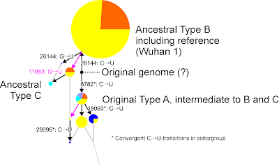
Their Type A is probably not ancestral to Type B/Wuhan 1, but derived from it or representing an early split.

Same graph, mutation arrows taking into account observed mutation probabilities (our 88 genomes data) and assuming that there was no recombination among earliest types of each lineage.

The 3 Us shared by the bat outgroup and (part of) Type A (8782, 18060, 29095) likely represent homoplasy in distantly related sister lineages (cf. our last SARS virus post). Being homoplasies, they produce a network box reflecting alternative mutational pathways but not recombination. Homoplasious (convergently evolved) mutational patterns accumulate with increasing phylogenetic distance. Neutral mutations have a generally higher chance to replace a C by an U, back-mutations are less likely, and some sites are more likely to be mutated than others. Hence, there is a good chance that the bat sister-CoV-virus shows more shared mutational patterns with a derived CoV-2 lineage (ie. derived Type A variants) than with the ancestral one (Type B). Distant outgroups should not be used to root Median networks (see also: How do we interpret a rooted median network).

The only possibly genuine mutation would be the shared C (Forster et al.'s pos. 28144, pos. 28219 in our alignment) opposing a U in all Type B and Type C, differentiated only by two incompatible mutations, G → U transitions. The U at pos 28144 may have evolved in parallel in the B and C types; and the actual all-ancestor of CoV-2 (as indicated above) is neither included in Forster et al.'s sample, nor in the current GISAID sample (or our harvest).

Outlook

It will be interesting to infer MJ networks on time-stamped and geo-referenced subsamples collected in the GISAID database, once the virus has had half a year (or more) to evolve, to see (i) how common homoplasy is, (ii) which sites are likely to accumulate → U substitutions independently of ancestry and (iii) whether there are further and more obvious examples of recombination. The further that genotypes evolve from the original stock, then the more diagnostic their sequences may become, and the easier it will be to decide whether shared but incompatible sequence features are the result of homoplasy or recombination.