Guide for working with machine learning datasets

As part of the Knowing Machines research project, A Critical Field Guide for Working with Machine Learning Datasets, by Sarah Ciston, offers advice for working through the life cycle of complex and large datasets:

Machine learning datasets are powerful but unwieldy. They are often far too large to check all the data manually, to look for inaccurate labels, dehumanizing images, or other widespread issues. Despite the fact that datasets commonly contain problematic material — whether from a technical, legal, or ethical perspective — datasets are also valuable resources when handled carefully and critically. This guide offers questions, suggestions, strategies, and resources to help people work with existing machine learning datasets at every phase of their lifecycle. Equipped with this understanding, researchers and developers will be more capable of avoiding the problems unique to datasets. They will also be able to construct more reliable, robust solutions, or even explore promising new ways of thinking with machine learning datasets that are more critical and conscientious.

Plus points for framing the guide in a spreadsheet layout.

Tags: , , ,

Guides for Visualizing Reality

We like to complain about how data is messy, not in the right format, and how parts don’t make sense. Reality is complicated though. Data comes from the realities. Here are several guides to help with visualizing these realities, which seem especially important these days.

Visualizing Incomplete and Missing Data

We love complete and nicely formatted data. That’s not what we get a lot of the time.

Visualizing Outliers

Step 1: Figure out why the outlier exists in the first place. Step 2: Choose from these visualization options to show the outlier.

Visualizing Differences

Focus on finding or displaying contrasting points, and some visual methods are more helpful than others.

Visualizing Patterns on Repeat

Things have a way of repeating themselves, and it can be useful to highlight these patterns in data.


Tags:

Posted by in design, guide

Tags:

Permalink

Real Chart Rules to Follow

Chart Rules

There are a lot of "rules" for visualization. Some are actual rules, and some are suggestions to help you make choices. Many of the former can be broken, if that's what the data dictates and you know what you're doing.

But, there are rules—usually for specific chart types meant to be read in a specific way and with few exceptions—that you shouldn't break. When they are, everyone loses. This is that small handful.

Bar chart baseline must start at zero

The bar chart relies on length to show data. Shorter bars represent lower values, and longer bars represent greater values. Compare bar lengths to compare values. That's how it works.

When you shift the baseline, you distort the visual.

Disappearing bars

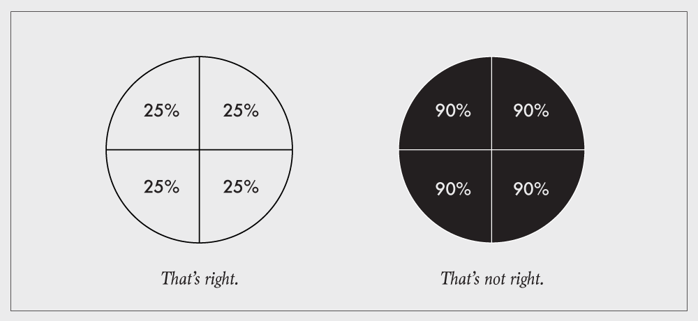
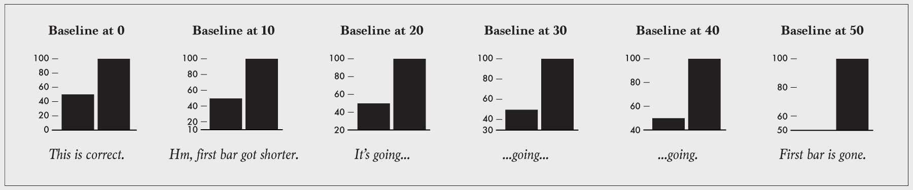
For example, look at the graphic above. The first bar chart on the left compares 50 and 100, and it has a zero-baseline. Good. The bar that represents 100 is twice the length of the bar that represents 50, because 100 is twice the magnitude of 50.

But when you shift the baseline to a higher, non-zero value, the length of the first bar decreases. The length of the other stays the same. The 100-value bar is no longer twice the length of the 50-value bar. Keep on going, and the left bar disappears completely, suggesting that 100 is infinitely greater than 50.

A bar chart's baseline must start at zero.

Example

This bar chart comes courtesy of Fox News:

Fox News bar chart

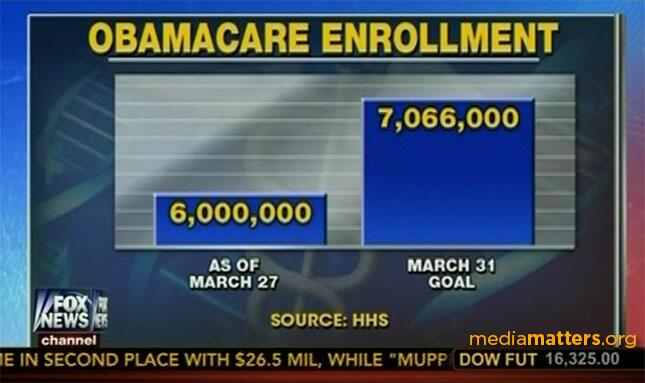
The March 31 goal of 7,066,000 is 17.8% greater than 6,000,000, but the second bar is almost three times the length of the first.

One might argue that the focus is on the difference of the two values rather than on the two values themselves. Even so, a bar chart would be the wrong choice. A time series that shows a monthly cumulative would likely be better.
 

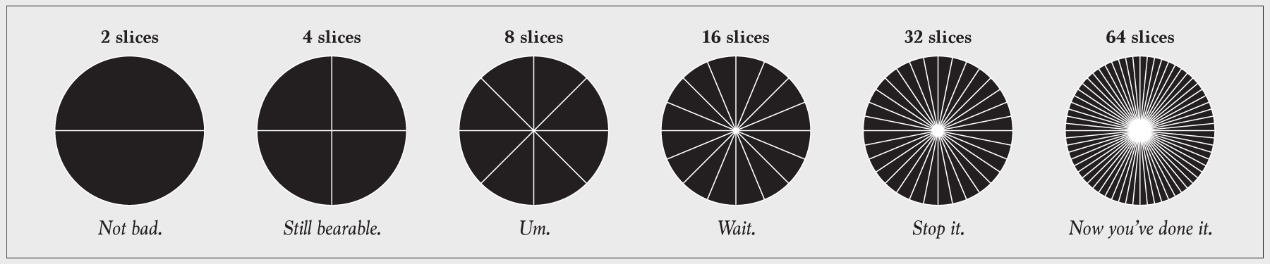
Don't go overboard with pie slices

Some say to avoid pie charts completely. Maybe they're right, and maybe not. Some might argue that pie chart usage in itself is an unforgivable violation. I would argue against that. In any case, the fact is that people use them regardless, so we can at least push for correct usage.

Avoid using too many slices, because it eventually becomes unreadable.

Pies!

What is "too many" slices though? That's a judgement call, but if it's hard to tell that one slice represents twice the value as another or smaller slices start to look the same, it's time to scale back. Consider clumping the smaller categories into a larger "Other" group. The same goes for donut charts.

Also consider using a different chart type to show proportions.

Just don't go overboard with pie slices.
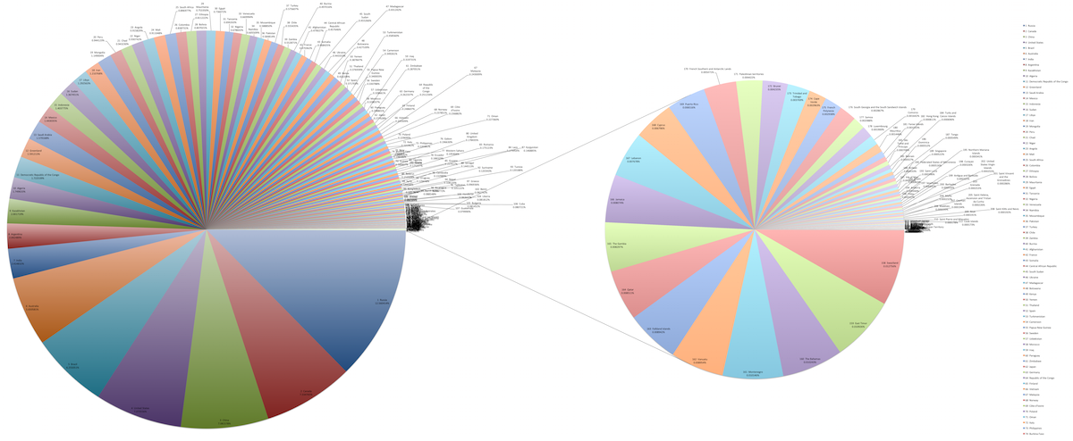
Example

This set of pie charts comes by way of Wikipedia, and it shows the areas of countries.

Pie chart of countries by area

The chart on the left already has a lot of slices, but then there's a breakout pie chart for smaller countries that provides even more. There are a lot of ways to go about showing this data, such as a treemap, properly scaled symbols, or just a regular map. The meager pie chart just isn't built for datasets that are more than a handful of values.
 

Respect the parts of a whole

Charts that represent parts of a whole should be used to show data that represents parts of a whole. This includes stacked bar charts, stacked area graphs, treemaps, mosaic plots, donut charts, and pie charts. Each section in these charts represents a separate, non-overlapping proportion.

Pie proportions deserve respect too

The most common occurrence of this violation is when a survey question allows for more than one answer. For example: "What mode of transportation have you used in the last week? Check all that apply." Account for the overlap, where people select more than one answer, or you can't chart the proportions straight up.

Example

This pie chart, courtesy of a Fox News affiliate, shows three percentages that aren't parts of the same whole:

Instead, each value is a standalone percentage out of 100, so three stacked bars (or regular bars) would be more useful in this case.
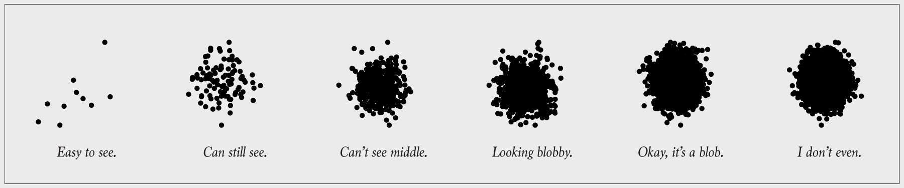
 

Show the data

This is the point of visualization. If you don't show the data, it defeats the purpose of the chart. This often happens when you show too much data at once, and you obscure the area of interest.

So many dots

This is a classic over-plotting problem, and there's plenty of research on the topic. But for your basic charts, there are a few simple solutions.

Change symbol sizes so that each dot (or whatever else) doesn't take up as much space. You're basically trying to increase white space.

Use transparency so that symbols still appear when another is placed on top.

Break up the population into subgroups either by sampling or using actual categories in the data. From there, you can go the small multiple route so that there are fewer points per chart.

Aggregate the data into bins.

In summary: Show the data.

Example

Here's a chart for every shot the Golden State Warriors took during the 2008-09 season.

Symbols

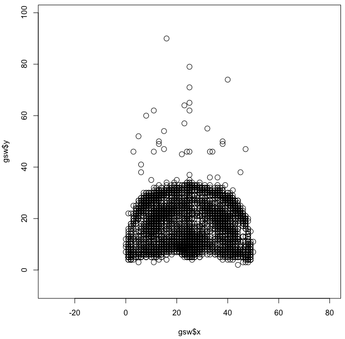
You end up with the shape of a court and a slight idea of where players shot the most — close to the basket, mid-range, and three-point. But the difference is subtle and you can't see the true magnitude of the differences. Aggregation would help.
 

Explain encodings

When you "show the data", you encode it to shapes, colors, and geometries. For that to work though, you and others need to be able decode back to the values. The classic example is unlabeled axes.

Label axes

Sometimes encodings don't need to be explained. For example, your audience likely knows how to read a bar chart, so you don't have to explain that bar length represents values. But you do need to explain the data, namely the units and the subject at hand.

So label your axes. Provide a key or legend. Explain encodings.

Example

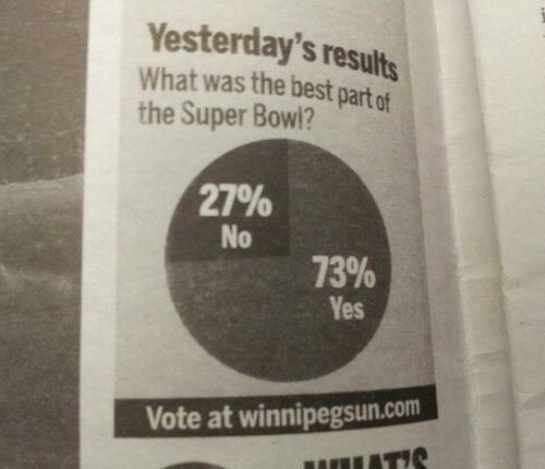
This mislabeled comes courtesy of the Winnipeg Sun:

Super Bowl Poll

If only we knew what the real question was.
 

Wrapping up

There you have it. At the end of the day—to make sure you don't break the most basic of visualization rules—it's all about understanding the encodings. If you understand how data translates to geometry, you can make your own things and establish your own visualization types. But when it comes to specific chart types that are meant to be read in a specific way, there's little to no leeway.

In summary: Learn data encodings. Then figure out the difference between a suggestion and a rule.

Tags: ,

Changing price of food items and horizon graphs

I've been messing with horizon graphs to look at patterns over time. Software company Panopticon, now called Datawatch, devised them back in 2008, but you never see them used — probably because no one knows how to read them. The chart type is actually quite nice though, once you get the hang of it.

Below shows the percentage change in price for select food items, since 1990. Estimates are from the Bureau of Labor Statistics and adjusted for inflation (of course).

Cost Horizon

It kind of reads like a heatmap over time. Darker colors represent higher absolute values. But you also get the extra layer of information with the filled trend lines.

However, you have to start from the beginning to really understand what's going on here.

Start with a standard time series line. The one below shows the increasing price of bacon relative to the price in 1990. I removed axis labels and grid lines for the sake of simplicity.

Bacon line

Now split the data up into bands using a uniform interval. Color based on how far above or below they are from the zero axis. Higher absolute values mean more intense shades of color, and a diverging color scheme is used to separate positive and negative values.

Filled bacon line

Now this is the tricky part. Collapse the positive bands to the zero axis so that the higher bands layer on top. Then reflect the negative values to the positive side of the axis, and collapse those in the same manner. The filled bacon time series chart becomes a horizon graph that takes up much less space and shows the same data.

Bacon horizon

With that in mind, go back to the first group of charts. It works quite nice as an overview visualization. The increasing price of bacon, flour, bread, and potatoes is easy to pick out at a glance. The seasonal price of lemons is obvious too.

Here's what the same data looks like if you used only lines.

Cost lines

You can still find the same patterns, but you have to look a bit closer to find them. For me, all the lines blur together until I refocus to look at an individual series.

How do the horizon graphs compare in terms of clarity? There's some promise. The Berkeley Visualization Lab did some research a while back that suggests the same. I think it's going to be a while though before the horizon graph becomes part of the general public's visual vocabulary.

Tags: , ,

Bivariate choropleth how-to

Single to bivariate

Your standard choropleth map shows geographic areas colored by a single variable. You're reading this, so you've seen them before. What if you have two variables? Then maybe a bivariate choropleth map. Cartographer Joshua Stevens describes the method and how to make one in open-source mapping software QGIS.

Ideally, you should at least have a hunch two variables are related when creating bivariate choropleth maps. This is because bivariate maps go further than simply showing two variables all willy nilly: they show where those two variables tend to be in agreement or disagreement. If there is no expectation that the two variables might be related, a bivariate choropleth is not the right choice.

This is a story of two variables, three hues.

Tags: ,

Naked Statistics

Naked Statistics by Charles Wheelan promises a fun, non-boring introduction to statistics that doesn't leave you drifting off into space, thinking about anything that is not statistics. From the book description:

For those who slept through Stats 101, this book is a lifesaver. Wheelan strips away the arcane and technical details and focuses on the underlying intuition that drives statistical analysis. He clarifies key concepts such as inference, correlation, and regression analysis, reveals how biased or careless parties can manipulate or misrepresent data, and shows us how brilliant and creative researchers are exploiting the valuable data from natural experiments to tackle thorny questions.

Naked StatisticsThe first statistics course I took—not counting the dreadful high school stat class taught by the water polo coach—actually drew me in from the start. Plus, I needed to finish my dissertation, so I didn't pick it up when it came out last year.

I saw it in the library the other day though, so I checked it out. If anything, I could use a few more anecdotes to better describe statistics to people before they tell me how much they hated it.

Naked Statistics is pretty much what the description says. It's like your stat introduction course with much less math, which is good for those interested in poking at data but well, slept through Stat 101 and have an irrational fear of numbers. You get important concepts and plenty of reasons why they're worth knowing. Most importantly, it gives you a statistical way to think about data, flaws and all. Wheelan also has a fun writing style that makes this an entertaining read.

For those who are familiar with inference, correlation, and regression, the book will be too basic. It's not enough just for the anecdotes. However, for anyone with less than a bachelor's degree (or equivalent) in statistics who wants to know more about analyzing data, this book should be right up your alley.

Keep in mind though that this only gets you part way to understanding your data. Naked Statistics is beginning concepts. Putting statistics into practice is the next step.

Personally, I skimmed through a good portion of the book, as I'm familiar with the material. I did however read a chapter out loud while taking care of my son. He might not be able to crawl yet, but I'm hoping to ooze some knowledge in through osmosis.