Money distribution for streaming music

From the listener perspective, we pay our monthly or annual fees and just turn on our music streams. The path those fees take from our wallet to musicians is less straightforward. For The Pudding, Elio Quinton does a good job of visually explaining where the money goes (and some of the better ways you can support artists).

Tags: , , ,

Price increases people have noticed

Inflation is high. For NYT’s The Upshot, Emily Badger, Aatish Bhatia and Quoctrung Bui busted out the word cloud to show the price increases people noticed in February. As you might expect, the things that people purchase more often appear higher on the list, because the changes are easier to track.

Tags: , ,

Billionaire tax rates

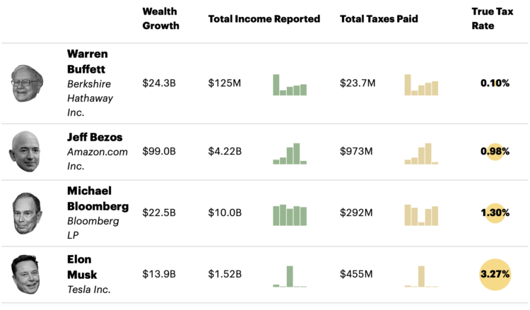
ProPublica anonymously obtained billionaires’ tax returns. Combining the data with Forbes’ billionaire wealth estimates, ProPublica calculated a “true tax rate” for America’s 25 richest people:

The results are stark. According to Forbes, those 25 people saw their worth rise a collective $401 billion from 2014 to 2018. They paid a total of $13.6 billion in federal income taxes in those five years, the IRS data shows. That’s a staggering sum, but it amounts to a true tax rate of only 3.4%.

It’s a completely different picture for middle-class Americans, for example, wage earners in their early 40s who have amassed a typical amount of wealth for people their age. From 2014 to 2018, such households saw their net worth expand by about $65,000 after taxes on average, mostly due to the rise in value of their homes. But because the vast bulk of their earnings were salaries, their tax bills were almost as much, nearly $62,000, over that five-year period.

As you might guess, a lot of the disparity has to do with wealth held in unrealized capital gains. The other part is how the ultrawealthy still pay for everything when most of their money is in investments and how that factors into deductions.

Tags: , , ,

Money-in-politics nonprofits merge their datasets

Center for Responsive Politics and National Institute on Money in Politics are merging their datasets to make it more accessible:

The nation’s two leading money-in-politics data organizations have joined forces to help Americans hold their leaders accountable at the federal and state levels, they said today.

The combined organization, OpenSecrets, merges the Center for Responsive Politics (CRP) and the National Institute on Money in Politics (NIMP), each leading entities for three decades. The merger will provide a new one-stop shop for integrated federal, state and local data on campaign finance, lobbying and more, that is both unprecedented and easy to use.

Good. More important than ever.

Tags: , , ,

Tooth Fairy Exchange Rate

Calculating how much money a kid gets after exchanging all twenty baby teeth. Read More

Not so likely life of The Simpsons

For The Atlantic, Dani Alexis Ryskamp compares the financials of The Simpsons against present day medians, arguing that the fictional family’s lifestyle is no longer attainable:

The purchasing power of Homer’s paycheck, moreover, has shrunk dramatically. The median house costs 2.4 times what it did in the mid-’90s. Health-care expenses for one person are three times what they were 25 years ago. The median tuition for a four-year college is 1.8 times what it was then. In today’s world, Marge would have to get a job too. But even then, they would struggle. Inflation and stagnant wages have led to a rise in two-income households, but to an erosion of economic stability for the people who occupy them.

Someone should take this a step further and look at distributions and time series to show the shift, with The Simpsons as baseline.

Tags: , , , ,

Who Makes More Money

Someone mentioned that $400,000+ per year was commonplace in American households. That seemed like an odd comment, so here’s a chart that shows what percentage of households make at least a certain amount.


Less than two percent of households made at least $400,000 in 2018. So… not very common. I’m not sure what that person was thinking.

Tags:

A million dollars vs. a billion visualized with a road trip

A million dollars. A billion dollars. The latter is 1,000 times more than the former. Just add a few zeros, right? Tom Scott used a road trip to visualize the actual difference in scale.

Scott starts by setting the baseline of a million dollars with a short, one-minute walk. Stack one million dollar bills after the other and it’s about the length of a football field. Stack one billion, and he has to drive for an hour.

Oh scale, you are a tricky thing.

It reminds me of the scaled solar system a few years ago. Earth was sized as a marble, and distance and the size of everything else was scaled accordingly.

Tags: , , ,

Data on loans issued through the Paycheck Protection Program

The Paycheck Protection Program was established to provide aid to small businesses. It’s a $669-billion loan program. The data for 4.8 million loans, amounting to $521 billion so far, is now available from the Small Business Administration.

For loans less than $150,000, you can download data for all states individually. Data for loans that were more than $150,000 can be downloaded as a single file. Look up business name, type, address, and loan amount range, among several other fields.

Seems like it’s worth a closer look.

Update: The Washington Post made a search interface for the dataset.

Tags: , , ,