We recently received a comment from a panelist (paraphrasing): how likely are good proposals to get funded? We’ve previously discussed differences between the funding rates we report directly to you from panels and the NSF-wide success rate numbers reported on our website. But the commenter was interested in an even more nuanced question: to what extent do award decisions follow the outcomes of merit review? This is a great topic for a post and, thanks to our Committee of Visitors review last year, we already have the relevant data compiled. (So this is really the perfect data-rich but quick post for panel season.)
To address this question, we need to first define what a “good proposal” is.
In our two-stage annual cycle, each project must pass through review at least twice before being awarded: once as a preliminary proposal, and once as an invited full proposal.
At each stage, review progresses in three steps:
- Three individual panelists independently read, review, and score each proposal prior to the panel. A single DEB panelist is responsible for reviewing an assigned subset of all proposals at the panel. This is the same for preliminary proposals and full proposals. Full proposals also receive several non-panelist “ad hoc” reviews prior to the panel.
- The proposal is brought to panel where the panelists discuss the proposal and individual reviews in relation to each other and in the context of the rest of the proposals in the panel to reach a consensus recommendation. This is the same for preliminary proposals and full proposals.
- The Program Officers managing the program take into consideration the reviews, the recommendations of the panel(s) that assessed the proposal, and their portfolio management responsibilities to arrive at a final recommendation. This is the same for preliminary proposals and full proposals.
In this case, since we are discussing the Program’s actions after peer review, we are defining as “good” anything that received a positive consensus panel recommendation. Initially, the label of “good” will be applied by the preliminary proposal panel. Then, at the full proposal panel it will receive a second label, which may or may not also be “good”. A “good” recommendation for either preliminary or full proposals includes any proposal not placed into the lowest (explicitly negative) rating category. The lowest category usually has the word “not” in it, as in “Do Not Invite” or “Not Fundable”. All other categories are considered “good” recommendations, whether there is a single positive category (e.g., “Invite”) or several ordinal options conveying varying degrees of enthusiasm (e.g., “high priority”, “medium priority”, “low priority”).
To enable this analysis, we traced the individual review scores, panel review recommendations, and outcomes for proposals from the first three years of the DEB preliminary proposal system (i.e., starting with preliminary proposals from January 2012 through full proposals from August 2014).
As we’ve reported previously, preliminary proposal invitation rates are between 20% and 30%, and between 20% and 30% of invited full proposals are funded, leading to end-to-end funding rates around 7%. But, as our commenter noted, that obscures a lot of information and your individual mileage will vary. So…
How likely are “good” proposals to get funded?
In the table below, you can see the overall invitation rate for preliminary proposals is 23%, but it looks very different depending on how well it performed in the panel[i].
| Preliminary Proposal Outcomes by Panel Recommendation |
% of Proposals Receiving Rating |
Pre-Proposal Outcome |
| Not Invited |
Invited |
Invite Rate |
| Pre-Proposal Panel Rating |
High (Good) |
19% |
22 |
879 |
98% |
| Low (Good) |
5% |
100 |
141 |
59% |
| Do Not Invite |
76% |
3597 |
74 |
2% |
| Total |
100% |
3719 |
1094 |
23% |
This stage is a major winnowing of projects. On the one hand, we tend toward inviting most of that which is recommended by the panel. On the other hand, for the majority of preliminary proposals that aren’t well-rated (so falling outside our working definition of “good”), it is highly unlikely it will see the full proposal stage. There is a low, 2%, Invite rate for proposals that the panels recommended as Do Not Invite. This is a measure of the extent to which program officers disagree with panelists and choose to take a chance on a particular idea or PI, based on their own knowledge of submission history and portfolio balance issues.
From these invitations, the programs receive full proposals. After review, programs award approximately 25% of the full proposals, but again the outcome is strongly influenced by the panel ratings.
| Full Proposal Outcomes by Panel Recommendation |
% of Proposals Receiving Rating |
Full Proposal Outcome |
| Declined |
Awarded |
Funding Rate |
| Full Proposal Panel Rating |
High (Good) |
17% |
30 |
122 |
80% |
| Medium (Good) |
23% |
115 |
98 |
46% |
| Low (Good) |
21% |
165 |
21 |
11% |
| Not Competitive |
39% |
349 |
7 |
2% |
| Total |
100% |
659 |
248 |
27% |
Program Officers are faced with a greater responsibility for decision-making at the full proposal stage. Whereas, preliminary proposal panels only gave the nod (High or Low positive recommendations) to ~23% of submissions, full proposal panels put 551 of 907 proposals into “fundable” categories (Low, Medium, or High). Since this is more than twice as many as the programs could actually fund,[ii] the work of interpreting individual reviews, panel summaries, and accounting for portfolio balance plays a greater role in making the final cut. Also note, that these are the cumulative results of three years of decision-making by four independently managed program clusters, so “divide by 12” to get a sense of how common any result is for a specific program per year.
Ultimately, the full proposal panel rating is the major influence on an individual proposal’s likelihood of funding and the hierarchy of “fundable” bins guides these decisions:
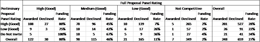
Success rates of DEB full proposals when categorized by preliminary proposal and full proposal panel recommendations.
While funding decisions mostly ignore the preliminary proposal ratings, readers may notice an apparent “bonus” effect in the funding rate for “Do Not Invite” preliminary proposals that wind up in fundable full proposal categories. For example, of 15 preliminary proposals that were rated “Do Not Invite” but were invited and received a “Medium” rating at the full proposal stage, 10 (67%) were funded compared to 45% and 42% funding for Medium-rated full proposals that preliminary proposal panelists rated as High or Low priority, respectively. However, this is a sample size issue. Overall the numbers of Awarded and Declined full proposals are not associated with the preliminary proposal recommendation (Chi-Square = 2.90, p = 0.235).
Does Preliminary Proposal rating predict Full Proposal rating?
This is a difficult question to answer since there is nothing solid to compare against.
We don’t have a representative set of non-invited full proposals that we can compare to say “yes, these do fare better, the same as, or worse than the proposals that were rated highly” when it comes to the review ratings. What we do have is the set of “Low” preliminary proposals that were invited, and the small set of “Do Not Invite” preliminary proposals that were invited by the Program Officers against the panel recommendations. However, these groups are confounded by the decision process: these invites were purposely selected because the Program Officers thought they would be competitive at the full proposal stage. They are ideas we thought the panels missed or selected for portfolio balance; therefore, they are not representative of the entire set of preliminary proposals for which the panels recommended Low or Do Not Invite.
| Distribution of Full Proposal Panel Ratings versus Preliminary Proposal Ratings |
# Recvd As Full Proposals |
Full Proposal Panel Rating |
| High |
Medium |
Low |
Not Competitive |
| Pre-Proposal Panel Rating |
High |
728 |
19% |
24% |
20% |
37% |
| Low |
117 |
10% |
21% |
20% |
50% |
| Do Not Invite |
62 |
8% |
24% |
23% |
45% |
So, given the active attempts to pick the best proposals out of those in the “Low” and “Do Not Invite” preliminary proposal categories, those which had been invited based on “High” ratings were twice as likely to wind up in the “High” category at the full proposal stage than those that had been invited from Low or Do Not Invite preliminary proposal categories. And, those invited from the Low or Do Not Invite categories were somewhat more likely to wind up in Not Competitive. Moreover, the score data presented below provides additional evidence that suggests this process is, in fact, selecting the best proposals.
What do individual review scores say about the outcomes and different panel ratings?
We expect the full proposal review stage to be a more challenging experience than the preliminary proposal stage because most of the clearly non-competitive proposals have already been screened out. Because of this, full proposals should present a tighter grouping of reviewer scores than preliminary proposals. The distribution of average proposal scores across the two stages is shown below. We converted the “P/F/G/V/E” individual review scores to a numerical scale from P=1 to E=5, with split scores as the average of the two letters (e.g., V/G = 3.5). As a reminder, the individual reviewer scores are sent in prior to the panel, without access to other reviewers’ opinions and having access to a relatively small number of proposals. So the average rating (and spread of individual scores for a proposal) is mostly a starting point for discussion and not the end-result of the review[iii].

The preliminary proposal scores are distributed across the entire spectrum, with the average review scores for most in the 3 to 4 range (a Good to Very Good rating). That we don’t see much in the way of scores below 2 might suggest pre-selection on the part of applicants or rating inflation by reviewers. Invitations (and high panel ratings) typically go to preliminary proposals with average scores above Very Good (4). Only a few invitations are sent out for proposals between Very Good and Good or lower.
The average scores for full proposals are more evenly distributed than the preliminary proposal scores with a mean and median around Very Good. The eventual awards draw heavily from the Very Good to Excellent score range and none were lower than an average of Very Good/Good. And, while some full proposals necessarily performed worse than they did at the preliminary proposal stage, there are still roughly twice as many full proposals with average scores above Very Good than the total number of awards made, so there is no dearth of high performing options for award-making.
So, what scores correspond to different panel ratings?
| Average Review Score of Invited Full Proposals by Panel Recommendation |
Full Proposal Panel Rating |
| High |
Medium |
Low |
Not Competitive |
Overall |
| Pre-Proposal Panel Rating |
High |
4.41 |
4.08 |
3.76 |
3.53 |
3.88 |
| Low |
4.32 |
4.13 |
3.88 |
3.52 |
3.81 |
| Do Not Invite |
4.42 |
4.00 |
3.75 |
3.44 |
3.73 |
| Overall |
4.40 |
4.08 |
3.78 |
3.53 |
3.87 |
There’s virtually no difference in average full proposal scores among groups of proposals that received different preliminary proposal panel ratings (rows, above). This further supports the notion that the full proposals are being assessed without bias based on the preliminary proposal outcomes (which are available to full proposal panelists after individual reviews are written). There is approximately a whole letter score difference between the average scores of full proposals (columns) from highly rated full proposals (E/V) to Not Competitive Full proposals (V/G). The average score for each rating is distinct.
About the Data:
The dataset used in this analysis was originally prepared for the June 2015 DEB Committee of Visitors meeting. We traced the review outcomes of preliminary proposals and subsequent full proposals over the first 3 cycles of proposal review. This dataset included the majority of proposals that have gone through the 2-stage review in DEB, but is not a complete record because preliminary proposal records are only tied to full proposals if this connection is successfully made by the PI at the time of full proposal submission. We discussed some of the difficulties in making this connection on DEBrief in the post titled “DEB Numbers: Per-person success rate in DEB”.
There are 4840 preliminary proposal records in this dataset; 1115 received invitations to submit full proposals. Of those 1115, 928 (83%) submitted full proposals and successfully identified their preliminary proposal. Full proposal records are lacking for the remaining 187 invitees; this is combination of 1) records missing necessary links and 2) ~a few dozen invitations that were never used within the window of this analysis. For full proposal calculations, we considered only those proposals that had links and had been processed to a final decision point as of June 2015 (907 records) when the data was captured.
The records followed the lead proposal of collaborative groups/projects in order to maintain a 1 to 1 relationship of all records across preliminary and full proposal stages and avoid counting duplications of review data. The dataset did not include full proposals that were reviewed alongside invited proposals but submitted under other mechanisms that bypass the preliminary proposal stage such as CAREER, OPUS, and RCN.
Data Cleaning: Panel recommendations are not required to conform to a standard format, and the choice of labels, number of options, and exact wording vary from program to program and has changed over time in DEB. To facilitate analysis, the various terms have been matched onto a 4-level scale (High/Medium/Low/Not Invite (or Not Competitive)), which was the widest scale used by any panel in the dataset; any binary values were matched to the top and bottom of the scale. Where a proposal was co-reviewed in 2 or more panels, the most positive panel rating was used for this analysis.
[i] Cases where the highly recommended preliminary proposal was Not Invited were typically because the project received funding (either we were still waiting on our budget from the prior year and the PI re-submitted, or the same work was picked up by another funding source). So, the effective invite rate for “high priority” recommendations is ~100%. The middle “Low” priority rating was used in only a limited set of preproposal panels in the first years of preproposals; at this point, all DEB preproposal panels used two-level “Invite or Do Not Invite” recommendations.
[ii] 248 is less than what we actually funded from the full proposal panels: when CAREER, OPUS, RCN, and proposals that were not correctly linked to preproposal data are accounted for, we’re a bit over 300 core program projects awarded in FYs 2013, 2014 and 2015: 100 new projects/year.
[iii] If the program were to be purely conservative and follow the scoring exactly in making award decisions, there would have been no awards with an average score below 4.2 (Very Good+) and even then half of the proposals that averaged Very Good (4) or better would go unfunded.


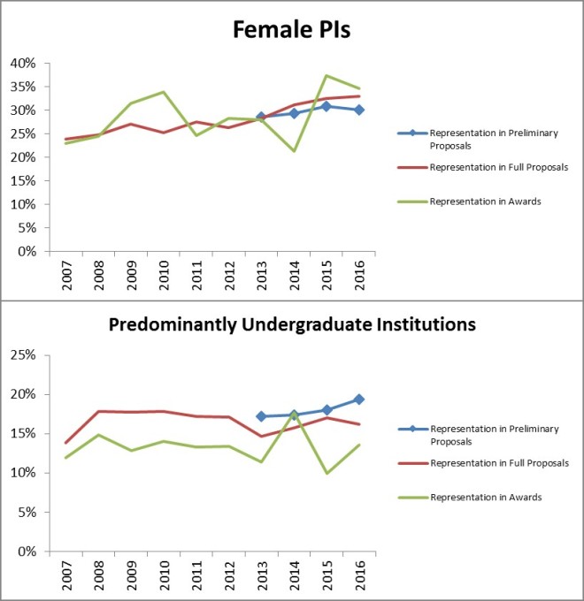


 While the proportion of single investigator preliminary proposals declined slightly, there was no decrease when it came to either full proposals or awards. As a reminder to readers: most of the apparent increase in the proportion of single investigator projects between the preliminary proposal and full proposal stages is because the primarily single-investigator proposals in the CAREER and OPUS categories are not subject to the preliminary proposal screen and thus they make up a relatively larger portion of the full proposals. Similarly, the absence of CAREER and OPUS proposals at the preliminary proposal stage depresses the single investigator proportion of the preliminary proposal counts relative to the historical full proposal baseline.
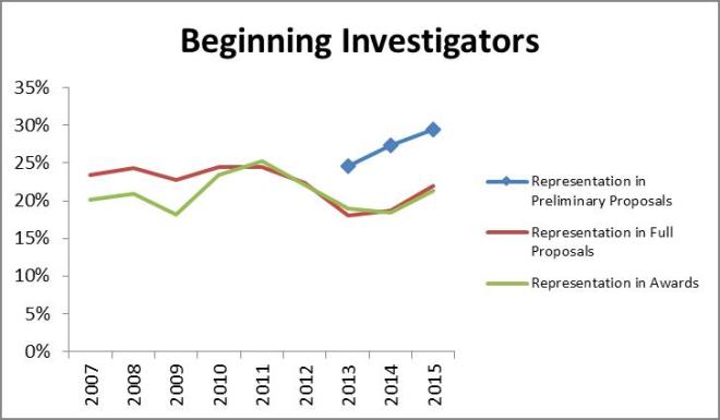 According to the classification form data, beginning investigators continue to receive awards in proportion to full proposal submissions but consistently represent a smaller segment of the proposal pool at these later stages than at the preliminary proposal stage
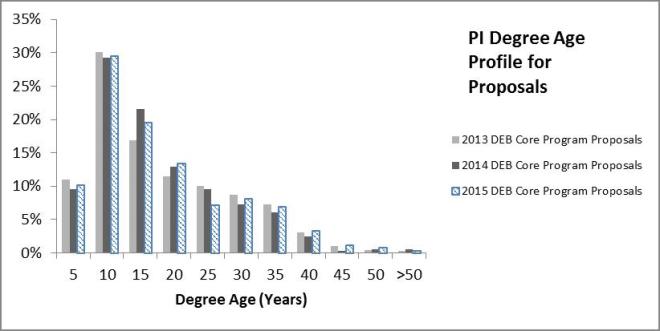
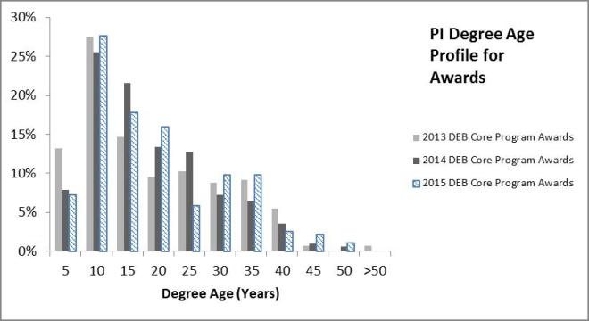
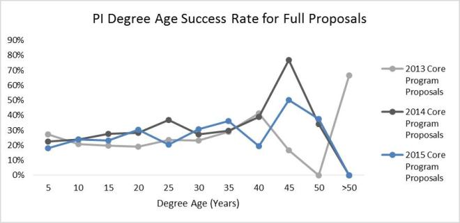 Little changed in the profile of submitter and awardee degree ages from 2013 through 2015. Success rate does not improve markedly with degree age and generally stays between 20-30% up through 35 years post PhD. PIs more than 35 years post-PhD are typically less than 5% of the total PIs on proposals and awards: too few in number to read much into the data. Early-, mid-, and later-career PIs appear to be faring equally well in core program award decisions.