Burger Place Geography

Nearest Burger

After looking at pizza places, coffee, and grocery stores, I had to look at burger chains across the country. The data was just sitting there. (Thanks, AggData.)

As before, the map above shows the nearest burger chain out of the selected seven. I chugged along every twenty miles, checked within a 10-mile radius, and then colored each dot accordingly.

With pizza places you saw a lot of regionality despite the national coverage of Pizza Hut. You saw a lot of Domino's on the east, Little Caesar's in California, and Godfather's in the midwest. Similarly, with coffee, Dunkin' Donuts reigned in the east and Caribou is popular in the midwest.

However, more than a handful of burger chains cover the country somewhat evenly, which gets you this map that resembles sprinkles on a cupcake, save a couple areas of interest. In the Oklahoma and Arkansas areas Sonic Drive-in dominates, and Jack in the Box established itself well in California. We saw a similar geographic pattern in Stephen Von Worley's burger map a few years ago.

But still, McDonald's is sprinkled throughout, which shouldn't surprise since it has more than twice the locations than its nearest competitor Burger King. Keep in mind this includes all the Golden Arches in Wal-Marts, airports, and college food courts.

Because of this expansive burger coverage by McDonald's and the other major chains, it's more useful to look at the locations separately, shown below. I also included all the other chains with at least a hundred locations.

burgers

As you expect, it looks like population density in the beginning. Chains are gonna open where the people are. Once you get past Wendy's though, you start to see region-specific chains.

I'd say Dairy Queen is well-established nationally, but it's interesting to see a gap with Oklahoma, Arkansas, Mississippi, and Louisiana. Do the folks there not like Dairy Queen? Maybe Sonic has a stronghold on the states in an epic battle for burger supremacy. Or it's just a totally mundane reason like Dairy Queen started in Illinois, expanded east, and then saw growth opportunity in Texas.

In any case, the separation is more obvious when you look at just Dairy Queen versus a competitor like Sonic, using the same distance formula as the first map.

sonic-vs-dq

The rest of the chains kind of have their regional pockets: Whataburger in Texas, Checkers in Florida, and of course, In-N-Out in California.

Then there's all the local joints, which I didn't even touch on yet. I'll have to leave that for another day though. In case someone is interested, Yelp seems like a good place to start. I poked around the review data for a bit, and it was interesting that the local places almost always reigned review-wise, and profiles for chains basically serve as somewhere for people to complain.

Evolution and timelines


Any history can be represented as a timeline, but a timeline diagram does not necessarily show an evolutionary history. Unfortunately, this does not stop people from putting the word "evolution" on their timeline diagrams.

A timeline simply represents the timing of certain events. These events are presumably related in some way, but they do not necessarily refer to the history of a set of objects, or even concepts, as we might expect for an evolutionary history. Here is classic example of a perfectly valid timeline that refers to a disparate set of objects / concepts.


Apparently we are expected to infer from this timeline that McDonald's attitude to providing the public with information about the nutritional value of their fast-food products has changed over the decades. But the idea that this changed attitude might involve some sort of evolutionary process is stretching an analogy a bit too far. The timeline certainly represents a journey, as claimed, but not an evolutionary one.

For most members of the general public, "evolution" is a story of the transformation of some object or idea through time, with each stage replacing the previous one. This is a simple story with a beginning, a middle and (possibly) an end. The story can usually be presented as a timeline, of course, with each stage of the transformation arranged in the correct time order. For a biologist, this is a transformation series, representing "transformational evolution", which follows the history of a single lineage through time (ie. a history chain).

There are plenty of examples of this use of a timeline to represent transformational evolution. For instance, consider corporate logos, such as those of these two well-known beverage manufacturers. Each new logo replaced the previous one, thus providing an analogy to evolution of a single object.


The word "evolution" as used here is not one that a biologist would use, but many other people would do so. Bank notes in the USA show a similar phenomenon — in this case, the people involved appear to get younger through time! [The same thing happens on the $100 bill, as well.]


We can even take the idea of transformational evolution and use it for prediction, as was done by Takeshi Fukuda in 2002:


However, biologists do not see the evolution of organisms in this way, at all. For them, evolution is a process of variation, with lots of new forms appearing and some old ones disappearing. So, rather than an ordered series of forms, each one replacing the previous one through time, biologists see an increasing diversity of forms that is counter-acted by loss of forms (ie. extinction). This is "variational evolution" rather than transformational evolution.

Variational evolution is usually represented using a phylogeny, which will be a network or a tree, depending on the particular history, rather than a timeline chain. A phylogeny shows the relationships among a wide variety of objects, many of which will exist (or have existed) at the same time. There may have been replacement of some objects by others, but in general it is the diversity of objects existing at the same time that is of principal interest.

The issue here is that a timeline is a poor way of representing variational evolution. A timeline enforces a linear ordering of relationships, solely because "time's arrow" has one direction only. But a linear temporal order cannot reflect the complex evolutionary relationships among the objects.

Consider this example from McDonald's in Canada. There is a clear timeline here but it does not refer to transformational evolution — instead, it refers to variational evolution. These breakfast items have not necessarily replaced each other, and thus their evolutionary relationships are more complex than can be represented by a timeline.


Indeed, many of these breakfast items are still on the menu today, including: Egg McMuffin, Scrambled Eggs, Hash Browns, Hot Cakes and Sausage, Sausage McMuffin, Sausage McMuffin with Egg, Breakfast Burritos (Sausage), Bagel (Bacon, Egg Cheese, Steak, Egg Cheese), and the Fruit 'N Yoghurt Parfait.

Here is another seemingly simple image from McDonald's but with the same complexity problem — it is variational not transformational.


And finally, here is a much more complex history from Apple computers:


A timeline shows the timing of certain events, which do not necessarily involve replacement. It might be a useful way to represent transformational evolution, but it is a poor way to represent variational evolution. A phylogeny is much more appropriate.

Fast-food maps — a network analysis


Season's greetings!

For Christmas last year in this blog we had a Network analysis of McDonald's fast-food, in which I examined the food nutrient content of a well-known fast-food vendor. This year I continue the same theme, but expand it to cover an analysis of the geographical locations of various fast-food chains within the USA.

The US restaurant industry included about 550,000 restaurants in 2012 (SDBCNet). Technically, this food industry distinguishes different types of restaurant. The ones we are interested in here are called "quick service restaurants" (QSR), which includes what are known as fast-food and fast-casual restaurants. These are sometimes also called "limited service restaurants".

There are quite a few QSR companies in the USA, and each of them has quite a few locations. In 2012, there were apparently 313,000 fast-food and fast-casual restaurants (Yahoo Finance blog The Exchange), which is more than 50% of the total restaurants. In 2005, more than two-thirds of the largest 243 cities in the US had more fast-food chains than all other restaurant types combined (Zachary Neal).

The QSRs serve an estimated 50 million Americans daily (The Statistic Brain). Indeed, in a 2011 poll of people in 87 U.S. cities, there were several places where >30% of the people had visited QSRs 20+ times in the previous month (nearly once per day), while in all cities >80% of the people had visited at least once (Sandelman & Associates).
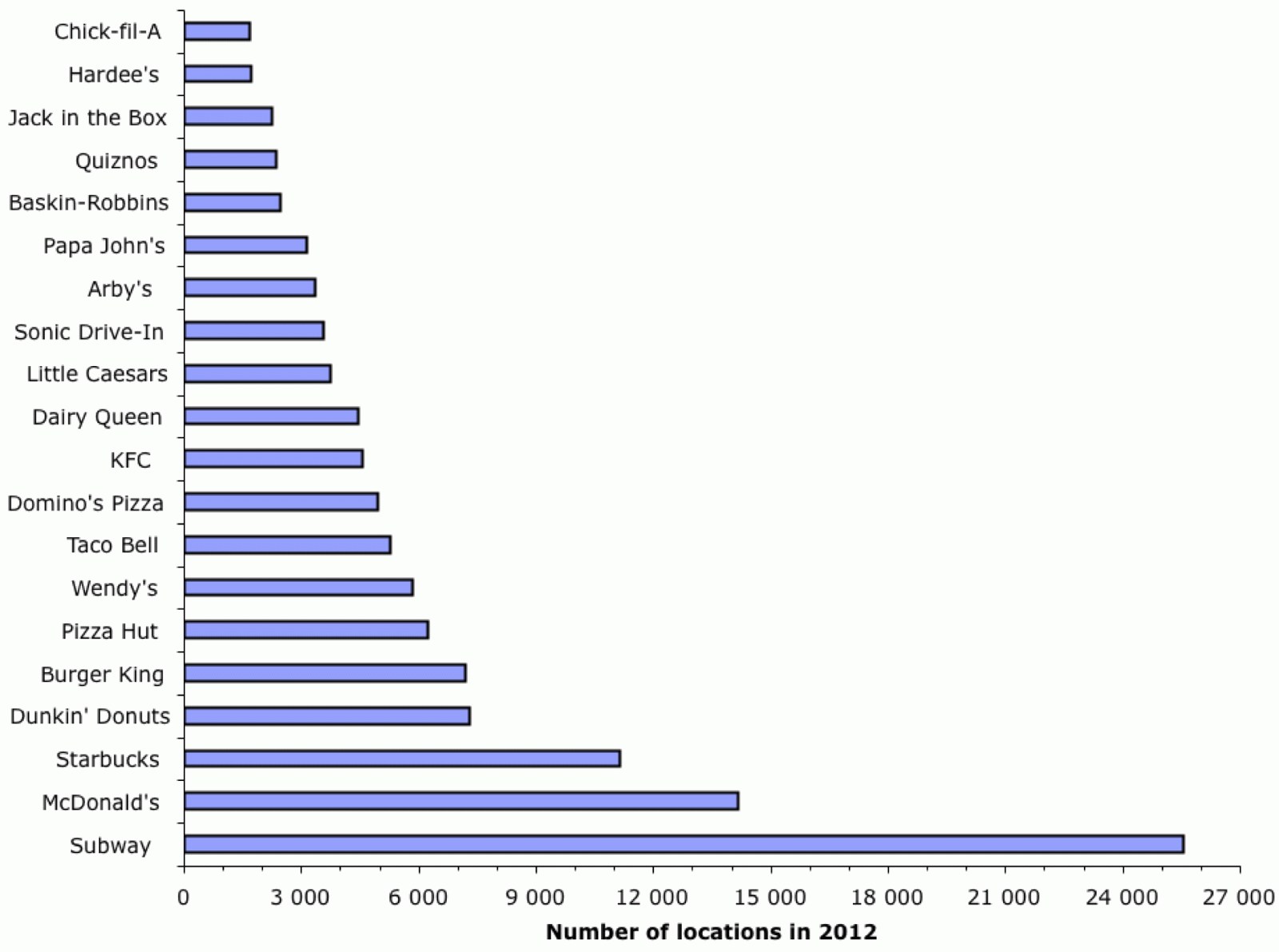


The QSR group reports that the national top 20 fast-food chains for 2012 were as shown in the first graph. This includes both company-owned units as well as franchised locations. Note that McDonald's had 34,480 restaurants in its worldwide system, with 14,157 of those being in the USA (The Exchange).

It is of interest to look at how this pattern has changed through time, and so I have taken the data from the QSR group's reports for 2003 to 2012, inclusive (these are the only ones available online). These data are for the number of locations of each of the top 50 chains each year in terms of dollar income. There are 61 chains that appear in the list for at least one of the years, but only 46 of these appeared often enough in the top 50 to be worth including in the analysis.

For this analysis, we can use a phylogenetic network. As usual, I have used the manhattan distance (on range-standardized data) and a neighbor-net network. The result is shown in the next figure. Fast-food chains that are closely connected in the network are similar to each other based on their restaurant numbers over the past decade, and those that are further apart are progressively more different from each other.


The network forms a simple chain from Subway (the biggest) through to the group of very similar-sized chains at the bottom-left. This indicatess that most of the restaurant chains have been fairly consistent in their relative sizes throughout the past decade (ie. the big stayed big and the small stayed small), although some chains have changed size. For example, KFC and Taco Bell have each shrunk by 15% since 2007, while Jack in the Box has expanded by 10%.

However, there is a large reticulation in the network involving Starbucks. This is caused by the fact that Starbucks started the decade as a much smaller chain than both Burger King and Pizza Hut, but it is now much larger than either of them. Similarly, there is another reticulation involving Cold Stone Creamery, which expanded rapidly in 2005 (increasing their number of locations by 50%).

The number of locations does not relate directly to dollar turnover, of course, as Subway has much smaller restaurants than do most of the other chains. In this respect, McDonald's leads the way by a considerable margin, with $35,600,000,000 in system-wide sales in the USA during 2012, versus $12,100,000,000 for Subway. This works out at $2,600,000 and $481,000 per restaurant per year, respectively. Starbucks comes in third, with $10,600,000,000 in 2012 ($1,223,000 per unit).

However, let's stick to the number of units, rather than the dollars, and consider their geographical locations. There are several datasets available on the internet that provide this information for different chains (which you actually could get yourself by visiting the homepage of each chain and asking for the location of each restaurant, one at a time!). If you are prepared to pay some money, then you can have the latest list from AggData; but I am not in that league.

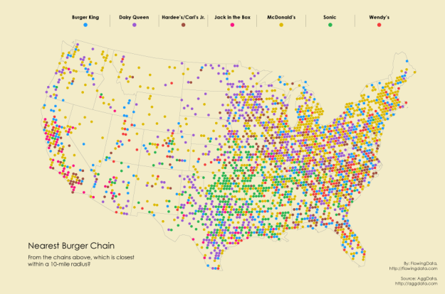
However, apparently the man at the Data Pointed blog is in that league, or was in 2010. His mapped version of the data for McDonald's (only) looks like this next figure (each dot represents one restaurant).


This has led him to contemplate the McFarthest Point, which is the point in the contiguous US states that is furthest from a McDonald's restaurant. He reckons that its map co-ordinates are: +41.94389, –119.54010. He has made an excursion to this spot (along with some fast-food), which you can read about in A Visit To The McFarthest Spot.

In turn, this caused the man at the Consumerist blog to contemplate the equivalent spot for Subway. This is currently estimated to be +42.397327, –117.956840 (Is This the Farthest Away You Can Get From a Subway in the Continental U.S.?).

Returning now to the data sources, you could also look at the data from the Food Environment Atlas (by Vince Breneman and Jessica Todd, of the USDA Economic Research Service). At the time of writing, this contains a Map with Fast-food restaurants / 1000 population for 2009, showing each individual county. This refers to the total number of units, summed across all fast food chains. A similar map is available at Business Insider, aggregated by state (but based on the 2008 data).

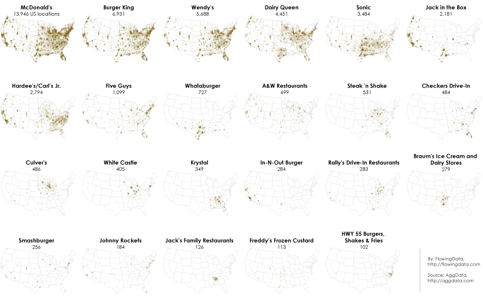
However, I cannot pay for the data, and I want the data separately for the different fast-food chains. That leads me to the Fast Food Maps by Ian Spiro. In 2007, he scraped the data from the web pages of various chains (as I noted above), and has made it available as a web page and an associated datafile.

He has included data for 10 of the fast-food chains, based on those present in the state of California. So, he covers only 8 out of the top 20 national chains: McDonald's, Burger King, Pizza Hut, Wendy's, Taco Bell, KFC, Jack in the Box, and Hardee's. To these, he adds Carl's Jr (mainly on the West Coast of the USA) and In-N-Out Burger (mainly in the South-West), which I did not include in my analysis.

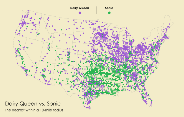
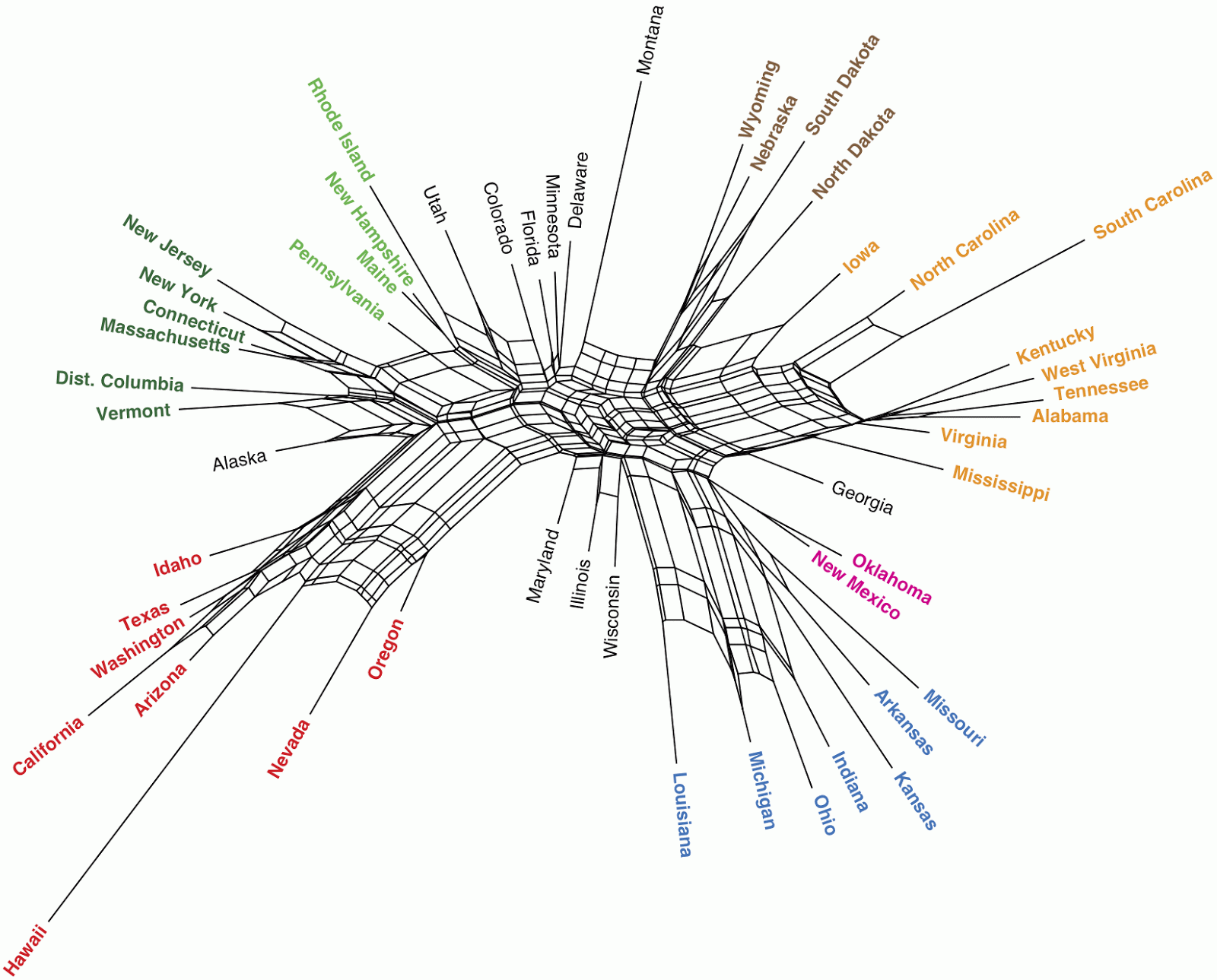
To analyze these data, I took the information for each chain in each state and divided this by the number of people in that state (to yield the number of restaurants per 100,000 people per chain per state). I then produced a phylogenetic network, as described above, and as shown in the next graph. States that are closely connected in the network are similar to each other based on the density of restaurants of each chain, and those that are further apart are progressively more different from each other. I have color-coded the states to highlight the similarities.


In the network, the states turn out to be arranged roughly geographically, with a few exceptions. In other words, neighboring states have similar densities of restaurants from certain fast-food chains.

For example, the red-colored states are from the West (including in the Pacific!), and they don't have Hardee's, but do have most of the Jack in the Box restaurants. The brown-colored states are from the North Centre, and these have the highest density of Burger King and Pizza Hut. Montana is separate from this grouping because it has a lower density of both Burger King and KFC.

The orange-colored states are from the Mid West and the South, and these have the highest density of Hardee's. Georgia is separate from this grouping because it has a lower density of Hardee's; and Florida is separate because it has a lower density of most chains. The blue-colored states are also from the Mid West, and these have the highest density of McDonald's and Wendy's. Illinois is separate because of a lower density of most chains (particularly KFC) except for McDonald's.

The dark-green-colored states are from the North East, and these don't have Hardee's, and they have the lowest density of Pizza Hut. The light-green-colored states are also from the North East, and these form a separate grouping because they have a higher density of most chains except McDonald's. Maryland is separate because it has an even higher density of most chains (particularly Hardee's); and Delaware has a higher density of Hardee's and Taco Bell.

Finally, Oklahoma and New Mexico have the highest density of KFC.

NB. For an interactive map showing the locations of the 507 Dunkin' Donuts, 269 Starbucks and 235 McDonald's in New York City (in October 2013), check out Mapping the Big Apple's Big Macs, Coffee, and Donuts. The concentration of Starbucks in downtown and midtown Manhattan is truly impressive. Indeed, 43% of the city's cafés are either Dunkin' Donuts or Starbucks (Coffee and Tea in New York City).

Conclusion

So, there you have it — fast-food is not randomly distributed in the USA. Where you live determines how much you have available of the different types. Indeed, as Pam Allison's Blog notes: "Although restaurants like McDonalds are very popular nationwide, they aren’t necessarily the most popular on a local level. In fact, there are only a handful of zip codes in the United States where McDonald's is the most popular. Rather, many local or regional chains are the more likely choice with consumers."

There are many other aspects to the geography of food, especially fast-food; but these can wait until a later blog post.

Is there good and bad fast-food?


Since the Christmas feast days are now over, this blog post continues the series on the nutritional characteristics of modern fast-food, which started with the Network analysis of McDonald's fast-food.

Men's Health magazine has produced a list of what it considers to be The 10 Worst Fast Food Meals in the USA. They chose one meal (usually a combination of several menu items) from each of ten different fast-food chains, which they considered to be extreme meals based on their nutritional characteristics. To counter-balance this list, they also chose another meal combination from each chain that they considered to be much "better for you".

For each of these 20 meals the magazine provided data on four of the nutritional characteristics: Calories, Fat, Saturated fat, and Sodium (salt). I have analyzed these data in the same manner as before: I standardized the data by expressing them as a percent of the officially recommended daily value based on a 2,000 calorie diet, then calculated a NeighborNet network based on manhattan distances.

The resulting network is shown in the figure. I have coloured the ten allegedly "better for you" meals alternately in green or blue, with all of the "worse for you" meals in black. Meals that are closely connected in the network are similar to each other based on their nutritional characteristics, and those that are further apart are progressively more different from each other.


Clearly, the "worst food" meals differ greatly from each others in their nutritional characteristics, while the other ten meals do not. In other words, there is a single clear concept of what is "good for you" but many different ideas about what is "bad for you" (or many ways in which the food can be unhealthy).

Furthermore, the "worst food" meals vary in their relationship to the better meals, with Long John Silver's Fish Combo Basket being rather similar to the better items, and both KFC's Half Spicy Crispy Chicken Meal and Burger King's Large Triple Whopper being at the extreme far end of the graph. Indeed, the "worst food" meals form a gradient of increasingly extreme nutritional characteristics: the calories, fat and saturated fat all increase from bottom to top in the network, and sodium increases from left to right.

The sodium change applies in the better meals, as well, with Quizno's Roadhouse Steak Sammies having more salt than the other nine meals in that group.

So, it seems to me that the fast-food chains are having a harder time creating unhealthy fish meals than they are creating unhealthy chicken and beef meals. However, this may just be lack of effort on their part, because the Tuna Melts with Cheetos meal is certainly pretty extreme.

Anyway, you now know which meals to target should you wish to send yourself into an early grave.

Network analysis of McDonald’s fast-food


Season's greetings: or as we say here in Sweden: God jul och gott nytt år! In many cultures, over-dosing on food is traditional at this time of year, so it is appropriate to have a food-related blog post this week. [Note there is a follow-up blog post called: Is there good and bad fast-food?]

In 1954 a multi-mixer salesman decided to check out the fast-food operation of a couple of brothers in California, named McDonald, and then offered to form a partnership with them. Nearly 60 years later, there are approximately 34,000 fast-food stores with this name worldwide, although there are very few in Africa, and I don't think they have any in Antarctica. This virus-like growth has been accompanied by negative comments on the nutritional quality of the food. Indeed, the international Slow Food organization, which cares very much about the traditional quality of food, was first formed to contest the opening of a McDonald's store near the historic Spanish Steps in Rome.

In a blog post amusingly entitled Infinite Mixture Models with Nonparametric Bayes and the Dirichlet Process, Edwin Chen looked at the nutritional content of the food provided by this culinary mega-chain. Another way to look these data is to use a phylogenetic network as a means of exploratory data analysis, which is what I provide here.

The data

The data are taken from the official document McDonald's USA Nutrition Facts for Popular Menu Items, dated 7 August 2012. The stated purpose of the document is this: "We provide a nutrition analysis of our menu items to help you balance your McDonald's meal with other foods you eat. Our goal is to provide you with the information you need to make sensible decisions about balance, variety and moderation in your diet." I presume that the data are accurate, at least on average for each menu item.

The data consist of measurements of 12 dietary characteristics for 82 of the menu food items available in the USA (excluding the drinks), not all of which are necessarily available in other countries. The data for each characteristic are listed as "% Daily Value" based on a 2,000 calorie diet, which thus standardizes the data to the same scale across all of the variables, thereby making them directly comparable. The characteristics are:
  • Calories
  • Total Fat
  • Saturated Fat
  • Carbohydrates
  • Cholesterol
  • Dietary Fiber
  • Protein
  • Sodium
  • Vitamin A
  • Vitamin C
  • Calcium
  • Iron
Sugar values are also listed in the original document, but there is no FDA recommended daily allowance available for sugar, and so these cannot be included in my analysis. The FDA argument is that we get enough calories out of the fat and protein that we eat, and so we don't actually need any extra sugar in our diet.

The analysis

I have analyzed these data using the manhattan distance and a neighbor-net network. The result is shown in the figure. Menu items that are closely connected in the network are similar to each other based on their dietary characteristics, and those that are further apart are progressively more different from each other.

Click to enlarge.

The network is basically a blob, with three side branches. The blob (with menu items labelled in black) represents what we could call "typical" McDonald's products, while the side-branches (with the labels in various colours) represent more extreme products, with either more or less of some of the measured characteristics. Basically, the menu items are increasingly "bad for you" at right and better for you at the very bottom.

I have numbered parts of the side-branches as 1–7 in the figure, and coloured the food names, to indicate various groups that are worth discussing. These groups can be described as follows:
  1. The dark red menu items to the right of (1) include the two Big Breakfast with Hotcakes, each of which provides 55% of your daily calorie needs (while most of the menu items to the left provide <40% each), and 40% of your iron requirements.
  2. The menu items to the right of (2) (in red or dark red) include all four of the Big Breakfasts, which each provide nearly 200% of the recommended daily intake of cholesterol (most of the other items provide < 90%), >60% of the total fat requirement, and >65% of your sodium needs (ie. salt).
  3. The items to the right of (3) (in orange, red or dark red) each provide >35% of your calorie needs and >60% of the total fat requirement, while those to the left provide less.
  4. The purple items below (4) include all of the menu items with added egg, and so these have the next highest cholesterol levels after the four Big Breakfasts, at 80-95% of your daily requirements (the other menu items have <50%).
  5. The four menu items to the left of (5) (in light green) are unique in containing >130% of your vitamin C needs, while the other items each provide <35%.
  6. The items to the left of (6) (in blue or light green) include all of the fruit-based items and potato-based items (fries, hash browns) plus the chicken nuggets and bites. These are distinguished by having relatively low values of several characteristics, including those that are bad for you (total fat, saturated fat, cholesterol, and sodium) and those that are good for you (protein and calcium).
  7. The green items below (7) include all nine of the Premium Salads (but not the Side Salad!). They each provide 160% of your vitamin A requirements (the other items each contain <20%), 25-35% of the vitamin C (most of the others contain <15%), and >15% of your dietary fiber.
The conclusions

This means that, for a healthy diet, you should steer well clear of the four "Big Breakfast" menu items, as they are very extreme even by McDonald's standards — you will need to take part in a great deal of strenuous exercise, to burn off their calories, cholesterol, fat and salt. The "Premium Salads", on the other hand, are extreme by having much less of these "bad for you" characteristics than is usual for McDonald's.

Unfortunately, while the the fruit concoctions (in light green and light blue) look good in the network, they also have more sugar (20-30 g each) than any of the other menu items (except the Cinnamon Melts), and therefore not everyone is a fan of them (eg. Mark Bittman; see also the MNN blog). Incidentally, it is also worth pointing out that fast-food in the USA is often much saltier than it is elsewhere in the world (see the article in Health magazine).

Finally, you might also like to compare the network locations of the menu items to William Harris' 10 Most Popular McDonald's Menu Items of All Time (not all of which have been included in my analysis):
  1. French Fries
  2. Big Mac
  3. Snack Wrap
  4. Happy Meal
  5. Egg McMuffin
  6. Apple Dippers and Baked Apple Pie
  7. Chicken McNuggets and Chicken Select Strips
  8. Premium Salads
  9. Double Cheeseburger
  10. McGriddles Breakfast Sandwich