✚ Chart Practice: Branch Out Beyond the Visual Bits

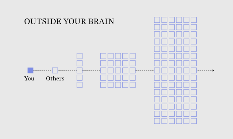
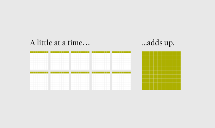
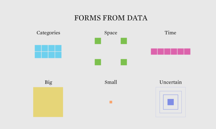
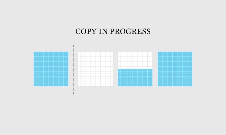
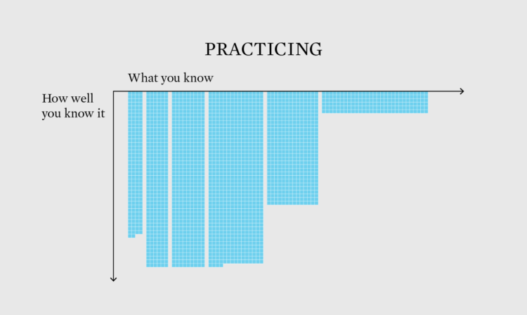
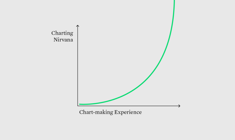
Welcome to The Process, where we look closer at how the charts get made. This is issue #244. I’m Nathan Yau, and this week we round up our series on practice with my favorite tip on getting better at visualization, which has little to do with visualization itself.

Become a member for access to this — plus tutorials, courses, and guides.

✚ Chart Practice: Changing the Audience

Welcome to The Process, where we look closer at how the charts get made. This is issue #243. I’m Nathan Yau, and after a short distraction with fake charts, we’re back on meaningful visualization practice. This week is about switching up your audience, because the charts you make and how you make them should adapt to who you make the charts for.

Become a member for access to this — plus tutorials, courses, and guides.

✚ Chart Practice: Feature Focus

Welcome to The Process, where we look closer at how the charts get made. This is issue #241. I’m Nathan Yau, and this week we continue with chart practice, this time focusing on the small things you can improve while still getting your work done.

Become a member for access to this — plus tutorials, courses, and guides.

✚ Chart Practice: Switching the Datasets

Welcome to The Process, where we look closer at how the charts get made. This is issue #239. I’m Nathan Yau, and this month is about what and how to practice visualizing data. Last week we went over mimicking others. This week we go over switching datasets to change up the forms we’re used to.

Become a member for access to this — plus tutorials, courses, and guides.

✚ Chart Practice: Mimicking Others

Welcome to The Process, where we look closer at how the charts get made. This is issue #238. I’m Nathan Yau, and last week was about practice. I quickly went through some ways you can add to your skillset, but let’s build on that for less hand-waving.

Become a member for access to this — plus tutorials, courses, and guides.

✚ Chart Practice

Welcome to The Process, where we look closer at how the charts get made. I’m Nathan Yau, and I’m remembering what it’s like to practice meaningfully.

Become a member for access to this — plus tutorials, courses, and guides.

One-Day Chart Challenge

The 30-Day Chart Challenge tasks you with a visualization prompt each day in April. I’ve wanted to do it the past couple of years, but my schedule doesn’t really fit with the daily-thing-for-thirty-days genre of challenges. So my genius idea was to compress the challenge into one day.

Read More

✚ Develop Your Judgement

Welcome to issue #197 of The Process, the newsletter for FlowingData members that looks closer at how the charts get made. I’m Nathan Yau, and this week I’m trusting my intuition over following the recipe for better results.

Become a member for access to this — plus tutorials, courses, and guides.

How practitioners learned data visualization

Visualization is still a relatively young field, so people learn about and how to visualize data in a lot of different ways. For instance, there weren’t any visualization-specific courses when I was in school, so I picked up a lot ad hoc. Alli Torban, looking at responses to the 2018 Data Visualization Survey, shows how others learned. The top three: examples, collaboration with those more skilled, and books.

Tags: ,

✚ Repetitions, Data Analysis as Brainstorm

Compelling visualization doesn't just conjure itself out of nowhere. The ideas come from somewhere, and oftentimes they build off previous ones. Read More