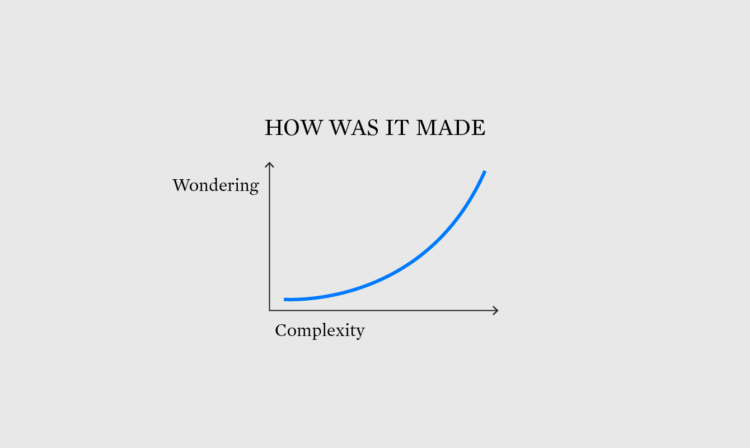
Welcome to The Process, the newsletter for FlowingData members that looks closer at how the charts get made. I’m Nathan Yau. This week’s topic comes through a FD reader who asks how I manage and organize data from analysis through visualization.
Become a member for access to this — plus tutorials, courses, and guides.