The power of wine and spirits brands in the marketplace


Commercial alcoholic beverages have all sorts of market characteristics, one of which is their ability to dominate their markets. This feature was investigated in a survey of the world’s leading drinks brands, published annually from 2006-2015 by the international company strategists Intangible Business. This was called The Power 100, in which each brand was given a power score, allowing them to be ranked.


Intangible Business apparently researched c. 10,000 spirit and wine brands across the globe, to assess both the financial contribution of each brand and its strength in the eyes of the consumer. To do this, they combined scores from a panel of drinks industry experts with global sales data (see Methodology, and Panelists). [Note: the resulting reports used to be housed at www.drinkspowerbrands.com, but this site disappeared in 2017, with 2015 as the final report.]

The Brand Score (out of 100) was produced by the panelists, who scored each brand for these eight characteristics (scale: 0–10):
  • Share of market: a volume-based measure of market share
  • Future Growth: projected growth based on 10 years of historical data plus future trends
  • Premium Price Positioning: a measure of the brand’s ability to command a premium
  • Market Scope: number of markets in which the brand has a significant presence
  • Brand Awareness: a combination of prompted and spontaneous awareness
  • Brand Relevancy: capacity to relate to the brand and a propensity to purchase
  • Brand Heritage: the brand’s longevity and a measure of how it is embedded in local culture
  • Brand Perception: loyalty, and how close a strong brand image is to a desire for ownership.
This Score was then turned into a Total Score (out of 100) by multiplying this by the brand's weighted sales volume. It was this Total Score that was used for the final Power list, with the top 100 being listed each year. However, I am not interested in this here — the Total Score is dominated by the sales volume, not by the Brand Score. The latter seems more interesting, so I will look at it here.

Across the 10 years, 141 brands appeared at least once, although only 68 (48%) of them appeared in all 10 surveys, with another 8 appearing in 9/10 years. That is, only half of the brands had any sustained Power. In the other cases, the brands either appeared in the early surveys only, or in the later surveys only — very few came and went from year to year (implying that they were just on the border of the top 100).

Network of the Brand Scores for 2015

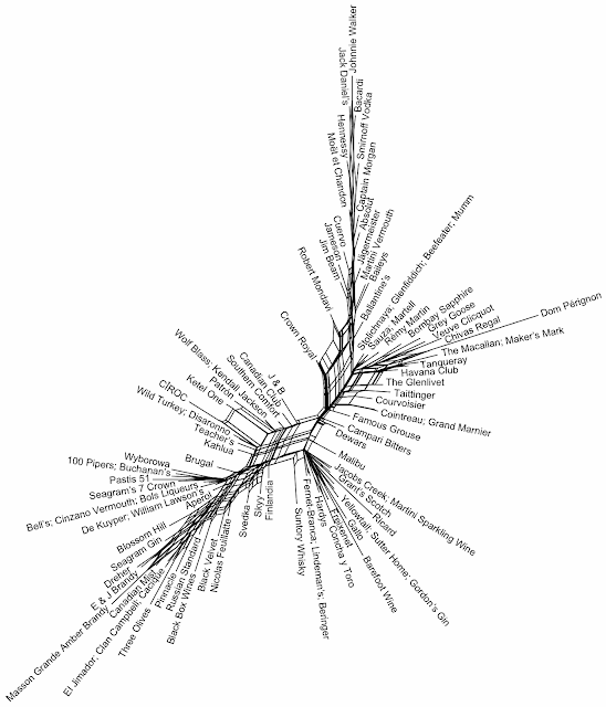
As usual in this blog, we can get a picture of the variation among brands by using a phylogenetic network, as a form of exploratory data analysis. For the first analysis, I calculated the similarity across the 8 Brand Score criteria using the Manhattan distance, based on those 100 brands that appeared in the final (2015) report. A Neighbor-net analysis was then used to display the between-year similarities, as shown in the graph above. Brands that are closely connected in the network are similar to each other based on their Brand Score, and those that are further apart are progressively more different from each other.

There is a general trend of high scores at the top of the network downwards to the bottom left. However, the network does not show a simple trend, such as is implied by the 1-dimensional ranking produced in the original Intangible Business report. That is, there is a complexity among the scores — it is possible for two brands to get the same Brand Score but to get it by scoring highly on quite different criteria. This illustrates the importance of using multi-dimensional summaries for exploratory data analysis — the patterns to be found may not be simple.

In this particular case, note that some brands, like Crown Royal and Dom Perignon, diverge greatly from the overall trend, indicating that they have unusual combinations of scores. Also, the two neighborhoods at the left and right of the network have different combinations from each other, although they end up with similar overall Brand Scores.

Network of the average Brand Scores across the 10 years

For the second analysis, I compared the different years. I calculated the Brand Score similarity across the 10 years using the Manhattan distance, based only on those 104 brands that appeared in at least 5 of the years. A Neighbor-net analysis was then used to display the between-year similarities, as shown in the second graph.

As you can see, in this case the network is as linear as you could expect, indicating that there is little more than 1 dimension of information to summarize. In this case, it basically shows a single rank-ordering of the Brand Scores averaged across the years (with the highest average score at the top of the network and the lowest at the bottom). So, in this case it is much simpler just to list the average Brand Scores in a table, rather than use the network (keep it simple!) — the network is being used to check whether there are more complex patterns, but not to display the pattern found.

This table is shown next, because it has never been listed before (none of the original reports compare all of the years). You can find your favorite brand, and check how "powerful" it has been in the maketplace, across time. Spirits do better than wines, but there is no consistency about which types of spirits do best.

Brand
Johnnie Walker
Bacardi
Hennessy
Jack Daniel's
Moët et Chandon
Smirnoff Vodka
Absolut
Dom Pérignon
Baileys
Veuve Clicquot
Chivas Regal
Captain Morgan
Cuervo
Martini Vermouth
Jameson
The Macallan
Ballantine's
Havana Club
Rémy Martin
Jägermeister
Maker's Mark
Glenfiddich
Martell
Jim Beam
Grey Goose
Bombay Sapphire
The Glenlivet
Concha y Toro
Robert Mondavi
Stolichnaya
Beefeater
Gordon's Gin
Courvoisier
Malibu
Tanqueray
Sauza
Crown Royal
Taittinger
Mumm
J & B
Patrón
Penfolds
Hardys
Cointreau
Freixenet
Gallo
Wolf Blass
Southern Comfort
Jacobs Creek
Campari Bitters
Famous Grouse
Torres
Grand Marnier
Canadian Club
Finlandia
Piper Heidsieck
Laurent Perrier
Beringer
Dewars
Kahlua
Martini Sparkling Wine
Yellowtail
Lindeman's
Svedka
Skyy
Wild Turkey
Grant's Scotch
Teacher's
Ketel One
De Kuyper
Kendall Jackson
Nicolas Feuillatte
Cutty Sark
Aperol
Disaronno
Ricard
Cinzano Vermouth
Russian Standard
Fernet-Branca
Bell's
Blossom Hill
Sutter Home
William Lawson's
Wyborowa
El Jimador
Bols Liqueurs
Eristoff
Clan Campbell
Seagram's 7 Crown
100 Pipers
Seagram Gin
Ramazzotti Amaro
Inglenook
Black Velvet
Three Olives
Seagram V.O.
Cacique
Metaxa
E & J Brandy
Canadian Mist
Dreher
Masson Grande Amber Brandy
Pastis 51
Moskowskaya
Category
Blended Scotch
Rum / Cane
Cognac
US Whiskey
Champagne
Vodka
Vodka
Champagne
Liqueurs
Champagne
Blended Scotch
Rum / Cane
Tequila
Light Aperitif
Blended Irish Whiskey
Malt Scotch
Blended Scotch
Rum / Cane
Cognac
Bitters / Spirit Aperitifs
US Whiskey
Malt Scotch
Cognac
US Whiskey
Vodka
Gin / Genever
Malt Scotch
Still Light Wine
Still Light Wine
Vodka
Gin / Genever
Gin / Genever
Cognac
Liqueurs
Gin / Genever
Tequila
Canadian Whisky
Champagne
Champagne
Blended Scotch
Tequila
Still Light Wine
Still Light Wine
Liqueurs
Other Sparkling
Still Light Wine
Still Light Wine
Liqueurs
Still Light Wine
Bitters / Spirit Aperitifs
Blended Scotch
Still Light Wine
Liqueurs
Canadian Whisky
Vodka
Champagne
Champagne
Still Light Wine
Blended Scotch
Liqueurs
Other Sparkling
Still Light Wine
Still Light Wine
Vodka
Vodka
US Whiskey
Blended Scotch
Blended Scotch
Vodka
Liqueurs
Still Light Wine
Champagne
Blended Scotch
Light Aperitif
Liqueurs
Aniseed
Light Aperitif
Vodka
Bitters / Spirit Aperitifs
Blended Scotch
Still Light Wine
Still Light Wine
Blended Scotch
Vodka
Tequila
Liqueurs
Georgian Vodka
Blended Scotch
US Whiskey
Blended Scotch
Gin / Genever
Bitters / Spirit Aperitifs
Still Light Wine
Canadian Whisky
Vodka
Canadian Whisky
Rum / Cane
Other Brandy
Other Brandy
Canadian Whisky
Other Brandy
Other Brandy
Aniseed
Vodka
Brand Score
81.0
76.9
76.9
76.8
74.2
73.6
70.8
69.7
69.3
69.3
69.1
67.4
67.1
66.3
65.7
63.4
63.4
63.3
63.2
62.8
62.0
62.0
61.9
61.6
61.6
60.9
60.8
60.7
60.4
60.2
59.7
58.7
58.7
57.8
57.7
57.7
57.1
57.0
57.0
56.9
56.9
56.4
56.1
55.9
55.7
55.6
55.4
55.3
55.0
54.7
54.7
54.5
54.5
54.0
53.9
53.2
52.9
52.6
52.5
52.2
52.2
52.1
52.0
51.9
51.8
51.8
51.5
51.1
51.0
50.4
50.0
49.2
49.1
49.0
49.0
49.0
48.8
48.7
48.4
48.0
47.6
47.1
46.4
45.8
45.1
45.0
44.1
43.7
43.1
42.4
42.3
42.3
42.2
42.0
41.9
41.0
40.6
39.6
39.5
39.3
39.3
37.7
37.6
37.0

A network of happiness, by ranks

This is a joint post by David Morrison and Guido Grimm

Over a year ago, we showed a network relating to the World Happiness Report 2018 based on the variables used for explaining why people in some countries report themselves to be happier than in other countries. A new WHR report is out for 2019, warranting a new network.

The 2019 Report describes itself as:
a landmark survey of the state of global happiness that ranks 156 countries by how happy their citizens perceive themselves to be. This year’s World Happiness Report focuses on happiness and the community: how happiness has evolved over the past dozen years, with a focus on the technologies, social norms, conflicts and government policies that have driven those changes.
For our purposes, we will simply focus on the happiness scores themselves. So, this time we will base our analysis on the country rankings for the four measures of subjective well-being:
  • Cantril Ladder life-evaluation question in the Gallup World Poll — asks the survey respondents to place the status of their lives on a “ladder” scale ranging from 0 to 10, where 0 means the worst possible life and 10 the best possible life
  • Ladder standard deviation — provides a measure of happiness inequality across the country
  • Positive affect — comprises the average frequency of happiness, laughter and enjoyment on the previous day to the survey (scaled from 0 to 1)
  • Negative affect — comprises the average frequency of worry, sadness and anger on the previous day to the survey (scaled from 0 to 1)
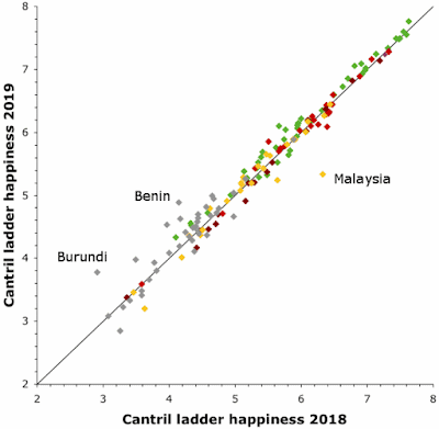
As expected, not a lot has changed between 2018 and 2019. The first graph shows the comparison of the Cantril Ladder scores (the principal happiness measure) for those 153 countries that appear in both reports. Each point represents one country, with the color coding indicating the geographical area (as listed in the network below).


Only three countries (as labeled) show large differences, with Malaysia becoming less happy, and two small African countries improving. As also expected, the European countries (green) tending to be at the top, and the African countries (grey) dominating the bottom scores.

Finland is still ranked #1, with even happier people than in 2018's report. New in the top-10 of the happiest countries is Austria (last years #12), which took the place of Australia (now #11). At the other end, South Sudan went down from 3.3 to 2.9 — this is not really a good start for the youngest state in the world. New to the lowest-ranking ten are Botswana (−0.1, down two places) and Afghanistan (−0.4, down 9).

A network analysis

The four measures of subjective well-being do not necessarily agree with each other, since they measure different things. To get an over view of all four happiness variables simultaneously, we can use a phylogenetic network as a form of exploratory data analysis. [Technical details of our analysis: Qatar was deleted because it has too many missing values. The data used were the simple rankings of the counties for each of the four variables. The Manhattan distance was then calculated; the distances have been displayed as a neighbor-net splits graph.]

In the network (shown below), the spatial relationship of the points contains the summary information — points near each other in the network are similar to each other based on the data variables, and the further apart they are then the less similar they are. The points are color-coded based on major geographic regions; and the size of the points represents the Cantril Ladder score. We have added some annotations for the major network groups, indicating which geographical regions are included — these groups are the major happiness groupings.


The rank-based network 2019 looks quite different to the one based on the explaining parameters 2018. Let us have a short look at the clusters, as annotated in the graph.

Cluster 1: The happiest this includes the welfare states of north-western and central Europe (score > 6.7), as well as Australia, Canada and New Zealand (~7.3), Taiwan (the 25th happiest country in the world, 6.4) and Singapore (#34 with 6.3). For both the positive and negative measures of happiness, the countries rank typically in the top 50, with Czechia ranking lowest regarding positive affects (#74), while the people in Singapore (#1) and Taiwan apparently suffer the fewest negative affects (#2).

Cluster 2: Quite happy includes countries like France, with 6.6 making it the happiest one of the group, plus countries along the southern shore of the Baltic Sea, as well as Japan, Hong Kong, but also also quite different countries from western Asia such as Kyrgyzstan and Turkmenistan, and Vietnam, the least happy (5.1) of the group. Common to all of them is that they rank in the top third of the standard derivation of the Cantril ladder scores, i.e. their people are equally happy across each country. Towards the right of the group, bridging to Cluster 3, we have countries that rank in the bottom third of positive affects. Potential causes are the high levels of perceived corruption, or the lack of social support and generosity, as in the case of Turkmenistan (#147 in social support, #153 in generosity).

Cluster 3: Not so happy — an Old World group of the lower half (Cantril scores between 5.2, Algeria, and 3.4, Rwanda) that are either doing a bit better than other, equally (un)happy countries regarding positive affects (Myanmar, Madagascar, Rwanda) or negative affects (e.g. Georgia, Ukraine), and are in the top-half when it comes to the SD.

Cluster 4: Generally unhappy — this collects most of the countries of the Sub-saharan cluster 2018 with Cantril scores ≤ 5, including three of the (still) unhappiest countries in the world: war-ridden Syria, the Central African Republic, and South Sudan, which rank in the bottom-half of all happiness rankings. When is comes to explanations, the ranking table is of little use: Chad, for example, ranks 2nd regarding perceived corruption, and the Central African Republic, generally regarded a as a failed state, ranks 16th, and 14th regarding freedom — ie. it seems to have similar values here like the happiest bunch (Cluster 1).

Cluster 5: Pretty unhappy — this includes Asian and African countries that are not much happier than those of Cluster 4 but which rank high when only looking at positive affects. The reasons may include low levels of perceived corruption but also generosity, at least in the case of Bhutan (#25, #13) and South Africa (#24/#1), the latter being the most generous country in the world (something Guido agrees with based on personal experience).

Cluster 6: Partially unhappy — is a very heterogeneous cluster, when we look at the Cantril scores ranging from 7.2 for Costa Rica (#12), a score close to the Top-10 of Cluster 1, to 4.7 for Somalia (#112). Effectively, it collects all states that don't fit ranking-pattern-wise in any of the other clusters. For example, the U.S. (6.9, #19) and U.A.E. (6.8, #21) plot close to each other in the network because both rank between 35 and 70 on the other three variables, ie. lower than the countries of Cluster 1 with not much higher Cantril scores. Mexico, by the way (6.6, #23), performs similarly to the U.S. but ranks much higher regarding positive affects. The latter seems to be a general trend within the other states of the New World in this cluster.

Cluster 7: Really not happy — also covers a wide range, from a Cantril score of 6.0 (Kuwait, #51 in the world) to 3.2 (Afghanistan, #154). It includes the remainder of the Sub-saharan countries, most of the countries in the Arab world, and the unhappy countries within and outside the EU (Portugal, Greece, Serbia, Bosnia & Herzegovina). These are countries that usually rank in the lower half or bottom third regarding all four included variables.

Cluster 8: Increasingly unhappy — these countries bridge between Clusters 1 and 7, starting (upper left in the graph) with Russia (#68, top 10 regarding negative affects) and ending with Democratic Republic of Congo (#127, Congo Kinshasa in WHR dataset, ranking like a Cluster 7 country). In between are pretty happy countries such as Israel (#13) and unhappy EU members (Bulgaria, #97). The reason Israel is not in Cluster 1 is its very low ranking regarding both positive affects (#104) and not too high placement when it comes to negative affects (#69), but in contrast to the U.S. it ranks high when it comes to the SD of the Cantril scores — that is, the USA has a great diversity regarding happiness, from billionaires to the very poor, whereas the peoples of most countries are more equally happy. Other very-high ranking countries regarding the latter are Bulgaria, the least-happy country of the EU, and Mongolia.

Lifestyle habits in the states of the USA


People throughout the western world are constantly being reminded that modern lifestyles have many unhealthy aspects. This is particularly true of the United Stats of America, where obesity (degree of over-weight) is now officially considered to be a medical epidemic. That is, it is a disease, but it is not caused by some organism, such as a bacterium or virus, but is instead a lifestyle disease — it can be cured and prevented only by changing the person's lifestyle.


The Centers for Disease Control and Prevention (CDC), in the USA, publish a range of data collected in their surveys — Nutrition, Physical Activity, and Obesity: Data, Trends and Maps. Their current data include information up to 2017.

These data are presented separately for each state. The data collection includes:
  • Obesity — % of adults who are obese, as defined by the Body Mass Index (>30 is obese)
  • Lack of exercise — % of adults reporting no physical leisure activity; % of adolescents watching 3 or more hours of television each school day
  • Unhealthy eating — % of adults eating less than one fruit per day; % of adolescents drinking soda / pop at least once per day.
The CDC show maps and graphs for these data variables separately, but there is no overall picture of the data collection as a whole. This would be interesting, because it would show us which states have the biggest general problem, in the sense that they fare badly on all or most of the lifestyle measurements. So, let's use a network to produce such a picture.

For our purposes here, I have looked at the three sets of data for adults only. The network will thus show states that have lots of obese adults who get little exercise and do not eat many fruits and vegetables.

As usual for this blog, the network analysis is a form of exploratory data analysis. The data are the percentages of people in each state that fit into the three lifestyle characteristics defined above (obese, no exercise, unhealthy eating). For the network analysis, I calculated the similarity of the states using the manhattan distance; and a Neighbor-net analysis was then used to display the between-state similarities.

Network of the lifestyle habits i the various US states

The resulting network is shown in the graph. States that are closely connected in the network are similar to each other based on their adult lifestyles, and those states that are further apart are progressively more different from each other. In this case, the main pattern is a gradient from the healthiest states at the top of the network to the most unhealthy at the bottom.

Note that there are seven states separated from the rest at the bottom of the network. These states have far more people with unhealthy lifestyles than do the other US states. In other words, the lifestyle epidemic is at its worst here.

In the top-middle of the network there is a partial separation of states at the left from those at the right (there is no such separation elsewhere in the network). The states at the left are those that have relatively low obesity levels but still fare worse on the other two criteria (exercise and eating). For example, New York and New Jersey have the same sorts of eating and exercise habits as Pennsylvania and Maryland but their obesity levels are lower.

It is clear that the network relates closely to the standard five geographical regions of the USA, as shown by the network colors. The healthiest states are mostly from the Northeast (red), except for Delaware, while the unhealthiest states are from the Southeast (orange), with Florida, Virginia and North Carolina doing much better than the others. The Midwest states are scattered along the middle-right of the network, indicating a middling status. The Southwest states are mostly at the middle-left of the network.

The biggest exception to these regional clusterings is the state of Oklahoma. This is in the bottom (unhealthiest) network group, far from the other Southwest states. This pattern occurs across all three characteristics; for example, Oklahoma has the second-lowest intake of fruit (nearly half the adults don't eat fruit), second only to Mississippi.

These data have also been analyzed by Consumer Protect, who offer some further commentary.

Conclusions

This analysis highlights those seven US states that have quantitatively the worst lifestyles in the country, and where the lifestyle obesity epidemic is thus at its worst.

These poor lifestyles have a dramatic impact on longevity — people cannot expect to live very long if they live an unhealthy lifestyle. The key concept here is the difference between life expectancy (how long people live, on average) and healthy life expectancy (how long people people remain actively healthy, on average). This topic is discussed by the The US Burden of Disease Collaborators (2018. The state of US health, 1990-2016. Journal of the American Medical Association 319: 1444-1472).

In that paper, the data for the USA show that, for most states, healthy life expectancy is c. 11 years less than the total life expectancy, on average. This big difference is due to unhealthy lifestyles, which eventually catch up with you. As a simple example, the seven states at the bottom of the network are ranked 44-51 in terms of healthy longevity, at least 2.5 years shorter than the national average. (Note: Tennessee is ranked 45th.)

You can see why the CDC is concerned, and why there is considered to be an epidemic.


Postscript

Some of the seven states highlighted here have other lifestyle problems, as well. For example, if you consult Places in America with the highest STD rates, you will find that they are listed as five of the top ten: 2: Mississippi, 3: Louisiana, 6: Alabama, 9: Arkansas, 10: Oklahoma, 31: Kentucky, and 50: West Virginia.

Phylogenetics of chain letters?


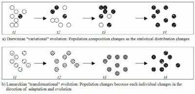
The general public and the general media often have no idea what biologists mean by the work "evolution". The word has two possible meanings, and they usually pick the wrong one. Niles Eldredge tried to clarify the situation by referring to them:
  • transformational evolution — the change in a group of objects resulting from a change in each object (often attributed to Lamarck)
  • variational evolution - the change in a group of objects resulting from a change in the proportion of different types of objects (usually attributed to Darwin).
Charles Darwin changed biology by pointing out that changes in species occur via the latter mechanism, not the former, which had been the predominant previous idea. Sadly, 160 years later, the idea of transformational evolution still seems to prevail in the minds of the general public and the people writing for them.


So, it was with some trepidation that I looked at an article in Scientific American called Chain letters and evolutionary histories (by Charles H. Bennett, Ming Li and Bin Ma. June 2003, pp. 76-81). It was subtitled: "A study of chain letters shows how to infer the family tree of anything that evolves over time, from biological genomes to languages to plagiarized schoolwork."

The "taxa" in their study consist of 33 different chain letters, collected during the period 1980–1995 (8 other letters were excluded), covering the diversity of chain letters as they existed before internet spam became widespread. These letters can be viewed on the Chain Letters Home Page.

The main issue with this study is that there are no clearly defined characters, from which the phylogeny could be constructed. The authors therefore resort to creating a pairwise distance matrix, among the taxa, in a manner (compression) that I have criticized before (Non-model distances in phylogenetics). I have also discussed previous examples where this approach has been used, notably: Phylogenetics of computer viruses? Multimedia phylogeny?

The essential problem, as I see it, is that without a model of character change there is no reliable way to separate phylogenetic information from any other type of information. That is, phylogenetic similarity is a special type of similarity. It is based on the idea of shared derived character states, as these are the only things that are informative about a phylogeny.

Compression, on the other hand, is a general sort of similarity, based on the idea of information complexity. This presumably will contain some useful phylogenetic information, but it will also contain a lot of irrelevance — for example, shared ancestral character states, which are uninformative at best and positively misleading at worst.

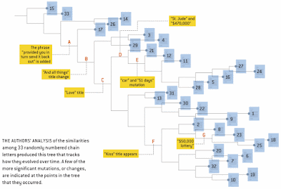
So, the authors can easily produce an unrooted tree from their similarity matrix, which they then proceed to root at one of the letters that they collected early on in their study. This tree is shown here.


However, whether this diagram represents a phylogeny is unknown.

Nevertheless, that does not stop us using an unrooted phylogenetic network as a form of exploratory data analysis, as we have done so often in this blog. This is not intended to produce a rooted evolutionary history, but instead merely to summarize the multivariate information in a comprehensible (and informative) manner. This might indicate whether we are likely to be able to reconstruct the phylogeny In this case, I have used a NeighborNet to display the similarity matrix, as shown next.

Phylogenetic network of cahin letters

It is easy to see that the relationships among the letters are not particularly tree-like. Moreover, the long terminal edges emphasize that much of the complexity information is not shared among the letters, while the shard information is distinctly net-like. So, a simple "phylogenetic tree" (as shown above) is not likely to be representative of the actual evolutionary history.

However, there are actually a few reasonably well-defined groups among the taxa — one at the top. one at the right, and several at the bottom of the network. There are also letters of uncertain affinity, such as L2, L23, L13 and L31. These may reflect phylogenetic history, even though that history is hard to untangle.

Finally, it is worth noting that the history of chain letters, dating back to the 1800s, is discussed in detail by Daniel W. VanArsdale at his Chain Letter Evolution web pages.

Which airlines serve the best wine?


I have only flown Business Class once, when I got upgraded on a flight from Sydney to Auckland; and I have never flown First Class. So, I don't really care about the so-called Cellars in the Sky, because I get only the vin ordinaire in Economy Class.


However, some people do care about the quality of the beer, wine and spirits served to the high flyers. These include the people at Business Traveller magazine / web site. For more than 30 years, they have handed out annual Cellars in the Sky awards, after evaluating the quality of the wine served to business class and first class passengers on the world's airlines.

Airlines can choose to enter the Awards process provided that they serve wine in business or first class on mid- or long-haul routes. The airlines submit up to two red wines, two white wines, a sparkling wine, and a fortified or dessert wine, from both their business and first class cellars. These wines are assessed and scored (blind) by a panel of independent judges. The awards are based on the average marks for the wines concerned, with separate awards for First Class and Business Class, plus an Overall Award for consistency across both classes.


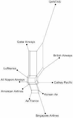
I have analyzed the data for the Best Overall Cellar for the years 2006 to 2018, inclusive. The number of airlines commended each year varied from 3 to 5 (average 4.0). I simply gave each airline a score scaled from 0–1 depending on its ranking in the awards list. There were 16 airlines mentioned over the 13 years, but I have included only those 10 that appeared in more than one year.

Since these are multivariate data, one of the simplest ways to get a pictorial overview of the data patterns is to use a phylogenetic network, as a tool for exploratory data analysis. For this network analysis, I calculated the similarity of the airlines, based on the awards they received, using the manhattan distance, and a Neighbor-net analysis was then used to display the between-airline similarities.


The resulting network is shown in the graph. Airlines that are closely connected in the network are similar to each other based on when they won their awards, and those airlines that are further apart are progressively more different from each other.

Only one airline received an award in every year: QANTAS, followed by Qatar Airlines with 9 out of 13 years. These two airlines are grouped together at the top of the figure. The other airlines are arranged based on which years they won awards. For example, Cathay Pacific won 7 awards, and both Singapore Airlines and British Airways won 5, but they were mostly not in the same years. American Airlines, Air France, Korean Air and Lufthansa each won only 2 awards.

So, if you want to get your money's worth out of your business-class ticket, then it would be a good idea to try QANTAS or Qatar Airlines — the hours will pass more quickly with a glass of good wine in your hand.

A network of World happiness


This is a joint post by Guido Grimm and David Morrison.

You may never have heard of it, but the there is a World Happiness Report. This is sponsored by The Sustainable Development Solutions Network (SDSN) and The Global Happiness Council (GHC). Reports were produced in 2012, 2013, 2015 and 2017, but here we are going to look at the World Happiness Report 2018.


To quote the Report:
The World Happiness Report is a landmark survey of the state of global happiness. The World Happiness Report 2018 ranks 156 countries by their happiness levels, and 117 countries by the happiness of their immigrants.
The rankings use data that come from the Gallup World Poll (GWP). The rankings are based on answers to the main life evaluation question asked in the poll. This is called the Cantril ladder: it asks respondents to think of a ladder, with the best possible life for them being a 10, and the worst possible life being a 0. They are then asked to rate their own current lives on that 0 to 10 scale. The rankings are from nationally representative samples, for the years 2015-2017.
The Report is very comprehensive in its discussion of methodology, and its limitations. It is also very ambitious in its conclusions. The main focus of the 2018 Report is comparing the happiness of immigrants with their local counterparts. Interestingly, they found no important differences between these two groups.

More importantly for this blog, the raw data are provided in an Appendix, so that anyone can look at what is going on. We have decided to do just that.

The Report's happiness index

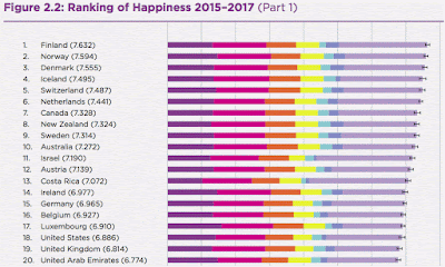
Below is the first little bit of Figure 2.2 (extracted from the report), which "shows the average ladder score (the average answer to the Cantril ladder question, asking people to evaluate the quality of their current lives on a scale of 0 to 10) for each country, averaged over the years 2015-2017." As you can see, the people who claim that they are happiest are those in the Nordic countries (Finland plus the Scandinavian countries: Norway, Denmark, Iceland and Sweden). These are the people whom the world's cultural cliché sees as sitting for half the year in the gloom! Apparently, you have all got it wrong.


As we have noted before, an index can often do a poor job of summarizing data, because it reduces complex data down to just one dimension. The Happiness Report tries to alleviate this limitation by adding information about some of the other variables that correlate with the Happiness score, using colors:
Each of these bars is divided into seven segments, showing our research efforts to find possible sources for the ladder levels. The first six sub-bars show how much each of the six key variables is calculated to contribute to that country’s ladder score, relative to that in a hypothetical country called Dystopia, so named because it has values equal to the world’s lowest national averages for 2015-2017 for each of the six key variables
However, we can do much better than this, by using all of these variables in a phylogenetic network. The key variables are (color-coded from left to right in the figure above):
  1. Gross Domestic Product (GDP) per capita is in terms of Purchasing Power Parity (PPP)
  2. Social support [the national average of the binary responses to the Gallup World Poll]
  3. The time series of healthy life expectancy at birth
  4. Freedom to make life choices [the national average of binary responses to the GWP question]
  5. Generosity [the residual of regressing the national average of GWP responses]
  6. Perceptions of corruption [ the average of binary answers to two GWP questions]
For the network, we simply put all of these variables into the analysis, along with the Happiness score.

[Technical details of our analysis: Qatar was deleted because it has too many missing values; each data variable was then standardized to zero mean and unit variance; the gower similarity was calculated, which ignores missing values, and this was converted to a distance; the distances were then displayed as a neighbor-net splits graph.]

A network analysis

The resulting network is shown next. Each point represents a country, with the name codes following the ISO-3166-1 standard. The spatial relationship of the points contains the summary information — points near each other in the network are similar to each other based on the data variables, and the further apart they are then the less similar they are. The points are color-coded based on major geographic regions (asterisks highlight single states that don't group with the rest of their geographical region). We have added some annotations for the major network groups, indicating which geographical regions are included — these groups are the major happiness groupings.


In this blog post we do not want to risk over-interpreting the data, as explained in the final paragraphs below. However, it is obvious that there are distinct patterns in the network. Happiness, and its correlates are not randomly distributed on this planet but, not unexpectedly, relate to the local socio-political situation.

Starting at the bottom-left, we have a geographically heterogeneous cluster of very well-off countries, either welfare states (as in northern Europe), capitalist democracies (eg. the USA, Singapore, Hong Kong), or oil-rich monarchies with high levels of public spending (as in the Middle East). Moving clockwise, the next cluster has much of the rest of the western and central European countries, along with the financially well-off parts of South America and Asia. The next cluster has many of the remaining eastern European countries, plus the nearest parts of Asia, where government spending on welfare is still apparent. Clearly, national wealth plays a large part in happiness, in spite of the well-known adage to the contrary.

This is followed, at the top-middle of the network, by a broad neighborhood (not a distinct cluster), where government spending on welfare is much less apparent, at least to an outsider. The countries here come from Europe, Asia, and Central plus South America (including, at the moment, Greece). Happiness and its correlates is reported to be much lower here.

To make this situation clearer, here is a version of the network with some of the happiness scores annotated — values are provided for the first and last 10th percentile of the happiness score, and the 10 largest (by population) countries in the world.


On the opposite side of the network, happiness is also apparently lower, but with a different set of correlations among the variables. There is a two-part cluster of geographically heterogeneous countries at the bottom-middle, plus a neighborhood at the bottom-right. The latter includes China and India, the two most populous countries (with one-third of our people), while Indonesia (4th) and Brazil (6th) are in the neighborhood at the top of the network.

Finally, the cluster at the right consists mostly of African countries, plus Pakistan (the 5th most-populous country). In this cluster, happiness is reported to be at its lowest observed level. Much of the world's monetary aid is spent in Africa, of course, to try to improve the situation, although there is clearly a long way to go. Not unexpectedly, most of the world's migrants come from the right-hand part of the network, which is one of the main focuses of the Happiness Report.

Final comments

It is interesting to note that the Bhutan (code BTN) government reportedly aims to increase the Gross National Happiness rather than the GDP (see Gross national happiness in Bhutan: the big idea from a tiny state that could change the world). The network shows that their 2015-2017 happiness is quite different to that of their geographical neighbors. However, it also suggests that they still have a long way to go.

We should finish the discussion with a general point about surveys, such as the Gallup Poll on which the Happiness Report is based. Respondents are not always completely honest when answering survey questions, which is why pre-election polls sometimes get it wrong — people are most serious when faced with an actual decision, rather than a question. All of the results here need to be interpreted in this light — they may not be far wrong, but they are unlikely to be completely right.

Apart from anything else, there can be cultural differences in the way in which the answers to the Gallup World Poll questions are treated. Does "happiness" really mean the same thing across all cultures? We know that "beauty" does not, and "freedom" does not; so why not "happiness"? After all, things like reported happiness are likely to be confounded with other feelings such as national pride. This issue could presumably be addressed by looking at other answers from the Gallup Poll.

Using splits graphs for multivariate data analysis


Data containing multiple measurements for each of a set of objects are usually too complex to be viewed easily in their raw form. Therefore, methods have been developed to usummarize the data down to something simpler. This is called multivariate data analysis.

One of the issues that needs to be addressed is that a data summary is designed to lose information. The goal is to somehow keep the most important information in the summary. Clearly, the simpler is the summary then the more information we are likely to lose.

This post is a simplistic introduction to why splits graphs, which were originally developed to summarize multivariate phylogenetic data, are usually very good data summaries. It compares the ability of maps, indexes and networks to summarize data.

Maps

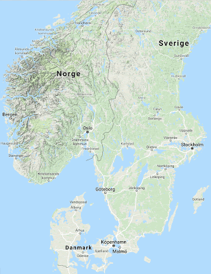
A map is a 2-dimensional drawing of some piece of 4-dimensional space-time. For example, the map shown here represents the southern part of Scandinavia.

A map is quite successful as a data summary. It reduces the 4-dimensional world down to 2+ dimensions — latitude and longitude are represented accurately; we use symbols or colors/shading to represent altitude; and we choose one specific time (thus eliminating that dimension). We can therefore reconstruct much of the 3-dimensional world from looking at a map (ie. much of the original information is retained in the summary).


In our example, we can see even from a glance at the map that Denmark is as flat as a pancake, Norway is very hilly, and Sweden is somewhere in between. We can also see that Uppsala and Oslo are at the same latitude, and that the simplest way to get from Uppsala to Trondheim is likely to be via Östersund rather than Oslo.

Indexes

An index is a linear ordering of numbers measuring some calculated characteristic of a set of objects. It condenses a series of measurements for each object down to a single number. The index shown here refers to the hotels in Östersund (which we might stay at on our way from Uppsala to Trondheim), and indicates the overall quality score from a well-known online booking site. The index summarizes a set of features of the hotels that might be of interest to potential guests.

Hotell Emma
Clarion Hotell Grand
Hotell Stortorget
Quality Hotell Frösö Park
Hotell Jämteborg
Best Western Hotell Ett
Best Western Hotell Gamla Teatern
Hotell Älgen
Hotell Zäta
   8.9
   8.7
   8.6
   8.6
   8.3
   8.1
   8.0
   7.9
   7.8

Unfortunately, an index is rarely very successful as a data summary. It reduces multi-dimensional data down to only 1 dimension. Therefore, we cannot tell which dimensions contribute to each value of the index — the same value could arise in many different ways. We therefore cannot reconstruct any of the original dimensions — what goes into the summary cannot come back out (as it can for a map).


Staff
Location
Cleanliness
Comfort
Facilities
Breakfast
Free WiFi
Value for money
Hotell
Stortorget
8.9
9.4
9.1
8.5
7.7
8.5
9.1
8.3
Quality Hotel
Frösö Park
8.7
8.9
8.3
8.2
8.8
8.5
8.7
8.9

In our example, two of the hotels have exactly the same index score, but this does not necessarily mean that the two hotels are the same as regards the quality features, as shown above. For instance, there are notable differences between them in Location and Value for Money, and even larger differences in Cleanliness and Facilities. This information is lost in the calculation of the quality index.

Networks

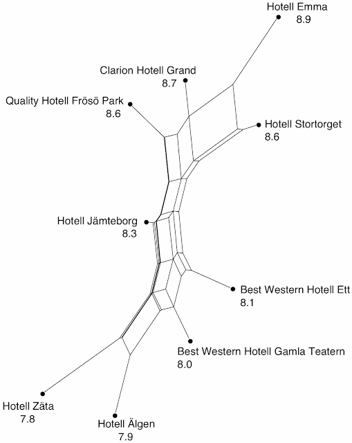
A splits graph (a type of phylogenetic network) is a 2-dimensional drawing of some multi-dimensional set of data, such as might be used to calculate an index. The network shown here is based on the same data used to calculate the quality index above.

A network reduces multi-dimensional data down to 2+ dimensions. Each object is represented as a point — the spatial relationship of the points (their neighborhood) has meaning; and the inter-connecting lines have meaning (they are groups supported by the data). Such a network is therefore much more successful as a summary than is an index. Like a map, it will be very successful for 3-dimensional data, with potentially reduced success as the number of dimensions increases — the rate of information loss will depend on how well-correlated are the dimensions.


In our example, the main pattern in the network shows the relative quality of the hotels, as measured by the index, descending from top to bottom (so that all of the information form the index is in the network). However, the graph also emphasizes the difference between the two hotels with identical index scores. Indeed, it shows us that the Quality Hotell Fröösö Park is probably more similar to the Clarion Hotell Grand than to the Hotell Stortorget.

Alternatives

There are other forms of multivariate data analysis that are often used instead of networks. Two common ones are: an ordination, which reduces multi-dimensional data down to 2 dimensions only; and a cluster tree, which reduces to 1 dimension only. These are therefore often less successful as data summaries. Indeed, a network is very much like a combination of an ordination and a cluster tree, with the best features of both methods and fewer of their limitations.

Further reading

How to interpret splits graph

Primer of Phylogenetic Networks

Morrison DA (2014) Phylogenetic networks — a new form of multivariate data summary for data mining and exploratory data analysis. Wiley Interdisciplinary Reviews: Data Mining and Knowledge Discovery 4: 296-312.

A network of political parties competing for the 2017 Bundestag


Many elections now have some sort of online black box that allow you to see which political party or candidate has the highest overlap with your own personal political opinions. This is intended to help voters with their decisions. However, the black boxes usually lack any documentation regarding how different are the viewpoints of the competing parties / candidates. Exploratory data analysis via Neighbour-nets may be of some use in these cases.

As a European Union citizen (of German and Swedish nationality) I am entitled to live and work in any EU country. I currently live in France, but I cannot vote for the parliament (Assemblée nationale) and government (M. Le Président) that affects my daily life, and decides on the taxes, etc, that I have to pay. However, I’m still eligible to vote in Germany (in theory; in practice it is a bit more complex).


The next election (Budestagswahl) is closing in for the national parliament of the Federal Republic of Germany, the Bundestag (equivalent to the lower house of other bicameral legislatures). To help the voters, a new Wahl-O-Mat (described below) has been launched by the Federal Institute of Political Education (Bundeszentrale für politische Bildung, BPB). This is a fun thing to participate in, even if you have already made up your mind about who to vote for.

Each election year, the BPB develops and sends out a questionnaire with theses (83 this year) to all of political parties that will compete in the election. The parties can answer with ‘agree’, ‘no opinion / neutral’, or ‘don’t agree’ for each thesis. The 38 most controversially discussed political questions have been included in the Wahl-O-Mat, and you can also answer them for yourself. As a final step, you can choose eight of the political parties competing for the Bundestag, and the online back box will show you an agreement percentage between you and them in the form of a bar-chart diagram.

But as a phylogeneticist / data-analyst, I am naturally sceptical when it comes to mere percentages and bar charts. Furthermore, I would like to know how similar the parties’ opinions are to each other, to start with. An overview is provided, with all of the answers from the parties, but it is difficult to compare these across pages (each page of the PDF lists four parties, in the same order as on the selection page). The Wahl-O-Mat informs you that a high fit of your answers with more than one party does not necessarily indicate a closeness between the parties — you may, after all, be agreeing with them on different theses.

This means that the percentage of agreement between me and the political parties would provide a similarity measure, which I can use to compare the political parties with each other. But how discriminatory are my percentages of agreement (from the larger perspective)?

A network analysis

There are 33 parties that are competing for seats in the forthcoming Bundestag, one did not respond. Another one, the Party for Health Research (PfHR — a one-topic party) answered all 36 questions with 'neutral'. However, the makers of the Wahl-O-Mat still had to include it; and since that party provided no opinion on any of the questions, I scored 50% agreement with them (since I answered every question with 'yes' or 'no') — this is more than with the Liberal Party (because we actually disagree on half of the 38 questions). This is a flaw in the Wahl-O-Mat. If you say 'yes' (or 'no') to a thesis that the party has no opinion on, then it is counted as one point, while two points are awarded for a direct match. However, it does not work the other way around — having no opinion on any question brings up a window telling you that your preference cannot be properly evaluated.

Because of this, I determined my position relative to the political parties using a neighbour-net. The primary character matrix is binary, where 0 = ‘no’, 1 = ‘yes’ and ‘?’ stands for no opinion (neutral), compared using simple (Hamming) pairwise distances. So, if two parties disagree for all of the theses their pairwise distance will be 1. If there is no disagreement, the pairwise distance will be 0. Since the PfHR has provided no opinion, I left it out (ie. its pairwise distances are undefined).

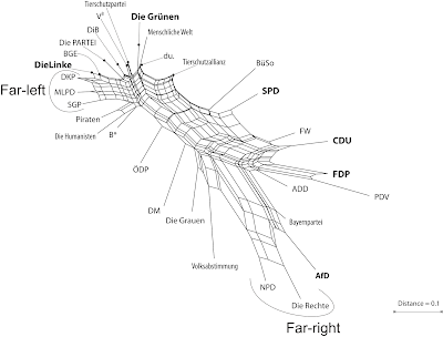
Fig. 1 Neighbour-net of German political parties competing in the 2017 election (not including me). Parties of the far-left and far-right are bracket, for political  orientation. Parties with a high chance to get into the next Bundestag (passing the 5% threshold) are in bold. [See also this analysis by The Political Compass, for comparison].

The resulting network (Figure 1) is quite fitting: the traditional perception of parties (left-wing versus right-wing) is well captured. Parties, like the ÖDP (green and conservative), that do not fit into the classic left-right scheme are placed in an isolated position.

The graph reveals a (not very surprising) closeness between the two largest German political parties, the original Volksparteien (all-people parties): the CDU/CSU (centre-right, the party of the current Chancellor) and the SPD (centre-left). The SPD is the current (and potentially future) junior partner of the CDU/CSU, its main competitor. According to the graph, an alternative, more natural, junior partner of the CDU/CSU would be the (neo-)liberal party, the FDP.

The parties of the far-right are placed at the end of a pronounced network stem — that is they are the ones that deviate most from the consensus shared by all of the other parties. They are (still) substantially closer to the centre-right parties than to those from the (extreme) left. However, the edge lengths show that, for example, a hypothetical CDU/CSU–AfD coalition (the AfD is the only right-wing party with a high chance to pass the 5% threshold) would have to join two parties with many conflicting viewpoints. That is, regarding their answers to the 38 questions, in general the CSU appears to be much closer to the AfD than to it's sister party, the CDU.

Regarding the political left, the graph depicts its long-known political-structure problem: there are many parties, some with very unique viewpoints (producing longer terminal network edges); but overall there is little difference between them. The most distinct parties in this cluster are the Green Party (Die Grünen) and the Humanist Party (Die Humanisten), a microparty promoting humanism (see also Fig. 2).

Any formal inference is bound by its analysis rules, which may represent the primary signal suboptimally. The neighbour-net is a planar graph, but profiles of political parties may require more than two dimensions to do a good job. So let's take a look at the underlying distance matrix using a ‘heat map’ (Figure 2).

Fig. 2 Heat-map based on the same distance matrix as used for inferring the neighbour-net in Fig. 1. Note the general similarity of left-leaning parties and their distinctness to the right-leaning parties.

We can see that the Left Party (Die Linke) and the Bündnis Grundeinkommen (BGE), a single-topic party founded to promote a basic income without conditions, don’t disagree in any point, and that the declining Pirate Party (flagged as social-liberal on Wikipedia) has turned sharp left. The Party for Animal Protection (Tierschutzpartei) and the Party of Vegetarians and Vegans (V3) should discuss a merger; whereas the Alliance for Animal Protection (Tierschutzallianz) is their more conservative counter-part, being much closer to e.g. the CDU/CSU.

We can also see that the party with the highest agreement with the SPD is still the Greens (Die Grünen). Furthermore, although the FDP and the Pirate Party have little in common, the Humanist Party (Die Humanisten) may be a good alternative when you’re undecided between the other two. [Well, it would be, if in Germany each vote counts the same, but the 5% threshold invalidates all votes cast for parties not passing the threshold.] The most unique party, regarding their set of answers and the resulting pairwise distances, is a right-wing microparty (see the network above) supporting direct democracy (Volksabstimmung).

Applications such as the Wahl-O-Mat are put up for many elections, and when documented in the way done by the German Federal Institute of Political Education, provide a nice opportunity to assess how close are (officially) the competing parties, using networks.

PS. For our German readers who are as yet undecided: the primary character matrix (NEXUS-formatted) and related files can be found here.

Inheritance in cultural evolution


I recently reviewed a book anthology devoted to the application of phylogenetic methods in archaeology (see List 2016, PDF here). This book, entitled Cultural Phylogenetics: Concepts and Applications in Archaeology, edited by Larissa Mendoza Straffon (2016), assembles eight articles by scholars who discuss or illustrate the application of phylogenetic approaches in different fields of anthropology and archaeology.

The volume presents a rich collection of different approaches, covering various topics ranging from the evolution of skateboards (Prentiss et al.) to the spread of the potter's wheel (Knappett). The articles dealing with theoretical questions range from historical accounts of tree-thinking in biology and anthropology (Kressing and Krischel) to an overview of the impact of Darwinian thinking on archaeology and anthropology (Rivero). Although I missed a golden thread when reading the eight articles of the volume, it is definitely worth a read for those interested in evolutionary approaches in a broader sense, as most articles explicitly reflect differences and commonalities between biological and cultural evolution, providing concrete insights into the challenges that archaeologists face when trying to promulgate quantitative approaches.

It is clear that evolution in the general sense is much broader than merely evolution in biology, as I have often tried to illustrate in this blog when showing how phylogenetic approaches can be applied in linguistics. Provided that descent with modification holds — in a broader sense — also for cultural artifacts, it is obvious to search for fruitful analogies between biological and cultural evolution, in order to profit from methodological transfer in disciplines like anthropology and archaeology. It is also clear, however, that certain analogies between biological evolution and evolution in other fields should be considered with great care. Even in linguistics, this is clearly evident, and I have pointed to this problem in the past (see Productive and unproductive analogies...). The goal cannot be a to try to press biological methods into the anthropological template. Instead, we have to rigorously test our proposed analogies, and adapt the biological methods to our needs if necessary.

What surprised me when reading the book was that the majority of the articles did not really seem to care about the crucial differences between biological and cultural evolution, but rather tried to fit the feet and heels of cultural evolution into biology's shoes. Tree thinking dominated most of the articles (with Knappett as a notable exception), and the scholars tried hard to find a clear distinction between vertical and lateral inheritance in cultural evolution. While it is clear that this distinction is the basis for phylogenetic tree applications, where patterns that do not fit a tree are explained as instances of homoplasy or lateral transfer, it is by no means clear why one would go through all the pain to identify these patterns in cultural evolution.

Consider, as an example, the evolution of skateboards. At some point in the history of mankind (some late point!), people decided to put wheels on a board and to do artistic tricks with it. Later, other people merchandised this idea, and started to sell those boards with wheels. Later on, other companies jumped on the bandwagon and started to produce their own brands, thus instigating a fight for the "best" model for a certain kind of clientel. In all of these cases, ideas for design were clearly taken among groups of people, further modified by specific needs or trends, until the current variety of skateboards arose. But which of these ideas were transferred vertically, and which ideas were transferred laterally? Can we identify processes of "speciation" in skateboard evolution, during which new brands were born?

In biology and linguistics we have the clear-cut criteria of interfertilityand intelligibility. They cause us enough problems, given that we have ring species in biology and dialect chains in linguistics, but at least they give us some idea how to classify a given exemplar as belonging to a certain group. But what is the counterpart in the evolution of skateboards? Their brand? Their shape? Their users? The analogy simply does not hold. We have neither vertical nor lateral transfer in topics such as skateboard evolution. All we have is a before and an after— a complex network in which objects were constantly recreated and modified, be it based on ideas that were inspired by other objects or people, or independently developed. It seems completely senseless to search for a distinction between vertical and lateral patterns here, as it is not even clear to what degree we are actually dealing with decent with modification.

It seems to me that the problem of inheritance needs to be addressed in cultural evolution before any further quantitative applications using tree-building methods are carried out. Given that ideas can easily be develop independently, the crucial question for studies of cultural evolution is whether similar ideas can be shown to share a common history. It is (as David mentioned in earlier in a blog post on False analogies between anthropology and biology) the general problem of homology that does not seem to be solved in most studies on cultural evolution. Here, linguistics has generally fewer problems, given that linguists have developed methods to test whether two words are homologous. In cultural evolution, however, the assessment of homology is far from being obvious.

I think that cultural evolution studies such as the ones presented in the book would generally profit from network approaches. By network approaches, I do not necessarily mean evolutionary networks (in the sense of Morrison 2011), as the problem of inheritance is difficult to solve. Instead, I am thinking of exploratory data analysis using phylogenetic networks (Morrison 2011), or some version of similarity networks (Bapteste et al. 2012). Phylogenetic network approaches are frequently used in biology, and are now also very popular in linguistics. Similarity networks are more common in biology, but we have carried out some promising studies of linguistic data (List et al. 2016). As all of these approaches are exploratory and very flexible regarding the data that is fed to them, they might offer new possibilities for exploratory studies on cultural evolution.

References
  • Bapteste, E., P. Lopez, F. Bouchard, F. Baquero, J. McInerney, and R. Burian (2012) Evolutionary analyses of non-genealogical bonds produced by introgressive descent. Proceedings of the National Academy of Sciences 109.45. 18266-18272.
  • Knappett, C. (2016) Resisting Innovation? Learning, Cultural Evolution and the Potter’s Wheel in the Mediterranean Bronze Age. In: Mendoza Straffon, L. (ed.) Cultural Phylogenetics: Concepts and Applications in Archaeology. Springer International Publishing: Cham and Heidelberg and New York and Dordrecht, pp. 97-111.
  • List, J.-M., P. Lopez, and E. Bapteste (2016) Using sequence similarity networks to identify partial cognates in multilingual wordlists. In: Proceedings of the Association of Computational Linguistics 2016 (Volume 2: Short Papers), pp. 599-605.
  • List, J.-M. (2016) [Review of] Cultural Phylogenetics: Concepts and Applications in Archaeology; edited by Larissa Mendoza Straffon. Systematic Biology (published online before print).
  • Morrison, D. (2011) An Introduction to Phylogenetic Networks. RJR Productions: Uppsala.
  • Prentiss, A., M. Walsh, R. Skelton, and M. Mattes (2016) Mosaic evolution in cultural frameworks: skateboard decks and projectile points. In: Mendoza Straffon, L. (ed.) Cultural Phylogenetics: Concepts and Applications in Archaeology. Springer International Publishing: Cham and Heidelberg and New York and Dordrecht, pp. 113-130.
  • Rivero, D. (2016) Darwinian archaeology and cultural phylogenetics. In: Mendoza Straffon, L. (ed.) Cultural Phylogenetics: Concepts and Applications in Archaeology. Springer International Publishing: Cham and Heidelberg and New York and Dordrecht, pp. 43-72.
  • Mendoza Straffon, L. (2016) Cultural Phylogenetics. Concepts and Applications in Archaeology. Springer International Publishing: Cham.