In the modern world, there is a lot of discussion about the environmental damage caused by cars and trucks, not least due to their involvement in global climate change. The pro-active parts of this discussion revolve around banning cars, so that parts of cities and towns can return to pedestrian areas (eg.
Life in the Spanish city that banned cars;
The automotive liberation of Paris), and encouraging alternative modes of transport, particularly bicycles (eg.
Copenhagenize your city: the case for urban cycling;
Britain wants cycle-friendly cities).
In particular, some cities throughout the world are taking active steps to improve the "walkability" of their centers, including Addis Ababa, Auckland, Denver, Hanoi, London, Manchester and San Francisco (
What would a truly walkable city look like?), and the "cyclability" of their inner suburbs, including Calgary, Copenhagen, Eindhoven, Lidzbark, Purmerend, San Sebastian, Utrecht and Vancouver (
Top 10 pieces of cycling infrastructure: which country does it right?). On the other hand, there are some cities who have not yet tried to do much about cycling, including Beijing, Cairo, Delhi, Hong Kong, Moscow, Mumbai, Nairobi, Orlando, São Paulo and Sydney (
Top 10 worst cities for cycling ).
The USA is not usually considered to be at the forefront of this movement, having long ago wedded itself to the cult of the private motor car. However, this does not mean that US cities are all the same in terms of non-car transportation. For example, the
Walk Score site, which is part of the
Redfin real estate organization, provides a
ranking of all US cities and neighborhoods with a population of 200,000 or more, in terms of how friendly they are for: walking, biking and transit.
The ranks are based on a score out of 100 for each location, using various
methodologies:
— Walk Score analyzes hundreds of walking routes to nearby amenities; points are awarded based on the distance to amenities in each category.
— Bike Score is calculated by measuring bike infrastructure (lanes, trails, etc), hills, destinations and road connectivity, and the number of bike commuters.
— Transit Score assign a "usefulness" value to nearby transit routes based on their frequency, type of route (rail, bus, etc), and distance to the nearest stop on the route.
Our interest here is in combining these three pieces of information into a single picture, showing which cities are generally good, at the moment.
Not unexpectedly, the Walk Score and Transit Score are highly correlated (86% shared rankings), while the Bike Score is not as highly correlated with either of these (49% and 42%, respectively). This means that the same cities tend to be good for the first two criteria. The three best cities for the Walk Score are New York, Jersey City and San Francisco, while the top two for the Transit Score are New York and San Francisco. On the other hand, for the Bike Score the top two are Minneapolis and Portland — it would be difficult to imagine either New York or San Francisco as being good for biking!
If we define a "good" score as being >70, then only San Francisco has a score for all three criteria >70, although Boston comes close. On the other hand, Pittsburgh and Washington D.C. have the most consistent scores across the board, because they have uniformly middle-rank scores.
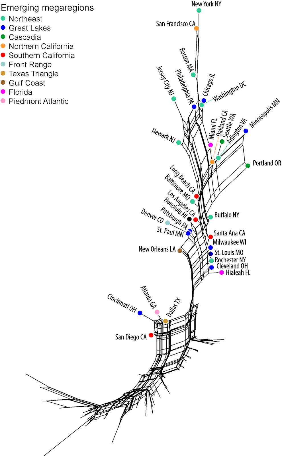
Since these are multivariate data, one of the simplest ways to get a pictorial overview of the data patterns is to use a phylogenetic network, as a tool for exploratory data analysis. For this network analysis, we calculated the similarity of the cities using the Manhattan distance, and a Neighbor-net analysis was then used to display the between-city similarities.
The resulting network of the 98 cities with complete data is shown in the figure. Cities that are closely connected in the network are similar to each other based on how good they are for walking, biking and transit, and those cities that are further apart are progressively more different from each other. The color-coding for the cities is from
Megaregions of the United States.
The network generally shows decreasing walking / transit scores from top to bottom, and decreasing biking scores from right to left. We have labeled only the top group of 29 cities, which are distinctly "better" than the remaining 69, plus four unusual cities (at the middle-left).
Note that, as expected, New York, San Francisco and Boston stand out at the top of the network. Note, also, that Minneapolis and Portland are separated in the network from the other cities, because of their high Bike Scores — all of the other cities in the top group have much lower biking scores. Newark, in particular, has a low biking score. New Orleans is at the bottom-left of this group because it has a low Transit Score but not Walk Score.
For the four unusual cities, separated at the left of the bottom group: Dallas has a low Transit Score, and Atlanta, Cincinnati and San Diego all have a low Bike Score.
The city at the very bottom-left of the network, which has the lowest score on all three criteria, is Arlington TX. Along the same lines, there is an online graph of
The 10 most dangerous states for cyclists, showing Florida way out in front.
Finally, you should be warned about potential problems with rankings like these, based on only a few selected criteria. For example, the real estate site StreetEasy recently tried to compile a list of
the 10 Healthiest Neighborhoods in New York city, and ended up listing the Brooklyn industrial area of Red Hook as number 1, which engendered a couple of negative comments, such as:
I guess the fact that the majority of Red Hook’s parkland has been closed for many years due to lead contamination, or the fact that we have one of the highest asthma rates in the city, was overlooked for this study.
Caveat emptor!


