Tracking wildfires in the west

Wildfires continue to burn in the western United States. The New York Times provides a tracker showing the ones burning now, along with air quality and a smoke forecast.

A couple of weeks ago, it smelled of smoke in my area and the sky was orange. I guess this is the new norm.

Tags: , ,

Fires in the west and climate change

This is some advanced mapping and scrollytelling from the Washington Post. The piece examines climate change in the context of the fires in the western United States.

Starting in the beginning of August, the piece takes you through the timeline of events as your scroll. Maps of temperature, wind, lightning, and fire serve as the backdrop. Berry Creek, California, a mountain town that burned to the ground, provides an anchor to show how large climate shifts can affect the individual.

Well done.

Tags: , , ,

More fire weather days coming

It’s been smoky this season. Based on research from Michael Goss et al., Al Shaw and Elizabeth Weil for ProPublica look at the current fire situation in California and what that might mean for the future and the rest of the country.

In wildfires, as with flooding and heat, climate change doesn’t create novel problems; it exacerbates existing problems and compounds risks. So there is no precise way to measure how much of all this increased wildfire activity is due to climate change. An educated guess is about half, experts say. Its role, however, is growing fast. Within 20 years, climate change promises to be the dominant factor driving larger and more frequent megafires — not only in California, but across the country.

Tags: , , ,

Millions of people experienced unhealthy air in 2020

NPR estimated how many people have experienced unhealthy air this year, largely in part to the wildfires on the west coast:

An NPR analysis of U.S. Environmental Protection Agency air quality data found that nearly 50 million people in California, Oregon and Washington live in counties that experienced at least one day of “unhealthy” or worse air quality during wildfire season so far this year. That’s 1 in 7 Americans, an increase of more than 9 million people compared with 2018, the worst previous year.

Oh.

Tags: , ,

Smoke from the U.S. West Coast travels east and overseas

Smoke from the wildfires made its way to the other side of the country and over the ocean. Using data from NOAA, Reuters animated the smoke clouds over time:

With climate change expected to exacerbate fires in the future, by worsening droughts and warming surface ocean temperatures, wildfire research is becoming especially important. Over the last year, the world has seen record fires in Australia, Brazil, Argentina, Siberia and now the U.S. West.

“I’m concerned that we are starting to see these phenomena more often … everywhere in the world,” Gassó said. “If it’s one year like this, it’s fine, as long as it doesn’t keep repeating itself like this.”

Uh oh.

Tags: , , ,

California wildfires map

Los Angeles Times provides a California-specific map of the current wildfires to stay updated on what’s happening right now.

In the zoomed out view, hexagons bin the individual fires and color by number of hotspots. Wavy hatching indicates levels of air pollution. In the zoomed in view, see the individual fires and click for current status.

Tags: , ,

Fire and smoke map

With the rush of wildfires in California, governor Gavin Newsom declared (another) state of emergency. The Fire and Smoke Map from the U.S. Forest Service and Environmental Protection Agency provides a picture of where we’re currently at. The map incorporates data from a variety of sensors across the country:

The sensor data comes from PurpleAir, which crowdsources data from that company’s particle pollution sensors and shows the data on a map. Before the sensor data appear on the AirNow Fire and Smoke Map, EPA and USFS apply both a scientific correction equation to mitigate bias in the sensor data, and the NowCast, the algorithm to show the data in the context of the Air Quality Index.

Tags: ,

Where the Australia fires are burning

The New York Times zoomed in on southeastern Australia where the fires have hit the worst. They also used small multiples to show the scale of the fires the past few months against previous years.

Tags: , ,

Visual guide for the fires in Australia

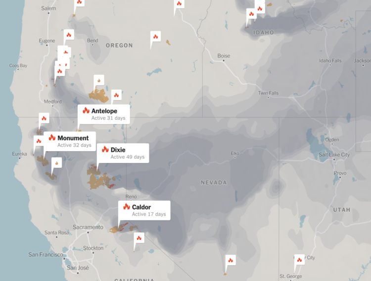
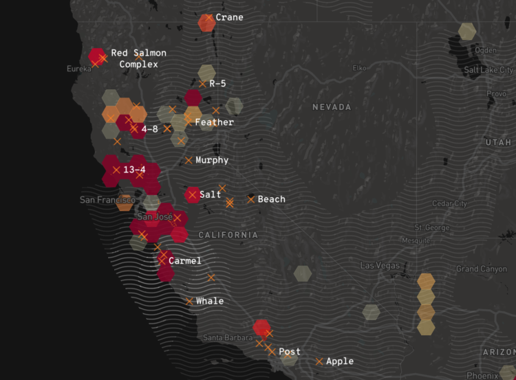
For The Guardian, Niko Kommenda and Josh Holder provide a visual guide to the bushfires in Australia:

Satellite data from Nasa showed a stark increase in the number of fire detections in November and December compared with previous years. Satellites detect fire “hotspots” by measuring the infrared radiation emitted by the blazes.

In previous years, between 2,000 and 3,000 such hotspots were recorded each December in the south-east, while in 2019 the number reached 227,000.

There’s an animated time series chart that changes the range of the y-axis, which I think is a good way to demonstrate the scale of the current fires.

Tags: , , ,