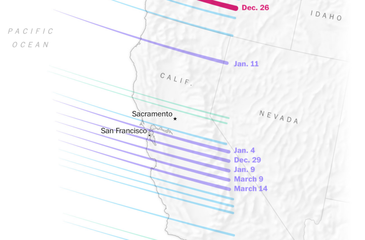
It rained a lot more than usual this winter in California. Diana Leonard and Dylan Moriarty, for The Washington Post, explain the science behind all the water falling from the sky.
Tags: rain, Washington Post, weather
Adam's Blogroll: click through to the author's blog
It rained a lot more than usual this winter in California. Diana Leonard and Dylan Moriarty, for The Washington Post, explain the science behind all the water falling from the sky.
Tags: rain, Washington Post, weather
Posted by in maps, rain, Washington Post, weather
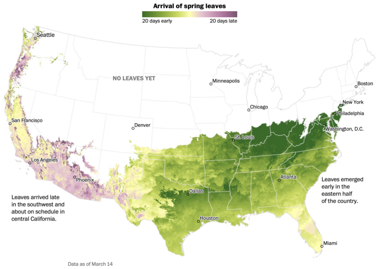
Going off the calendar, today is the first day of spring, but nature just goes off the weather. For The Washington Post, Harry Stevens mapped the early and late arrival of spring leaves across the country:
This year’s winter weather pattern cleaved the country in half. As a ridge of high atmospheric pressure warmed the east, a low pressure system kept conditions cooler and wetter than usual across the west, said Michael A. Crimmins, a climate science professor at the University of Arizona.
It’s like Punxsutawney Phil has no actual bearing on the arrival of spring.
Tags: spring, Washington Post, weather
Posted by in maps, spring, Washington Post, weather
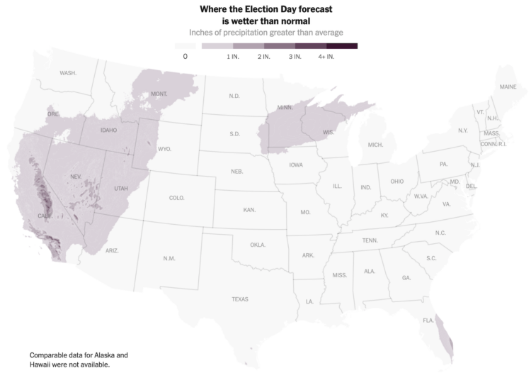
There’s rain in the forecast tomorrow in some areas of the United States, which is worth noting because tomorrow is election day. Eve Washington and John Keefe, for The New York Times, picked out the overlap between competitive races and areas it’s likely to rain.
Mainly I post for the A+ headline: “Will Rain Affect Turnout Tomorrow? The Answer Is Cloudy.” That, and I’m reminded of the ever important overlap between an eclipse and sasquatch sightings.
Tags: election, forecast, New York Times, weather
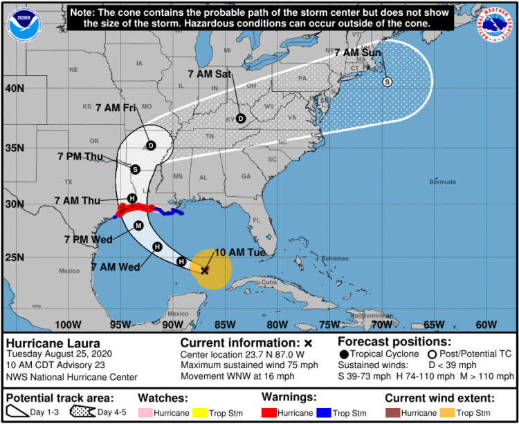
It seems that there is always surprise when a hurricane makes landfall in some areas, which some attribute to poor forecast communication with the cone on a map that shows possible paths. Scott Dance and Amudalat Ajasa for The Washington Post discuss the challenges that people have reading the cone of uncertainty:
Indeed, many residents and authorities have said Ian’s track surprised them, even though the cone for days included the storm’s eventual landfall point on its southern edge. So some meteorologists and social scientists are saying the disaster is only the latest evidence that the Hurricane Center should revamp the way it depicts forecasts — communicating the scope and intensity of a storm’s threats, rather than just the expected path of a single point at its center.
Maybe, when it comes to communicating hurricane forecasts, we should get rid of possible-paths maps altogether and focus on possible outcomes. The shape and direction of a storm matters a lot less than the chances the storm hits your town. So no path, just choropleth map that shows probabilities.
Tags: forecast, hurricane, uncertainty, Washington Post, weather
Posted by in design, forecast, hurricane, uncertainty, Washington Post, weather
Meteorologist Greg Dutra was delivering the daily weather news for ABC Chicago and accidentally discovered that his map was interactive when he touched the screen:
This wasn’t in the training manual! @TBrownABC7 @valwarnertv and I go OFF THE RAILS when I discovered the TV is a touch screen while on-air on @ABC7Chicago
pic.twitter.com/almrdxqz3d
— Greg Dutra (@DutraWeather) August 4, 2022
It’s good, wholesome joy from a data display, in case you forgot what that looks like.
Tags: interaction, weather
Posted by in interaction, maps, weather
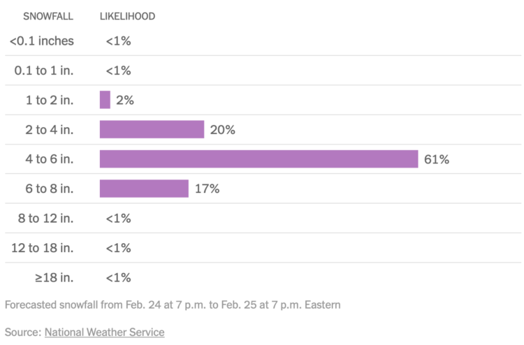
For NYT’s The Upshot, Aatish Bhatia, Josh Katz and Margot Sanger-Katz show the full distribution of expected snowfall in your area instead of just the middle:
The range can be wide. That’s because predicting snow remains tricky, especially several days out, said Alex Lamers, a warning coordination meteorologist at the National Weather Service. Getting a snowfall total right requires predicting the path of a storm correctly, estimating the amount of precipitation and understanding additional factors — like the temperature high in the atmosphere, or wind speeds close to the ground — that can influence the snow’s density.
The Weather Man with Nicolas Cage is such an underrated movie.
Tags: snow, uncertainty, Upshot, weather
Posted by in snow, Statistical Visualization, uncertainty, Upshot, weather

Weather Strip is a new weather app by visualization researcher Robin Stewart. It shows the week’s forecast as a time series chart, aiming to show you details at a glance. The temperature shows as a line chart, and a stacked area chart that represents weather conditions serves as background.
You’d think it’d hit all the right notes for me, but I’m more of a bare minimum type when it comes to weather forecasts. Just a table of highs, lows, and chance of rain is all I need. People seem to be into this view though, so maybe you’ll enjoy this more than me.
Tags: weather

Based on data from the Global Forecast System, The New York Times mapped the lowest temperatures across the country between February 14 and 16.
The blue-orange color scale diverges at freezing, which creates a striking image of a very cold country. The dotted lines and temperature labels make the patterns especially obvious.
As someone who lives in an orange area, I was shocked by all of the blue. Stay safe.
Tags: climate, New York Times, temperature, weather
Posted by in Climate, maps, New York Times, temperature, weather
Apparently ladybugs migrate this time of year, and it’s enough to show up on the radar as a giant rain cloud. Yeah.
The large echo showing up on SoCal radar this evening is not precipitation, but actually a cloud of lady bugs termed a "bloom" #CAwx pic.twitter.com/1C0rt0in6z
— NWS San Diego (@NWSSanDiego) June 5, 2019
Posted by in ladybugs, Mistaken Data, weather