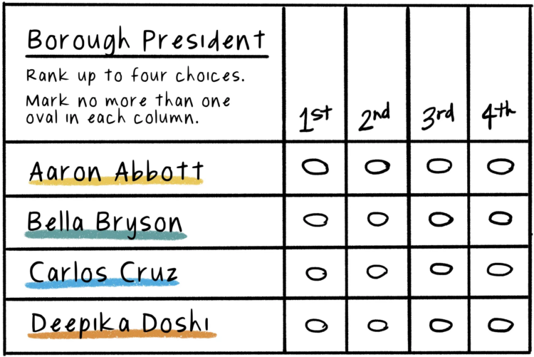
Connie Hanzhang Jin and Kaitlyn Radde, for NPR, used illustrations to explain how ranked-choice voting works. Instead of picking a single candidate, you can rank your choices, and if someone does not win outright, the rankings kick in.
Adam's Blogroll: click through to the author's blog
Connie Hanzhang Jin and Kaitlyn Radde, for NPR, used illustrations to explain how ranked-choice voting works. Instead of picking a single candidate, you can rank your choices, and if someone does not win outright, the rankings kick in.
Posted by in comic, Infographics, NPR, voting

Bloomberg used a Sankey diagram to show the path of over a thousand voting bills, classifying them as restrictive, mixed effect, or expansive:
Across the country, Republican state lawmakers proposed more than 300 bills this year to restrict voting and dozens more that would restrict in some ways and expand in others. But the broadest measures either stalled or were scaled back.
Tags: bills, government, voting
Posted by in bills, government, Infographics, voting

NYT’s The Upshot has a quiz that puts you in a neighborhood via Google Maps images. Who did the neighborhood vote for in the 2020 presidential election? The aggregate of reader results is the most interesting part, which shows a strong correlation between correct guesses and the magnitude of the win by a candidate.
I much prefer this quiz over the refrigerator one The Upshot put up last year.
Tags: election, neighborhood, Upshot, voting
Posted by in election, Infographics, neighborhood, Upshot, voting

For The New York Times, Ford Fessenden, Lazaro Gamio and Rich Harris go with a Dorling cartogram to look at the votes gained per county in the 2020 election, compared against the 2016 election.
As you’d expect, voting overall was up just about everywhere this year. Some counties shifted left. Some shifted right. The key points of interest come about when the the map starts zooming into specific regions.
See also: the election wind map.

It’s election day here in the United States, but millions of votes have already been mailed or dropped off. In some states, the number of early votes already surpassed the total in 2016. The New York Times provides a state-by-state breakdown.
Tags: election, New York Times, voting
Posted by in election, maps, New York Times, voting
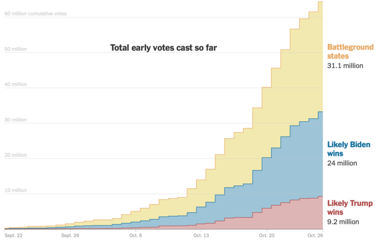
As you might expect, early voting volume is high across the country. In many states, one week until election day, the early voting count is already more than half of the total 2016 counts. For The New York Times, Denise Lu and Karen Yourish provide the breakdown with cumulative charts by state.
See also how long it might take to count all the votes.
And you can download the count data from the United States Election Project.
Tags: election, New York Times, voting
Posted by in election, New York Times, Statistical Visualization, voting
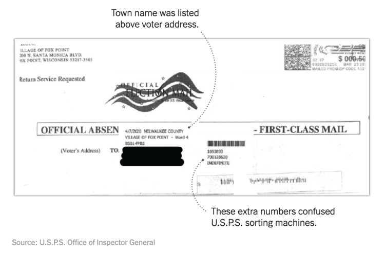
Mail-in ballots can be rejected if they’re not filled out or mailed correctly. A small percentage of them always are. This year, when we’re talking millions of mail-in ballots, even a small percentage means a lot of tossed ballots. For NYT’s The Upshot, Larry Buchanan and Alicia Parlapiano show how some states modified the design of their ballots to reduce the rejections.
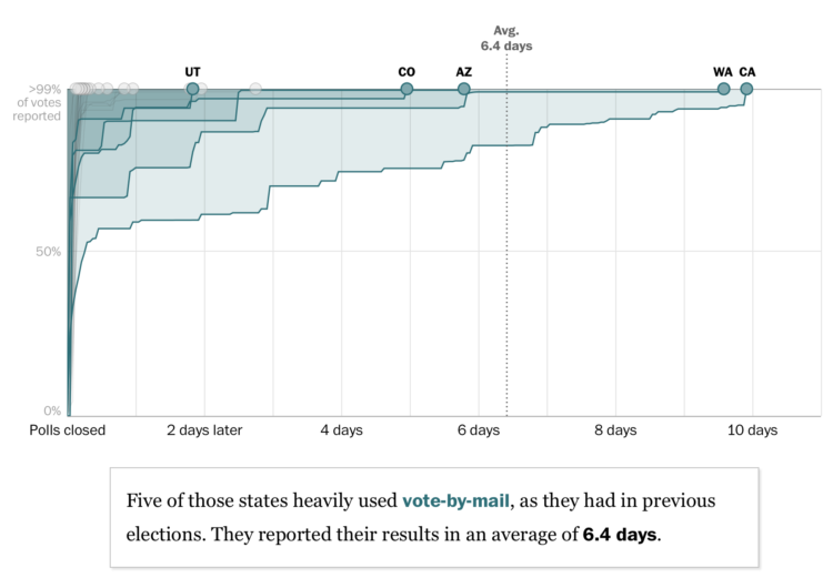
For The Washington Post, Ashlyn Still and Kevin Schaul charted how long it took for primary ballots to be counted in each state. The times might give a hint of what we’re in for on election night:
Before the pandemic struck, mail-in states like California were already counting slowly. Then the coronavirus forced dozens of states to quickly expand absentee voting, and the slowdowns got more dramatic. These two trends — more absentee voting, not much time to prepare for it — could lead to some snail’s-paced race calls in November.
There are some nice details to note in this piece.
The inverted vertical axis and area fills focus on ballots left to count over time instead of ballots already in. The limited contrast keeps attention away from the white space under the lines.
The states move up to the top, and as the lines roll out (in the scrollytelling format), the speed is fixed, so that states that took more time count finish moving later.
And finally, the scrollytelling format helps highlight individual states at a time, and the small multiples at the end probably help satiate those who want to just see it all at once.
It’s a relatively straightforward dataset with multiple time series lines, but the choices make the patterns obvious.
Tags: coronavirus, election, voting, Washington Post
Posted by in coronavirus, election, Statistical Visualization, voting, Washington Post
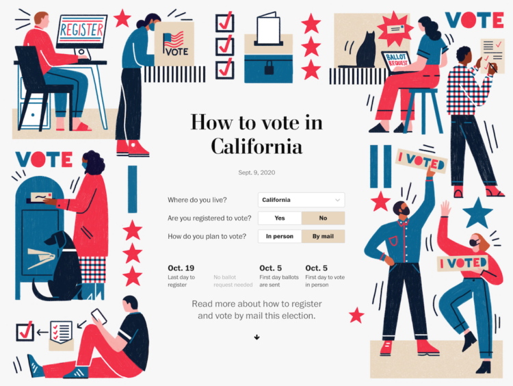
The Washington Post provides another straightforward voting guide, based on where you live and how you plan to vote.
Election season is always interesting graphics-wise, because all of the news outlets are starting with the same data and information. But they all show the data a little differently, asking various questions or using different visual approaches.
Things are just getting started, but contrast this Post piece with FiveThirtyEight’s voting guide. The former zeros in on the your voting scenario, whereas the latter still gives some space for the overall national view.
Tags: election, voting, Washington Post
Posted by in election, Infographics, voting, Washington Post
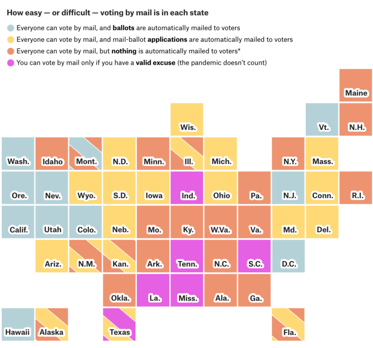
Each state is handling mail-in voting in a certain way with varying timelines and rules. FiveThirtyEight provides a straightforward state-by-state guide so you can see what your state is doing.
I like the color-coded grid map doubling as quick navigation. You get the overview and a jump to the state of interest.
Tags: election, FiveThirtyEight, voting
Posted by in election, FiveThirtyEight, Infographics, voting