Exploration of players’ shot improvement in the NBA

Wondering whether if a player’s shot improves over the course of his career, Peter Beshai shows shot performance for all players from the 2018-19 season:

To understand whether or not a player actually gets better over time, we need some kind of baseline to compare their current performance against. On Shotline, the baseline is set after a player completes their first season in the NBA and has shot at least 200 times. This may sometimes feel a bit arbitrary, and I guess it is, but it feels reasonable to compare a player’s first season’s performance to their current to understand whether they have improved or not. The graphs are set up to allow you to compare their current performance against any other point in time too if the baseline is not sufficiently interesting to you.

Tags: ,

Prophet for forecasting with a lot of data

Facebook released Prophet, which is a procedure to quickly forecast with time series data.

Prophet is a procedure for forecasting time series data. It is based on an additive model where non-linear trends are fit with yearly and weekly seasonality, plus holidays. It works best with daily periodicity data with at least one year of historical data. Prophet is robust to missing data, shifts in the trend, and large outliers.

Plus it’s available in both Python and R. What. Should be worth a look.

Tags: , ,

Ride on the VR time series roller coaster

VR Nasdaq

Speaking of virtual reality visualization, this Nasdaq roller coaster by Roger Kenny and Ana Asnes Becker for the Wall Street Journal is quite the ride. The underlying data is just the index’s price/earnings ratio over time, but you get to experience the climbs and dips as if you were to ride on top of the time series track.

Weeeeeee, bubble burst.

Tags: , ,

A Crash Course for Visualizing Time Series Data in R

Visualizing Time Series Data in R

Last year I put together a four-week course to provide FlowingData members with guided instruction through a few year’s worth of a la carte visualization tutorials in R. While some people have specific visualization types in mind, you might want to learn more about the overall process.

In the same effort, but a bit more focused, here is a crash course for visualizing time series data in R. It’s meant to be digested over just a couple of days to get you going with your own data right away.

All members can access it now.

If you’re not a member yet, you can sign up here for instant access. I’d love your support.

The crash course is for people relatively new to visualization in R, and you don’t need programming experience to put it to use. You start with the basics, move into more advance visualization, and then work through common stumbling blocks to avoid getting stuck.

Tags: , ,

Spiraling global temperature chart

Global temperature is on the rise, as most of us know. Ed Hawkins charted it in this spiral edition of temperature over time.

See also the Quartz chart that uses a standard coordinate system but stacks lines on top of one another.

Tags: , ,

Feeling hot, hot, hot

The Hottest Year

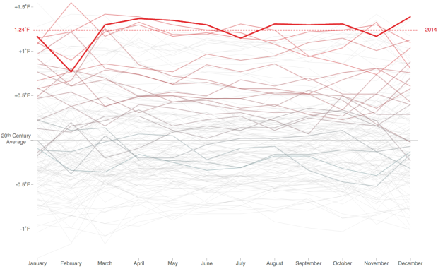
When you look at overall global temperatures over time, you see a rising line and new heat records set. Instead of just one line though, Tom Randall and Blacki Migliozzi for Bloomberg split up the time series by year and animated it.

Each year is overlaid on top of the other with a new time series in each frame. The dotted line rises too as new records are set, and as time passes, the older time series lines fade to the background.

You still get the rising effect as you would with a single time series over the past 135 years, but this view provides more focus to the increase, closer to present time.

Tags: , , , ,

Touchdown passing record

Peyton Manning record

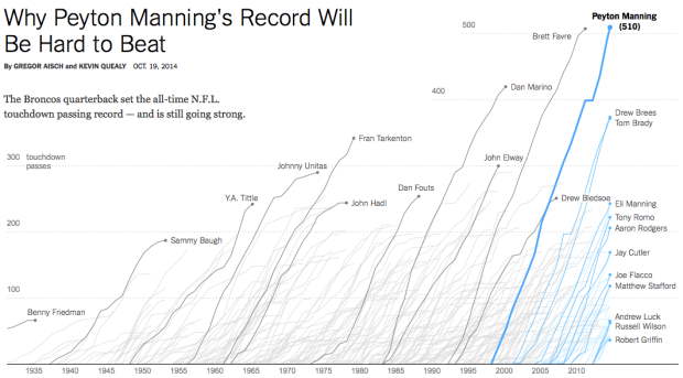
Peyton Manning, quarterback for the Denver Broncos, passed up Brett Favre's career record of 508 passing touchdowns. Manning, currently at 510 passing touchdowns, is now setting his own records that won't be beat for a long while. Gregor Aisch and Kevin Quealy for the Upshot chart out Manning's trajectory of quarterbacks past and present.

Those who have followed New York Times graphics might recognize a similar time series display from when baseball player Alex Rodriguez* joined the 600 home run club. Or from 2007, when Barry Bonds* chased the all-time home run record. It's kind of fun to see the graphics grow bigger, brighter, and more open over the years. Flash disappears. Multi-line voronoi comes in.

At the base though, it's the same chart, and it's still good.

Tags: , ,

Breakout detection in R

Breakout detection

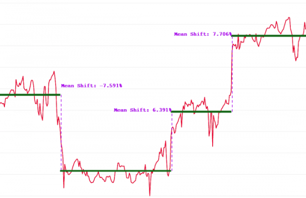
Say you have time series data and you want to detect significant changes, but there's also a lot of noise to sift through. Twitter released an open source R package, BreakoutDetection, to help with that.

Our main motivation behind creating the package has been to develop a technique to detect breakouts which are robust, from a statistical standpoint, in the presence of anomalies. The BreakoutDetection package can be used in wide variety of contexts. For example, detecting breakout in user engagement post an A/B test, detecting behavioral change, or for problems in econometrics, financial engineering, political and social sciences.

Was a quick installation and worked as expected for me. Twitter has released plenty of open source projects, but I think this is the first R package. Nice.

Tags: , ,

F1 racing winners and age

F1 racing winners and age

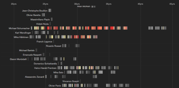
So here's a sport I don't see or hear much about. F1 racing, which requires a different sort of strength and agility than say football or basketball, has a wide range of ages. Drivers can be in their teens. Some are in their late 40s (and successful). Peter Cook visualized the ages and races of drives through F1 racing history, since 1950.

Each row represents a driver's career, and each color-coded dash in a row represents a race. Colors indicate wins, a trip to the podium, and a top 10 finish.

My favorite part is the tour on initial load. The interactive points out highlights in the data, such as the youngest, oldest, and drivers of interest.

Tags: , ,

Your life on Earth

Your life on earth

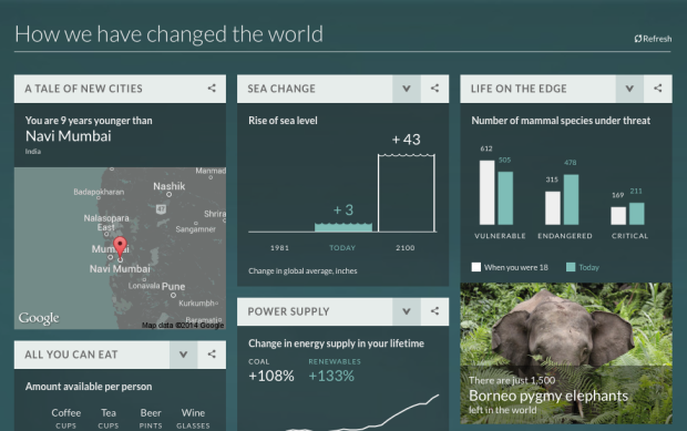
The BBC has a fun piece that shows changes over your lifetime. Enter your date of birth, gender, and height, and you get personalized data nuggets, categorized by how you changed, how the world changed, and how people changed the world during your years on this planet.

For me: 161 major volcano eruptions, 72 solar eclipses, and a 2.7 billion increase in global population.

Naturally, as with most global numbers, these are based on estimates from a wide range of sources, so keep that in the back of your mind as you scroll.

Tags: , ,