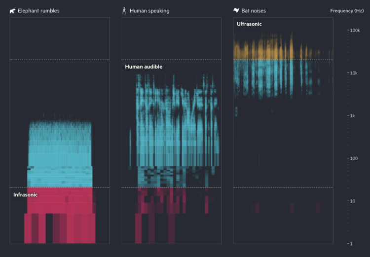
Financial Times highlights how researchers are using AI to try to learn what animal sounds mean and to communicate back. Turn on the sound for maximum effect.
Tags: AI, animals, Financial Times, sound
Adam's Blogroll: click through to the author's blog
Financial Times highlights how researchers are using AI to try to learn what animal sounds mean and to communicate back. Turn on the sound for maximum effect.
Tags: AI, animals, Financial Times, sound
Posted by in AI, animals, Financial Times, sound, Statistical Visualization
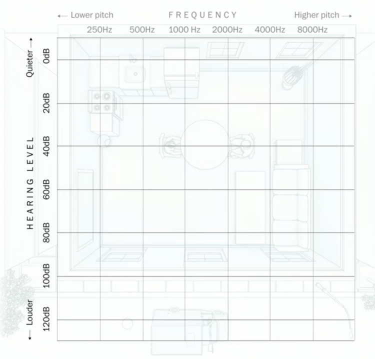
Using an audiogram as a backdrop, Amanda Morris and Aaron Steckelberg, for The Washington Post, explain what hearing loss sounds and looks like.
Hearing level, or volume, is on the vertical axis, and frequency, or pitch, is on the horizontal axis. Objects in the illustration are placed based on where they reside in the coordinate system, which is pretty great. Put on headphones for the full effect.
Tags: hearing, illustration, sound, Washington Post
Posted by in hearing, illustration, Infographics, sound, Washington Post
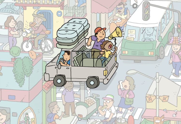
Aaron Reiss and Oscar Molina Palestina, for The Pudding, explore the sounds of Mexico City, focusing on the street vendors and daily life. With implementation by Michelle McGhee and illustrations by Diego Parés, the piece walks you through individual sounds with what they mean and why they are relevant.
The sounds on their own probably would’ve just seemed like noise to a foreigner, but the tour through the illustrated city really helps you hear.
Posted by in Infographics, mexico, Pudding, sound
When I think swamp noise, I imagine a blob of sound that’s some mix of water and wildlife, but that’s because I don’t know anything. Mitchell Whitelaw, in collaboration with ecologist Skye Wassens, used recordings of Nap Nap Swamp in New South Wales, Australia to show you a breakdown of what the individual sounds are.
You hear the sounds of running water, wind, and different animals with various patterns. This is all framed over time and a subtle visualization to show water levels. The sound profile at the swamp changes as the water rises. Nice, calming work.
Tags: Mitchell Whitelaw, Nap Nap Swamp, nature, Skye Wassens, sound, water
Posted by in Mitchell Whitelaw, Nap Nap Swamp, nature, Skye Wassens, sound, Statistical Visualization, water
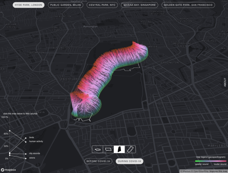
With lockdown orders arounds the world, places that we’re allowed to go sound different. The MIT Senseable City Lab looked at this shift in audio footprint through the lens of public parks:
Using machine learning techniques, we analyze the audio from walks taken in key parks around the world to recognize changes in sounds like human voices, emergency sirens, street music, sounds of nature (i.e., bird song, insects), dogs barking, and ambient city noise. We extracted audio files from YouTube videos of park walks from previous years, and compared them with walks recorded by volunteers along the same path during the COVID-19 pandemic. The analysis suggests an overall increase in birdsong and a decrease in city sounds, such as cars driving by, or construction work. The interactive visualization proposed in Sonic Cities allows users to explore and experience the changing soundscapes of urban parks.
The 3-D view shown above is visually interesting, but the top-down view is the easiest to read, looking like a stacked area chart over a map.
At distinct points on the mapped paths, a gradient line represents the distribution of quieter and louder sounds. Louder sounds appear to take up more space during the pandemic.
It’s hard to say how accurate the sound classification is through this view, but as I poked around, it seemed a bit rough. For example, the chart for Central Park in New York shows bird sounds making about 0% of the footprint, but you can hear birds pretty easily in the audio clips. I’d also be interested in how they normalized between YouTube clips and their own recorded audio to get a fair comparison.
Nevertheless, it’s an interesting experiment both statistically and visually. Worth a look.
Tags: coronavirus, machine learning, MIT Senseable City Lab, park, sound
Posted by in coronavirus, machine learning, maps, MIT Senseable City Lab, park, sound

Sports visualization and analysis tends to focus on gameplay — where the players are, where the ball goes, etc. In Reimagine the Game, the focus in on crowd noise through the course of a game. Pick a game and see the waves of noise oscillate through the arena during significant events.
It’s an advertisement feature on The Economist, which is kind of interesting, but it’s still fun to watch the games play out.
Posted by in soccer, sound, sports, Statistical Visualization