Wind flows displayed with spinning paddles

Joanie Lemercier used a grid of spinning paddles that turn with the wind. Collectively, they show the flows through the air in real-time.

It reminds me of a digital map that used a similar geometry to show wind patterns across the United States.

Tags: , ,

Rock map of Scotland

Harry Jefferies shared his grandfather’s 30-year project:

My grandpa who is 85 started making this rock map of Scotland in 1992. He collected rocks during amateur geology trips over 30 years. He says it had to be geologically correct and also aesthetically pleasing. He asked if I could share online as He wants to go viral so please share

Thirty years. I’m a sucker for slow data collection and physical visualization.

Tags: , , ,

Crochet lake map

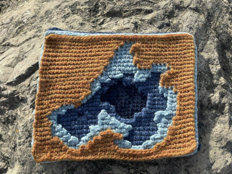
Andrew Hahn crocheted a map of Lake Mendota in Wisconsin. Each stitch represents 300 square meters and each layer represents 10 meters of depth. I should learn to crochet.

Tags: , , ,

Global warming bike path

It amazes me how many places in the world Ed Hawkins’ Warming Stripes appears. My favorite has still gotta be the shower tiles.

Tags: , ,

Chicken egg color spectrum

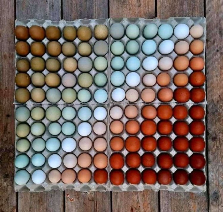
Eggs aren’t always white, which is oddly calming in this photo.

(I couldn’t figure out where this picture was originally from. Anyone?)

Tags: , ,

Map made of candy corn to show corn production

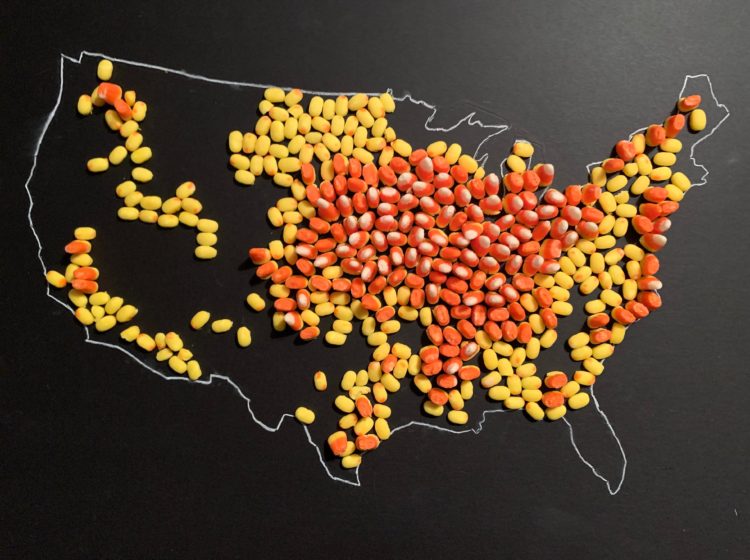
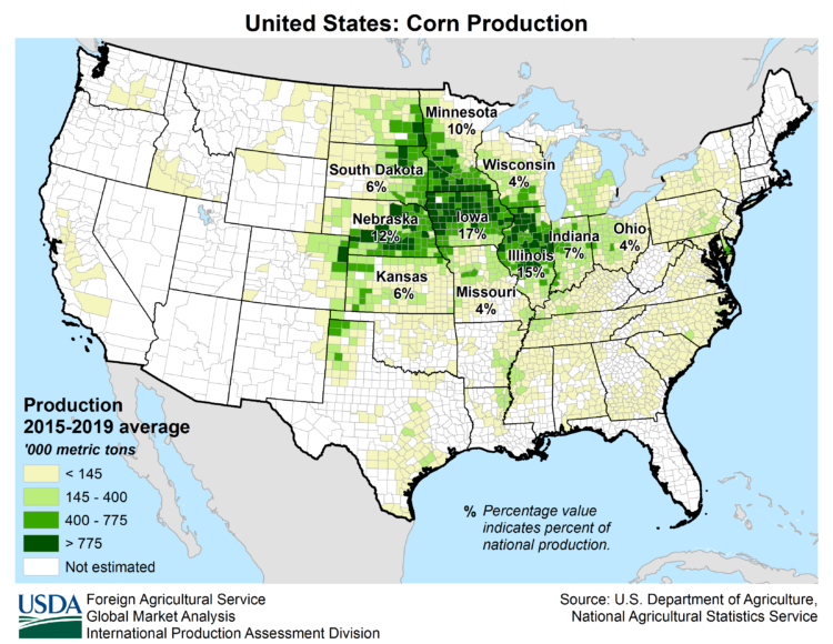
With candy corn as her medium, Jill Hubley mapped corn production in the United States, based on data from the USDA. With just three hues of yellow, orange, and white and three heights to match, Hubley was able to clearly show the geographical patterns.

For reference, here is the USDA corn map:

Finally, I have a use for my kids’ leftover Halloween candy.

Tags: , , ,

A flag planted for every Covid-19 death

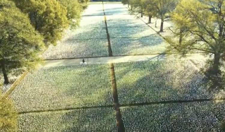
In fall 2020, Suzanne Brennan Firstenberg planted a flag for each American who died from Covid-19. There were over a quarter of a million flags at the time. The art installation is back at the National Mall, but this time there are over 660,000 flags. The scale is just…a lot.

Tags: , , ,

Data recorded in fabric quilt

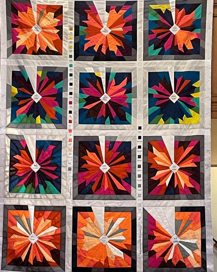
Kim Moran-Jones quilted temperature minima and maxima in the UK, along with Covid-19 deaths on the perimeter in grayscale. Data and the physical fit well together.

Tags: , , ,

Data visualization in virtual reality

Virtual reality puts you in a digital world that can feel like a real world when it’s done right. Research from Benjamin Lee, et al. explored some of the possibilities in work they’re calling data visceralation.

As a proof of concept, shown in the video above, the researchers recreated popular works for virtual reality. Watch Olympic runners sprint past you or look up at the comparison of the world’s tallest buildings.

The goal is essentially to make the abstract shapes or data points feel more real. Looks promising.

By the way, this work is going to be presented at VIS 2020, which will be virtual and free to attend this year. If you’re interested in poking your head in, but don’t know where to start, Robert Kosara wrote an outsider’s guide to the conference to point you in the right direction.

Tags: ,