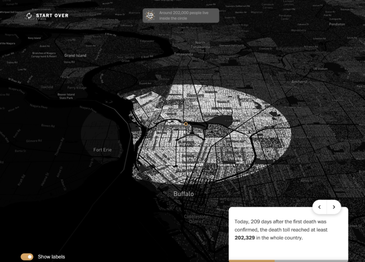
With recorded U.S. Covid-19 deaths passing the 200k mark, somehow the number still feels distant for many. The Washington Post, in collaboration with Lupa and the Google News Initiative, brings the tally to your neighborhood to help you relate more closely.
The story starts at your location. Based on population counts and density, you zoom out to see an approximation of how far a death radius would expand from where you are. You’re also taken to a county that would be wiped out.
Obviously we’re looking at hypotheticals here, but the interactive provides a granular sense of scale. The point is that 200,000 people dead is… a lot.
The Post’s version is based on Lupa’s original, which they made with Brazil numbers and location. Alberto Cairo provides background on the project here.
Small note for those who make these location-based interactives. Some people (me) who don’t want to share location or are outside the range of your dataset, it’s useful to provide links to well-known locations, so that they can still see the data.
Tags: coronavirus, neighborhood, personalization, scale, Washington Post