Happiness ratings, by country and age

The World Happiness Report, published each year since 2012, just dropped for 2024. They focused on age and happiness this year. Overall, the United States ranked in the range from 17 to 29 among all countries, but was worse for young people. Finland was definitively at the top.

The visualizations are clinical, which is kind of sad given the topic of the report. Someone should collate the data and have some fun with it.

Tags: ,

How much more income people need to be happy

For the Wall Street Journal, Joe Pinsker reports on income and happiness, or more specifically, on the raises people said they needed to be happy. The more people have the more they need.

Tags: , ,

When Americans Are Happiest

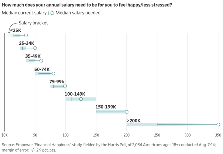
We saw that life satisfaction changes with age, based on data from the Bureau of Labor Statistics. In the same survey, people were also asked about their happiness throughout the day when they ate, traveled, watched television, took care of kids, and other activities.

People reported happiness on a scale from 0 to 6, where 0 was not happy at all and 6 was very happy. The animation above shows the average happiness for the fifty most common activities. It runs from age 20 to 70.

Work, as you might imagine, sticks around the bottom of the range; eating and drinking lingers around the middle and the top; and socializing sticks around the top. The smaller circles show more variation over time, as kids and grandkids enter the picture and retirement kicks in.

Notes

The data comes from the well-being module of the 2021 American Time Use Survey. I downloaded microdata via IPUMS. I made the animation with R.

Tags: , ,

Building a happy life, interpreted through data

How to Build a Happy Life from The Atlantic is a podcast on finding happiness:

In our pursuit of a happy life, we build, we structure, and we plan. Often, we follow conventional wisdom and strategize. But what happens when our plans fall through and expectations don’t meet reality—when the things that should make us happy don’t?

In season 3 of our How To series, Atlantic happiness correspondent Arthur Brooks and producer Rebecca Rashid seek to navigate the unexpected curves on the path to personal happiness—with data-driven insights and a healthy dose of introspection.

I’m late to this, but I had some downtime during the Thanksgiving break and liked the data- and research-centric episodes. As you might expect, there’s a lot of fuzziness in the numbers and there’s more than one way to find happiness.

Tags: , , ,

Mapping happiness

Gallup surveyed Americans about their well-being across various factors. National Geographic gets into some of the geographic breakdowns.

While Gallup’s survey doesn’t attempt to explain why individuals feel the way they do, it does expose some commonalities among the lives of Americans. Respondents from the lowest ranked states were more likely to report worse physical and financial health: They were more likely to smoke, be obese, and have little interest in life. They also reported not having enough money to buy food or healthcare.

You can grab the data from the Gallup site here.

Tags: ,

Emotional dynamics of literary classics

Happiness meter for Huck Finn

As a demonstration of efforts in estimating happiness from language, Hedonometer charts emotion over time for literary classics. The above is the collection of charts for Adventures of Huckleberry Finn by Mark Twain.

I wish I could say this meant something to me, but comparative literature in high school was never my strong suit. From a totally superficial point of view though, the chart in the top left shows happiness metrics — based on the research of Peter Dodds and Chris Danforth — through the entirety of the book. The chart on the right shows a comparison of book sections, which you can select in the first chart.

Tags: , ,