Language-based AI to chat with her dead husband

For the past few years, Laurie Anderson has been using an AI chatbot to talk her husband who died in 2013. For the Guardian, Walter Marsh reports:

In one experiment, they fed a vast cache of Reed’s writing, songs and interviews into the machine. A decade after his death, the resulting algorithm lets Anderson type in prompts before an AI Reed begins “riffing” written responses back to her, in prose and verse.

“I’m totally 100%, sadly addicted to this,” she laughs. “I still am, after all this time. I kind of literally just can’t stop doing it, and my friends just can’t stand it – ‘You’re not doing that again are you?’

“I mean, I really do not think I’m talking to my dead husband and writing songs with him – I really don’t. But people have styles, and they can be replicated.”

One part of me feels like this isn’t the way to preserve a memory of someone who is gone, but the other part feels that I would do the same thing if I were in her situation and had the opportunity.

See also the man who trained an AI chatbot with old texts from his dead fiancee.

Tags: , , ,

Local wanderlust

Alastair Humphreys, using a 20 by 20 kilometer map of where he lives, explored one square kilometer at a time as if he were traveling farther. For the Guardian:

Travelling around my unremarkable map for a year gave me much to remark on. It was one of the most interesting journeys of my life and shifted my perspective on the way we choose to travel. It made me calmer and healthier. It fostered feelings of curiosity, awe, gratitude and a deeper awareness of nature than I had experienced before. The more you look, the more you see. The more you see, the more you learn and care. Your local map is a fractal of the world at large. Embrace it, care for it, cherish it, and discover it. You might just find that a single map is enough exploration for an entire lifetime.

Tags: , ,

Supermarket provides AI-driven meal planner and is disappointed by the internet using it to output weird recipes

A supermarket chain in New Zealand offered an AI-based recipe generator, and of course people started throwing in random household items to see what it would make. For The Guardian, Tess McClure reports:

The app, created by supermarket chain Pak ‘n’ Save, was advertised as a way for customers to creatively use up leftovers during the cost of living crisis. It asks users to enter in various ingredients in their homes, and auto-generates a meal plan or recipe, along with cheery commentary. It initially drew attention on social media for some unappealing recipes, including an “oreo vegetable stir-fry”.

When customers began experimenting with entering a wider range of household shopping list items into the app, however, it began to make even less appealing recommendations. One recipe it dubbed “aromatic water mix” would create chlorine gas. The bot recommends the recipe as “the perfect nonalcoholic beverage to quench your thirst and refresh your senses”.

Tags: , , ,

Experimental Noisycharts sonifies data for improved accessibility

Nick Evershed, for The Guardian, describes Noisycharts, an experimental component for their in-house charting tool:

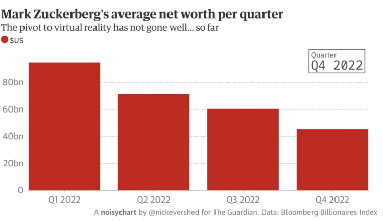
What does rising global carbon dioxide sound like? Or the crash of the pound? How about Sydney’s record-breaking rainfall, or the share value wiped out following Facebook’s pivot to virtual reality?

While all of these things have been frequently graphed, now we can turn them into audio as well.

Noisycharts is a new tool created by Guardian Australia to easily turn data into sound, with an animation to accompany it.

One of the examples uses a modulated dog bark to demonstrate how the sounds can match with the context. That seems like a fun path to explore.

Unfortunately, it’s not meant for public use (yet?). For that, you might want to check out TwoTone.

Tags: , ,

Communicating effectiveness of boosters

Statisticians David Spiegelhalter and Anthony Masters for The Guardian on reframing risk estimates:

An earlier UKHSA study estimated two Pfizer/BioNTech doses gave around 99.7% (97.6% to near-100%) protection against Delta-infected hospitalisation, but after 20 weeks that effectiveness waned to 92.7% (90.3% to 94.6%). This estimated decline for people over 16 may not sound much, but if we look at it in terms of “lack of protection”, their estimated vulnerability relative to being unvaccinated went from 0.3% to 7.3%. That is a major, although uncertain, increase in risk.

Such “negative framing” can change impressions: “90% fat-free” sounds rather different than “10% fat”.

Tags: , , , ,

Visual guide to redistricting

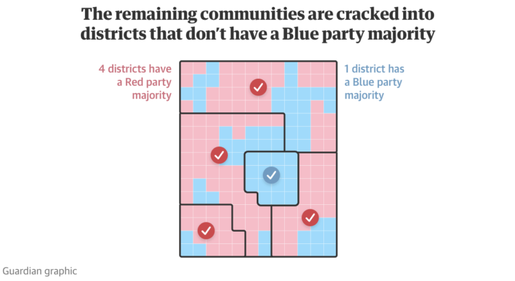
Gerrymandering continues to be an important thread that I think many people still don’t understand, mostly because it’s called gerrymandering. The Guardian provides a visual guide to explain how creative redistricting can lead to favorable votes.

If you’re still not sure, see also the game District by Christopher Walker which walks you through what gerrymandering is and how it works.

Tags: , ,

Measuring centuries-old droughts through tree rings

To measure drought in the present day, we use data from sensors that constantly record environmental conditions, such as soil moisture, precipitation, and snow water content. But to measure drought thousands of years ago, researchers can use tree rings. Alvin Chang for The Guardian shows how the researchers line up old rings to gather historical data and then do that across a region.

Tags: , , ,

Melting glaciers

Niko Kommenda for The Guardian used small multiples to show 90 of the largest glaciers in the world and how they have melted over many decades. The animation transitions between two time periods for each glacier, showing what was there earlier and what is left.

Tags: , , ,

Testing Gmail’s tab choices on presidential candidates’ emails

For many, Gmail automatically categorizes incoming emails to the primary inbox, promotions, and spam. The Markup and The Guardian tested the categorization on presidential candidate emails:

Their results:

I don’t use Gmail, and I don’t get any of these emails, but I’m curious how these candidate emails differ. Does Buttigieg write more personal messages whereas Sanders’ is more like an advertisement?

Tags: , , , ,

Visual guide for the fires in Australia

For The Guardian, Niko Kommenda and Josh Holder provide a visual guide to the bushfires in Australia:

Satellite data from Nasa showed a stark increase in the number of fire detections in November and December compared with previous years. Satellites detect fire “hotspots” by measuring the infrared radiation emitted by the blazes.

In previous years, between 2,000 and 3,000 such hotspots were recorded each December in the south-east, while in 2019 the number reached 227,000.

There’s an animated time series chart that changes the range of the y-axis, which I think is a good way to demonstrate the scale of the current fires.

Tags: , , ,