Common Millionaire Household

One million dollars is a lot of money, and for most people, it can seem so far out of reach it might as well be impossible. However, a lot of households have at least that in financial assets, which doesn’t count the value of non-financial assets like a house or car.

Read More

Curiously timed stock trades by ultra-wealthy

Continuing an analysis of IRS records, Robert Faturechi and Ellis Simani for ProPublica delve into the timing of executives trading stock in partners and competitors:

The Medpace executive is among dozens of top executives who have traded shares of either competitors or other companies with close connections to their own. A Gulf of Mexico oil executive invested in one partner company the day before it announced good news about some of its wells. A paper-industry executive made a 37% return in less than a week by buying shares of a competitor just before it was acquired by another company. And a toy magnate traded hundreds of millions of dollars in stock and options of his main rival, conducting transactions on at least 295 days. He made an 11% return over a recent five-year period, even as the rival’s shares fell by 57%.

Tags: , , ,

Wealthy Percentiles Rising

The rich continue to get richer, and everyone else either only kind of earns more or stays where they’re at. This chart shows how Americans in the 99th percentile, or the top 1%, separated from the bottom more over the years.

Read More

Inevitably super rich

Sometimes it feels like a foregone conclusion that most of the money ends up with a small percentage of people. Alvin Chang, for The Pudding, describes the Yard-sale model, which shows how such a skew in distribution inevitably happens even when an individual’s chances seems fair.

This is a fun one. It’s got illustrations, simulations, and interaction to show you how the (simplified) model works and applies to your life.

Tags: , , , ,

Less rich Covid billionaires

With Covid came sudden shifts in daily life and work, which gave rise to certain companies that were able to fill specific needs. Some individuals’ net worth increased many times over. But as things move back closer to where they were pre-Covid, sudden wealth is also moving back. Bloomberg zeros in on the billionaires whose net worth increased and then decreased because of the life changes.

The chart above uses scaled bubbles to show the shifts from peak to present. The horizontal axis represents percentage change since the end of 2019.

Tags: , , ,

Shifting flight paths for wealthy Russians

For The New York Times, Pablo Robles, Anton Troianovski, and Agnes Chang mapped the change in destinations for Russian private jets, before and after sanctions. Before, it was more about Paris, Milan, and Geneva. After, Dubai became a top destination.

I like the charts after the map. A slope chart with a white fill provides contrast and a flight departures board gives a little something extra.

Tags: , , ,

Comparing rich people incomes and the taxes they pay

Based on leaked IRS data for the 400 wealthiest Americans, ProPublica provides a comparison of their incomes and the lower taxes they paid between 2013 and 2018. This might be best piece so far from ProPublica’s IRS series in terms of understanding the big picture from their dataset. Also, that “smaller than a pixel” note for the average American is doing some heavy lifting.

Tags: , , ,

Jeff Bezos wealth to scale

Jeff Bezos’ wealth is difficult to understand conceptually, because the scale is just so much more than what any of us are used to. So for NYT Magazine, Mona Chalabi took a more abstract approach, focusing less on monetary values and more on how many multiples more Bezos has compared to the median household.

See also The Washington Post’s comparison from a couple of years ago, scaling things down to spending equivalencies. I think Chalabi’s comparison works better. It’s abstract compared with abstract.

Tags: , , , ,

Pollution by the rich versus poor

Based on estimates from the World Inequality Lab, Bloomberg shows how wealthier individuals’ habits — not just countries’ activities — contribute more to overall carbon emissions.

There’s a 3-D grid map with a square for each country. It transitions from the usual way of looking at national carbon emissions to carbon emissions from the wealthy who live everywhere. You can always count on Bloomberg to keep their graphics spicy.

Tags: , ,

Billionaire’s spending scaled to your net worth

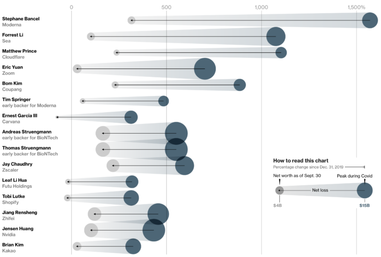
We hear about billionaires spending millions of dollars on ads, acquisitions, etc. It seems like a ridiculous amount of money, but that’s partially because us common folk think of the millions of dollars in the context of our own net worth. When Jeff Bezos spends a few multiples of what we will never make in a lifetime, it seems like a lot.

For The Washington Post, Michelle Ye Hee Lee and Youjin Shin made an interactive that instead looks at the spending as a percentage of net worth. The purchases suddenly seem less crazy (sort of).

It’s simple math but a nice way to make the spending scales more relatable.

Tags: , , ,