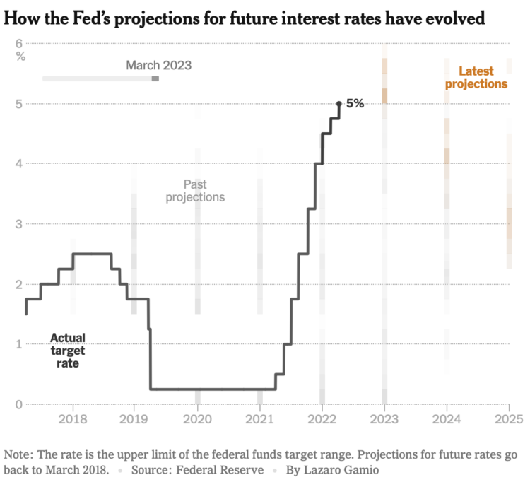
This clever chart by Lazaro Gamio shows changing interest rates set by the Fed and changing projections. The animation makes it.
Tags: animation, interest, New York Times, projections
Adam's Blogroll: click through to the author's blog
This clever chart by Lazaro Gamio shows changing interest rates set by the Fed and changing projections. The animation makes it.
Tags: animation, interest, New York Times, projections
Posted by in animation, interest, New York Times, projections, Statistical Visualization
It’s been a while since we got our regular reminder that the Mercator projection is better for navigation on the tradeoff for distorted area at the poles. Neil Kaye provides an animation:
Animating the mercator projection so countries and territories are correct size and shape in relation to each other.#dataviz #30Daymapchallenge #worldisnotflat #day28 pic.twitter.com/968GSBepA1
— Neil Kaye (@neilrkaye) November 28, 2021
See also the Mercator projection with the poles shifted to where you live and this physical demo of how all maps have their distortions.
Tags: Mercator, Neil Kaye, projections
Posted by in maps, Mercator, Neil Kaye, projections
Posted by in Humor, Miscellaneous, projections, SMBC

We’ve seen faces as map projections before, but this is 63 projections on one page. Plus, you can click and drag to change the center points to see how different parts of the face change.
Tags: projections
Posted by in maps, projections
FLOW is an interactive art installation by Maotik that represents real-time weather data in the form of digital tides and waves that fill a room.
I used 11 parameters to define the ocean form, we connect ourselves to a database and retrieve data such as sea levels, tide coefficient, humidity, weather cast, wind force, wind direction, weather cast, moon cycle, location, time of the day. When parameters such as wind force or sea levels will affect the movement of the sea others such as weather cast or humidity will change the colors.
How do I install this in my garage?
Tags: nature, projections
Posted by in Data Art, nature, projections
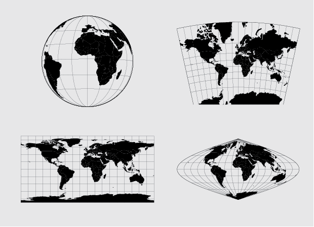
We’ve seen many one-off projects that show the distortions you get when you project a map. There’s just no avoiding them, when you convert a 3-D object onto a two-dimensional plane. Vox demonstrates and explains with an inflatable globe.
Tags: projections, Vox
Posted by in maps, projections, Vox

Most of us have seen the True Size of Africa graphic that squishes multiple countries into an area we normally see as much smaller. This is because of projections, which places a spherical planet in a two-dimensional space. Different projections have different tradeoffs. Even the True Size graphic has issues.
This interactive by Zan Armstrong tries a different route by overlaying two globes against each other.
I was inspired to create this after reading a friend's account of his time fighting Ebola in Sierra Leone. He was frustrated with misunderstanding about the disease, including that a "school in New Jersey that panicked and refused to admit two elementary school children from Rwanda. Never mind that Rwanda is 2,600 miles from the epidemic area in West Africa. That’s the distance from my apartment in DC to Lake Tahoe."
Rotate each globe on the left to the areas of interest. The globe on the right shows two highlighted areas in the same view.
Nice.
Tags: perspective, projections
Posted by in Mapping, perspective, projections
No need to settle for the mapping defaults in R. Apply map projections to show geographic data in a way most suitable for your work.
Posted by in projections, R, shapefile, Tutorials
No need to settle for the mapping defaults in R. Apply map projections to show geographic data in a way most suitable for your work.
Posted by in projections, R, shapefile, Tutorials