A New FlowingData Book, Second Edition

I wrote a book! It’s the second edition of Visualize This. It focuses on the how of visualization with practical examples that you can apply to your own data. You’ll learn how to use a variety of tools and work through the full visualization process, from data to visual analysis to publication-ready graphics.

This second edition is loosely based on the first, but this is a brand new book. The examples are new, the tools are refreshed, and I rewrote almost every word. It turns out a lot can change over a decade and a half.

You can pre-order Visualize This now.

I hope it’ll help all of you have more fun with data.

More updates to come.

Tags:

Posted by in Book, Site News

Tags:

Permalink

Where else to find FlowingData

You can always count on the site for updates on visualization, data, and statistics. There’s also RSS and email. But someone told me you should meet the people where they are, so here are the other places you can find FD.

Instagram — Visual. More common to post less frequently. I have a feeling this might be where I end up in my social media travels.

X/Twitter — There was a time when I had a Twitter app open all the time while I wrote my books and dissertation. It was a fun place for ideas and to share things. It’s in a weird place now, and it doesn’t seem to be getting better. So I’m still around, for now.

LinkedIn — Whoa. I have no idea what I’m doing in this career-focused place. But every couple of weeks someone posts one of my projects as their own and it gets thousands of interactions, so here I am.

YouTube — I animate data sometimes that works better in video format.

Reddit — The visualization-centric Subreddits can be overly critical and seem to have a high ratio of armchair chart experts. But I also want to know who took the flowingdata username and never posted many years ago. (It might have been me.)

Bluesky — As Twitter alternatives go, this might be it. I’m not sure if I want an alternative though.

Threads — Or maybe this? I don’t know it’s too much.

Mastodon — I’m here. It doesn’t seem like it’s for me. It took me three tries to spell mastodon correctly.

Social media is at a crossroads, so I’m kicking the tires on everything at this point.

Tags:

On the Data Journalism Podcast

I had a short chat with Alberto Cairo and Simon Rogers on The Data Journalism Podcast. They talk to people about data journalism. It’s a podcast. Thanks to Alberto and Simon for having me and luring me out of my bubble.

Tags: ,

New Visualization in R Course, and Other Updates

I have two course-related updates on FlowingData. First, there’s a new course on visualizing data with R. Second, I updated the Visualization for Clarity course so that you can more easily get feedback from me on how to make a better chart.

Members get instant access to the new courses. If you’re not a member yet, you can find information here.

If you’re already a member (thank you), log in and you can have at it.

Visualization in R

The first version that I wrote several years ago was an effort to consolidate my visualization tutorials so that those new to charts in R had a more step-by-step way to follow along.

This second version of the course is completely rewritten with new examples, exercises, quizzes, and resources all in one place. So it should be easier to follow along. You can also keep track of what you’ve completed and pick up where you left off. I hope it’s helpful.

Find more details on the Visualization in R course here.

Improving with feedback

I have another course, Visualization for Clarity, which is tool-independent. It’s more focused on making data graphics that help people understand data better than it is on the tools to work with data.

There are a few new wrinkles to this course. There are more exercises and resources. There are quizzes.

But the best part is that there’s a final project that you can send to me. If you send your project by November 30, 2022, I’ll send back comments on how I might make it better (or how great the work is).

When I was new to visualization, I made charts and stared at them for a while. I knew there was something to improve, but I wasn’t sure what it was, so I’d tinker a lot. Tinkering is time well-spent, but feedback from others helps with less random tinkering. I hope it’s helpful.

Find more details on Visualization for Clarity here.

Become a member

FlowingData is proudly 100% member-supported, and I’d like to keep it that way forever. If you’re not a member, I’d appreciate your support. You can see membership perks here.

Tags: , ,

15 years

This past weekend marked 15 years since I first posted on FlowingData. What started as a placeholder for class projects, became a hobby, which eventually turned into a career choice.

With each year that passes, running an independent site, on data visualization of all things, seems less common. Many of my favorite data and visualization sites from years past are dead links now or are frozen in time.

It’s for a good reason though: There are a lot of opportunities these days for people who know how to visualize data. The field is more established than it was 15 years ago.

So, sometimes it feels weird out here in my little corner of the internet. But I’m glad that I’ve been able to do this for this long and still get to do it, all while enjoying the process. I get to see things develop and be a part of the growth, in my own quiet, introverted way.

Thank you for reading. Thank you to past and present members who support FlowingData. Not a member? Check out the perks for keeping this fully member-supported site flowing.

Alright, back to the data. Some fun things are headed down the pipeline.

Tags:

FlowingData Shop is Open, Temporarily

I’m opening the print shop for a few days. Get your order in, and I’ll try my best to get it to you before Christmas.

Still Flowing at 14

FlowingData turned 14 years old last week. Is that old? It feels old.

The site started as a sandbox to put class projects. Flat HTML files. JPEG files. Google Maps placemarkers. Flash. Vanilla JavaScript.

As I studied from across the country, it turned into a place to share links with classmates. Did you see that project on Infosthetics? How did Stamen make that map? These big infographics are getting out of hand.

I experimented. To my surprise and delight, stuff I made traversed the internets. Some work landed in my friends’ and family’s feeds through roundabout routes. I learned how visualization could reach a lot of people and get them excited about data.

Statistics grew out of that required course that everyone hated. Data also grew. It got big. It became a science.

Visualization grew with the data. Once thought of as just an analytical tool (to some), it developed into a medium for communication, expression, and storytelling.

As I finished my PhD, thinking about my future, I took job interviews. I think as the interviewee, you’re supposed to try to impress the interviewers. But deep down, it was the other way around for me. I was looking for someone to convince me that what they had to offer was better than running FlowingData. I didn’t find anything.

So, here I am, 6,243 posts, guides, tutorials, links, and projects later. Sheesh.

Thanks for reading. Thank you to supporting members. If you’re not a member yet and you’d like to keep the data flowing, I’d of course appreciate your support. I’m hoping to do this for many more years.

Tags:

Introducing a New Course on Mapping Geographic Data in R, with ggplot2

I’m happy to announce a new course on mapping geographic data in R, using the ggplot2 package. The course is by data journalist and visualization consultant Maarten Lambrechts, and it’s available immediately to FlowingData members.

If you’re not a member yet, now is a great time to join. You get instant access to this course, plus four others and over a hundred in-depth visualization tutorials.

For those who’ve read FlowingData for a while probably know that I’m not much of ggplot2 user. It’s not that I don’t like it. I just never worked it into my workflow, and what I’m using now hasn’t stalled my work yet.

But when it comes to visualizing data, I’m a firm believer in learning a wide array of tools. A flexible toolset lets you visualize data in the way that you want. The tool shouldn’t be the limiting factor.

Hence, this course.

I worked through the course myself, and I’ll tell you first-hand that it’s fun, practical, and will get you up to speed quick. There’s real data, concrete examples, and you’ll be making beautiful maps with your own data in no time.

Check it out now.

Tags: , ,

2020.

Last year, in 2019, my main goals for FlowingData and work were to stay focused and make charts. I was satisfied with my progress, and for 2020, I had hoped to step that up with more depth and more play.

But you know what happened. The year was challenging for many reasons, and it was hard to concentrate or to think of much else other than the day’s current events.

I’m lucky to be able to work from home though, and I am thankful for that. So FD was able to roll on.

As I do every year, I like to bookend with an annual review, so here we go.

Most Viewed

These are the most viewed projects from 2020:

  • Guessing Names Based on What They Start With — The year started off strong with this fun interactive that guessed your name, based on when you were born.
  • Toilet Paper Calculator — Remember when the most pressing threat seemed to be that you might run out of toilet paper? I made a straightforward calculator so you would know how much to buy (and how much to leave others).
  • Finding the New Age, for Your Age — Life expectancy improves (it was), so I wanted to know how your age corresponded to life expectancy of the past. (It also looked like we were rounding a corner with the pandemic in August.)
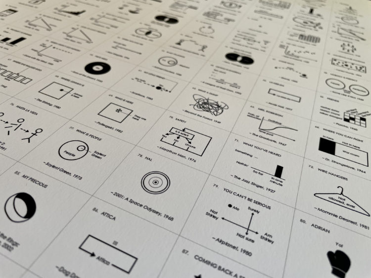
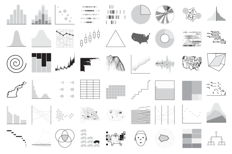
  • Chart Types — I’ve been cataloging FD posts by chart type for a while but never made it obvious. Now you can see them all in the same place.
  • Redefining Old Age — I was getting curious again. 2020 had other plans.

FD is largely an extension of my mundane curiosities played out in data form. The challenge this year was that the data questions were on constant repeat. How much longer? Now what? What, no, why? I looked at plenty of Covid-19 data but promised myself I wouldn’t make any of those meanderings public.

So the projects I worked on this year were mostly me trying to find order or looking for a distraction. You can only bake so much bread.

The Process

The weekly newsletter for FD members kept going (if a bit shorter than in the past). I published issue 120 last week. It’s hard to believe I’ve been writing it for over two years now (plus the monthly tool roundups), but here we are.

These are my favorites from the year:

I’ve never been more confident about how data is intertwined with our daily lives, which crossed over into the newsletter somewhat unintentionally.

A New Course on Visualization for Clarity

I wrote a new self-guided course on visualization for clarity. I announced it briefly in The Process but never announced it on the blog proper. It never seemed like the right time to talk about it I guess?

Well, here it is. It’s tool-agnostic and focused on designing data visualization for an audience.

Tutorials

More tutorials were added to the collection this year. There are now 132 in-depth tutorials covering many chart types and a mix of tools (but mostly still R).

I was hoping to carry the momentum from 2019 into 2020, enlisting other skilled visualization folks to bring their own perspectives and new tools — Excel, ggplot, Python, JavaScript — but again, it was a weird year. I’m going to lean into this more next year.

That’s about it. Thank you for reading and an especially big thank you to members who support my work and FlowingData. This was the second full year as a completely member-supported site, and I’m thankful that this is what I get to do.

Previous years: 2013, 2014, 2015, 2016, 2018, 2019

Tags:

Cataloging All the Charts

If you’re interested in a specific chart type, you can now browse FlowingData by all of the major ones. Find tutorials, guides, and examples for plenty of inspiration for the data you’re trying to visualize.

A few years ago, I added a new meta field to posts that indicated what kind of chart was used. I originally intended it as a way to make tutorials on FD easier to find and to categorize projects in some way. Then I started marking posts that served as a good examples of any given chart type.

I’ve been doing this off and on and adding new types as they come in. But I never made it obvious, and I don’t think many people noticed the extra field for some of the posts.

So it’s more obvious now. Browse all of the chart types so far.

Tags: