Numbers quiz tests how well you know your country

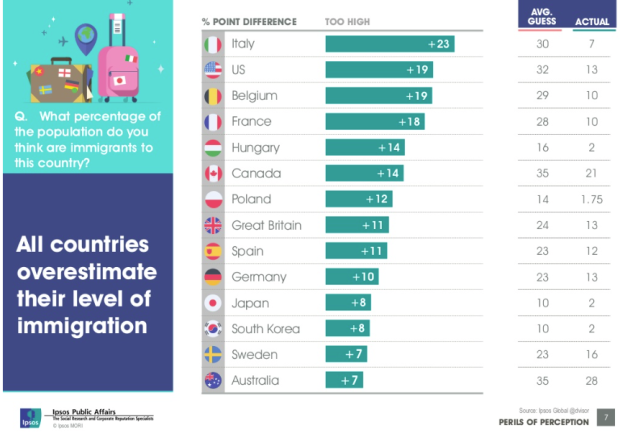
In their annual survey that tests public perception against reality, Ipsos Mori asked people about their own country's numbers. What's the obesity rate in your country? What percentage of people in your country are immigrants? The Guardian setup the quiz so that you can see how your own perceptions compare against both reality and others' in your country.

Stat quiz

After each question, you get the actual (estimated) value, and you can compare all countries in a second view. Some countries overall are better than others, which you see at the quiz end. Fun.

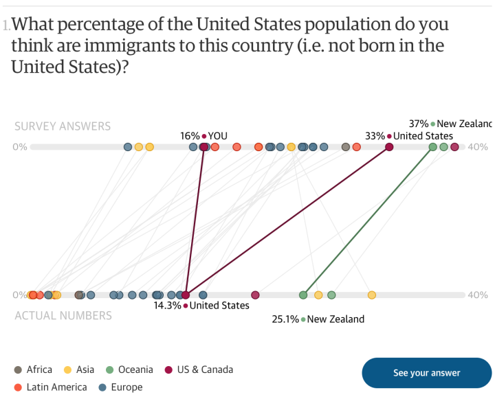
I'm curious what the distributions look like and what the margin of error is. Are the countries that rank low uninformed, such that survey answers are all over the place, or is the perception universally off, such that answers tightly cluster around the average?

Essentially: uninformed versus misinformed.

Tags: , ,

Focusing on the full picture with data

I don't know the full context of this discussion, but in the interview below, Hans Rosling talks to media person Adam Holm about why we shouldn't use the media to form our opinions about the world. Media person disputes. Rosling puts foot on table and says Holm is wrong.

https://www.youtube.com/watch?v=xYnpJGaMiXo

Hard to argue with that.

See also Rosling's 2014 TED talk on how to not be ignorant about the world.

Tags: ,

Statistically ignorant

Immigration

Ipsos MORI, primarily a marketing research group I think, released results of their study on public perception of demographics versus reality, on numbers such as immigration, religion, and life expectancy. The key takeaway is that out of the people they polled from fourteen countries, the average person typically over- or underestimated — by a lot.

This grows to be an issue as officials form policies driven by public perception, which is a similar takeaway from the Gapminder Foundation's Ignorance Project.

The Ipsos MORI study also provides an index of ignorance, placing Italy at the top and the United States at number two. (Interestingly, Sweden, where the Gapminder Foundation is based, is last on the list i.e. lowest ignorance.)

Before you go nuts, remember not to take these ranking estimates too literally. Even though 500 to 1,000 people were surveyed for each country, I'd be curious to hear more about the sampling methodology. Was each country's sample really representative of the population?

I mean, based on the chart above, the average guess for immigration percentage in the United States is 32. So people thought a third of the country's population is from somewhere else? That seems high to me. Or maybe I'm just ignorant about ignorance. [via The Guardian]

Tags: ,