Happiness ratings, by country and age

The World Happiness Report, published each year since 2012, just dropped for 2024. They focused on age and happiness this year. Overall, the United States ranked in the range from 17 to 29 among all countries, but was worse for young people. Finland was definitively at the top.

The visualizations are clinical, which is kind of sad given the topic of the report. Someone should collate the data and have some fun with it.

Tags: ,

How much more income people need to be happy

For the Wall Street Journal, Joe Pinsker reports on income and happiness, or more specifically, on the raises people said they needed to be happy. The more people have the more they need.

Tags: , ,

When Americans Are Happiest

We saw that life satisfaction changes with age, based on data from the Bureau of Labor Statistics. In the same survey, people were also asked about their happiness throughout the day when they ate, traveled, watched television, took care of kids, and other activities.

People reported happiness on a scale from 0 to 6, where 0 was not happy at all and 6 was very happy. The animation above shows the average happiness for the fifty most common activities. It runs from age 20 to 70.

Work, as you might imagine, sticks around the bottom of the range; eating and drinking lingers around the middle and the top; and socializing sticks around the top. The smaller circles show more variation over time, as kids and grandkids enter the picture and retirement kicks in.

Notes

The data comes from the well-being module of the 2021 American Time Use Survey. I downloaded microdata via IPUMS. I made the animation with R.

Tags: , ,

Building a happy life, interpreted through data

How to Build a Happy Life from The Atlantic is a podcast on finding happiness:

In our pursuit of a happy life, we build, we structure, and we plan. Often, we follow conventional wisdom and strategize. But what happens when our plans fall through and expectations don’t meet reality—when the things that should make us happy don’t?

In season 3 of our How To series, Atlantic happiness correspondent Arthur Brooks and producer Rebecca Rashid seek to navigate the unexpected curves on the path to personal happiness—with data-driven insights and a healthy dose of introspection.

I’m late to this, but I had some downtime during the Thanksgiving break and liked the data- and research-centric episodes. As you might expect, there’s a lot of fuzziness in the numbers and there’s more than one way to find happiness.

Tags: , , ,

Counting Happiness and Where it Comes From

Researchers asked 10,000 participants to list ten things that recently made them happy. I counted and connected the dots.

Read More

Surprise, Less Happiness During Pandemic

Since 1972, the General Social Survey has asked people about their happiness. It never changed much — until 2020 happened.

Read More

A network of happiness, by ranks

This is a joint post by David Morrison and Guido Grimm

Over a year ago, we showed a network relating to the World Happiness Report 2018 based on the variables used for explaining why people in some countries report themselves to be happier than in other countries. A new WHR report is out for 2019, warranting a new network.

The 2019 Report describes itself as:
a landmark survey of the state of global happiness that ranks 156 countries by how happy their citizens perceive themselves to be. This year’s World Happiness Report focuses on happiness and the community: how happiness has evolved over the past dozen years, with a focus on the technologies, social norms, conflicts and government policies that have driven those changes.
For our purposes, we will simply focus on the happiness scores themselves. So, this time we will base our analysis on the country rankings for the four measures of subjective well-being:
  • Cantril Ladder life-evaluation question in the Gallup World Poll — asks the survey respondents to place the status of their lives on a “ladder” scale ranging from 0 to 10, where 0 means the worst possible life and 10 the best possible life
  • Ladder standard deviation — provides a measure of happiness inequality across the country
  • Positive affect — comprises the average frequency of happiness, laughter and enjoyment on the previous day to the survey (scaled from 0 to 1)
  • Negative affect — comprises the average frequency of worry, sadness and anger on the previous day to the survey (scaled from 0 to 1)
As expected, not a lot has changed between 2018 and 2019. The first graph shows the comparison of the Cantril Ladder scores (the principal happiness measure) for those 153 countries that appear in both reports. Each point represents one country, with the color coding indicating the geographical area (as listed in the network below).


Only three countries (as labeled) show large differences, with Malaysia becoming less happy, and two small African countries improving. As also expected, the European countries (green) tending to be at the top, and the African countries (grey) dominating the bottom scores.

Finland is still ranked #1, with even happier people than in 2018's report. New in the top-10 of the happiest countries is Austria (last years #12), which took the place of Australia (now #11). At the other end, South Sudan went down from 3.3 to 2.9 — this is not really a good start for the youngest state in the world. New to the lowest-ranking ten are Botswana (−0.1, down two places) and Afghanistan (−0.4, down 9).
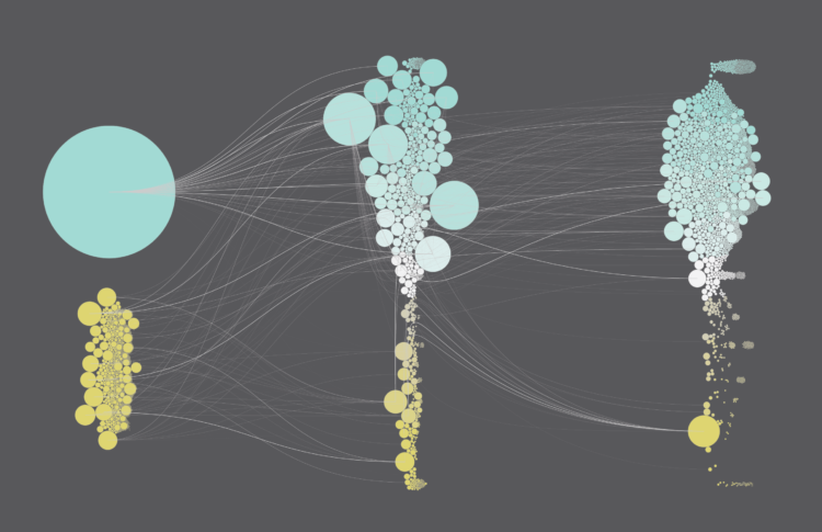
A network analysis

The four measures of subjective well-being do not necessarily agree with each other, since they measure different things. To get an over view of all four happiness variables simultaneously, we can use a phylogenetic network as a form of exploratory data analysis. [Technical details of our analysis: Qatar was deleted because it has too many missing values. The data used were the simple rankings of the counties for each of the four variables. The Manhattan distance was then calculated; the distances have been displayed as a neighbor-net splits graph.]

In the network (shown below), the spatial relationship of the points contains the summary information — points near each other in the network are similar to each other based on the data variables, and the further apart they are then the less similar they are. The points are color-coded based on major geographic regions; and the size of the points represents the Cantril Ladder score. We have added some annotations for the major network groups, indicating which geographical regions are included — these groups are the major happiness groupings.


The rank-based network 2019 looks quite different to the one based on the explaining parameters 2018. Let us have a short look at the clusters, as annotated in the graph.

Cluster 1: The happiest this includes the welfare states of north-western and central Europe (score > 6.7), as well as Australia, Canada and New Zealand (~7.3), Taiwan (the 25th happiest country in the world, 6.4) and Singapore (#34 with 6.3). For both the positive and negative measures of happiness, the countries rank typically in the top 50, with Czechia ranking lowest regarding positive affects (#74), while the people in Singapore (#1) and Taiwan apparently suffer the fewest negative affects (#2).

Cluster 2: Quite happy includes countries like France, with 6.6 making it the happiest one of the group, plus countries along the southern shore of the Baltic Sea, as well as Japan, Hong Kong, but also also quite different countries from western Asia such as Kyrgyzstan and Turkmenistan, and Vietnam, the least happy (5.1) of the group. Common to all of them is that they rank in the top third of the standard derivation of the Cantril ladder scores, i.e. their people are equally happy across each country. Towards the right of the group, bridging to Cluster 3, we have countries that rank in the bottom third of positive affects. Potential causes are the high levels of perceived corruption, or the lack of social support and generosity, as in the case of Turkmenistan (#147 in social support, #153 in generosity).

Cluster 3: Not so happy — an Old World group of the lower half (Cantril scores between 5.2, Algeria, and 3.4, Rwanda) that are either doing a bit better than other, equally (un)happy countries regarding positive affects (Myanmar, Madagascar, Rwanda) or negative affects (e.g. Georgia, Ukraine), and are in the top-half when it comes to the SD.

Cluster 4: Generally unhappy — this collects most of the countries of the Sub-saharan cluster 2018 with Cantril scores ≤ 5, including three of the (still) unhappiest countries in the world: war-ridden Syria, the Central African Republic, and South Sudan, which rank in the bottom-half of all happiness rankings. When is comes to explanations, the ranking table is of little use: Chad, for example, ranks 2nd regarding perceived corruption, and the Central African Republic, generally regarded a as a failed state, ranks 16th, and 14th regarding freedom — ie. it seems to have similar values here like the happiest bunch (Cluster 1).

Cluster 5: Pretty unhappy — this includes Asian and African countries that are not much happier than those of Cluster 4 but which rank high when only looking at positive affects. The reasons may include low levels of perceived corruption but also generosity, at least in the case of Bhutan (#25, #13) and South Africa (#24/#1), the latter being the most generous country in the world (something Guido agrees with based on personal experience).

Cluster 6: Partially unhappy — is a very heterogeneous cluster, when we look at the Cantril scores ranging from 7.2 for Costa Rica (#12), a score close to the Top-10 of Cluster 1, to 4.7 for Somalia (#112). Effectively, it collects all states that don't fit ranking-pattern-wise in any of the other clusters. For example, the U.S. (6.9, #19) and U.A.E. (6.8, #21) plot close to each other in the network because both rank between 35 and 70 on the other three variables, ie. lower than the countries of Cluster 1 with not much higher Cantril scores. Mexico, by the way (6.6, #23), performs similarly to the U.S. but ranks much higher regarding positive affects. The latter seems to be a general trend within the other states of the New World in this cluster.

Cluster 7: Really not happy — also covers a wide range, from a Cantril score of 6.0 (Kuwait, #51 in the world) to 3.2 (Afghanistan, #154). It includes the remainder of the Sub-saharan countries, most of the countries in the Arab world, and the unhappy countries within and outside the EU (Portugal, Greece, Serbia, Bosnia & Herzegovina). These are countries that usually rank in the lower half or bottom third regarding all four included variables.

Cluster 8: Increasingly unhappy — these countries bridge between Clusters 1 and 7, starting (upper left in the graph) with Russia (#68, top 10 regarding negative affects) and ending with Democratic Republic of Congo (#127, Congo Kinshasa in WHR dataset, ranking like a Cluster 7 country). In between are pretty happy countries such as Israel (#13) and unhappy EU members (Bulgaria, #97). The reason Israel is not in Cluster 1 is its very low ranking regarding both positive affects (#104) and not too high placement when it comes to negative affects (#69), but in contrast to the U.S. it ranks high when it comes to the SD of the Cantril scores — that is, the USA has a great diversity regarding happiness, from billionaires to the very poor, whereas the peoples of most countries are more equally happy. Other very-high ranking countries regarding the latter are Bulgaria, the least-happy country of the EU, and Mongolia.

Happiness and Health

When one goes down, so does the other. If only there were a way to keep more people healthy. Read More

A network of World happiness


This is a joint post by Guido Grimm and David Morrison.

You may never have heard of it, but the there is a World Happiness Report. This is sponsored by The Sustainable Development Solutions Network (SDSN) and The Global Happiness Council (GHC). Reports were produced in 2012, 2013, 2015 and 2017, but here we are going to look at the World Happiness Report 2018.


To quote the Report:
The World Happiness Report is a landmark survey of the state of global happiness. The World Happiness Report 2018 ranks 156 countries by their happiness levels, and 117 countries by the happiness of their immigrants.
The rankings use data that come from the Gallup World Poll (GWP). The rankings are based on answers to the main life evaluation question asked in the poll. This is called the Cantril ladder: it asks respondents to think of a ladder, with the best possible life for them being a 10, and the worst possible life being a 0. They are then asked to rate their own current lives on that 0 to 10 scale. The rankings are from nationally representative samples, for the years 2015-2017.
The Report is very comprehensive in its discussion of methodology, and its limitations. It is also very ambitious in its conclusions. The main focus of the 2018 Report is comparing the happiness of immigrants with their local counterparts. Interestingly, they found no important differences between these two groups.

More importantly for this blog, the raw data are provided in an Appendix, so that anyone can look at what is going on. We have decided to do just that.

The Report's happiness index

Below is the first little bit of Figure 2.2 (extracted from the report), which "shows the average ladder score (the average answer to the Cantril ladder question, asking people to evaluate the quality of their current lives on a scale of 0 to 10) for each country, averaged over the years 2015-2017." As you can see, the people who claim that they are happiest are those in the Nordic countries (Finland plus the Scandinavian countries: Norway, Denmark, Iceland and Sweden). These are the people whom the world's cultural cliché sees as sitting for half the year in the gloom! Apparently, you have all got it wrong.


As we have noted before, an index can often do a poor job of summarizing data, because it reduces complex data down to just one dimension. The Happiness Report tries to alleviate this limitation by adding information about some of the other variables that correlate with the Happiness score, using colors:
Each of these bars is divided into seven segments, showing our research efforts to find possible sources for the ladder levels. The first six sub-bars show how much each of the six key variables is calculated to contribute to that country’s ladder score, relative to that in a hypothetical country called Dystopia, so named because it has values equal to the world’s lowest national averages for 2015-2017 for each of the six key variables
However, we can do much better than this, by using all of these variables in a phylogenetic network. The key variables are (color-coded from left to right in the figure above):
  1. Gross Domestic Product (GDP) per capita is in terms of Purchasing Power Parity (PPP)
  2. Social support [the national average of the binary responses to the Gallup World Poll]
  3. The time series of healthy life expectancy at birth
  4. Freedom to make life choices [the national average of binary responses to the GWP question]
  5. Generosity [the residual of regressing the national average of GWP responses]
  6. Perceptions of corruption [ the average of binary answers to two GWP questions]
For the network, we simply put all of these variables into the analysis, along with the Happiness score.

[Technical details of our analysis: Qatar was deleted because it has too many missing values; each data variable was then standardized to zero mean and unit variance; the gower similarity was calculated, which ignores missing values, and this was converted to a distance; the distances were then displayed as a neighbor-net splits graph.]

A network analysis

The resulting network is shown next. Each point represents a country, with the name codes following the ISO-3166-1 standard. The spatial relationship of the points contains the summary information — points near each other in the network are similar to each other based on the data variables, and the further apart they are then the less similar they are. The points are color-coded based on major geographic regions (asterisks highlight single states that don't group with the rest of their geographical region). We have added some annotations for the major network groups, indicating which geographical regions are included — these groups are the major happiness groupings.


In this blog post we do not want to risk over-interpreting the data, as explained in the final paragraphs below. However, it is obvious that there are distinct patterns in the network. Happiness, and its correlates are not randomly distributed on this planet but, not unexpectedly, relate to the local socio-political situation.

Starting at the bottom-left, we have a geographically heterogeneous cluster of very well-off countries, either welfare states (as in northern Europe), capitalist democracies (eg. the USA, Singapore, Hong Kong), or oil-rich monarchies with high levels of public spending (as in the Middle East). Moving clockwise, the next cluster has much of the rest of the western and central European countries, along with the financially well-off parts of South America and Asia. The next cluster has many of the remaining eastern European countries, plus the nearest parts of Asia, where government spending on welfare is still apparent. Clearly, national wealth plays a large part in happiness, in spite of the well-known adage to the contrary.

This is followed, at the top-middle of the network, by a broad neighborhood (not a distinct cluster), where government spending on welfare is much less apparent, at least to an outsider. The countries here come from Europe, Asia, and Central plus South America (including, at the moment, Greece). Happiness and its correlates is reported to be much lower here.

To make this situation clearer, here is a version of the network with some of the happiness scores annotated — values are provided for the first and last 10th percentile of the happiness score, and the 10 largest (by population) countries in the world.


On the opposite side of the network, happiness is also apparently lower, but with a different set of correlations among the variables. There is a two-part cluster of geographically heterogeneous countries at the bottom-middle, plus a neighborhood at the bottom-right. The latter includes China and India, the two most populous countries (with one-third of our people), while Indonesia (4th) and Brazil (6th) are in the neighborhood at the top of the network.

Finally, the cluster at the right consists mostly of African countries, plus Pakistan (the 5th most-populous country). In this cluster, happiness is reported to be at its lowest observed level. Much of the world's monetary aid is spent in Africa, of course, to try to improve the situation, although there is clearly a long way to go. Not unexpectedly, most of the world's migrants come from the right-hand part of the network, which is one of the main focuses of the Happiness Report.

Final comments

It is interesting to note that the Bhutan (code BTN) government reportedly aims to increase the Gross National Happiness rather than the GDP (see Gross national happiness in Bhutan: the big idea from a tiny state that could change the world). The network shows that their 2015-2017 happiness is quite different to that of their geographical neighbors. However, it also suggests that they still have a long way to go.

We should finish the discussion with a general point about surveys, such as the Gallup Poll on which the Happiness Report is based. Respondents are not always completely honest when answering survey questions, which is why pre-election polls sometimes get it wrong — people are most serious when faced with an actual decision, rather than a question. All of the results here need to be interpreted in this light — they may not be far wrong, but they are unlikely to be completely right.

Apart from anything else, there can be cultural differences in the way in which the answers to the Gallup World Poll questions are treated. Does "happiness" really mean the same thing across all cultures? We know that "beauty" does not, and "freedom" does not; so why not "happiness"? After all, things like reported happiness are likely to be confounded with other feelings such as national pride. This issue could presumably be addressed by looking at other answers from the Gallup Poll.

What Makes People the Most Happy

It's in the details of 100,000 moments. I analyzed the crowd-sourced corpus to see what brought the most smiles. Read More