Lifelines

Using estimates from a report by the Well Being Trust and the Robert Graham Center, Periscopic shows projected deaths of despair in Lifelines.

Lights, each representing a life, float above the water, and as you adjust levels of mental health care, employment, and social connection, the lives either sink to the bottom or stay above the water. How do we keep as many as we can above water?

Tags: , ,

Apple vs. Google company structure, as seen through patents

For Co.Design, Periscopic compared patent ownership between Apple and Google, which ends up providing a good idea of company structure.

“Over the past 10 years Apple has produced 10,975 patents with a team of 5,232 inventors, and Google has produced 12,386 with a team of 8,888,” writes Wes Bernegger, data explorer at Periscopic. Those numbers are, frankly, pretty similar in terms of proportion. “The most notable difference we see is the presence of the group of highly connected, experienced ‘super inventors’ at the core of Apple compared to the more evenly dispersed innovation structure in Google,” he continues. “This seems to indicate a top-down, more centrally controlled system in Apple vs. potentially more independence and empowerment in Google.”

Be sure to check out PatentsView too, where these networks stem from.

Tags: , , ,

Emotional arcs for inaugural addresses

Inaugural addresses come in different flavors, with different messages and purpose. Periscopic passed video of the ten most recent speeches through the Microsoft Emotion API to estimate emotion from each speaker’s facial expressions. Then they used a feather metaphor to visualize the results.

Shown here in the form of collected emotion arcs, each “feather” represents an inaugural address. Each barb of the feather is a moment during the speech where the president displayed an emotion — positive emotions are drawn above the quill, negative emotions below. The length of each barb represents the intensity of the emotion. The curve of the feather itself indicates the overall positivity or negativity of the speech.

As you might expect, the feather for Donald Trump weighs predominantly downward in red and orange.

Tags: , ,

PhD gender gaps around the world

How Nations Fare in PhDs by Sex

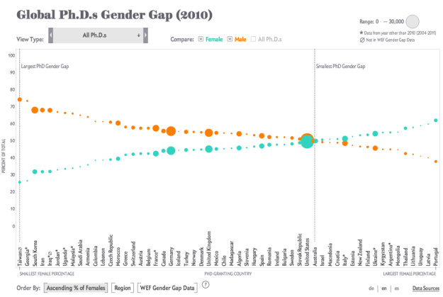
Periscopic, for Scientific American, visualized the number of PhDs awarded in various countries. You might expect men to be in high percentages and women to be in low, but it's not always in that direction.

In the U.S., women are going to college and majoring in science and engineering fields in increasing numbers, yet here and around the world they remain underrepresented in the workforce. Comparative figures are hard to come by, but a disparity shows up in the number of Ph.D.s awarded to women and men. The chart here, assembled from data collected by the National Science Foundation, traces the gender gap at the doctoral level for 56 nations. The situation in individual countries varies widely, but as the numbers make clear, there are interesting exceptions to the global trend.

Each view shows a vertical dotted line to indicate where PhDs awarded are an even split between men and women. To the left of that dotted line shows where men earn more PhDs than women, and on the right, where women earn more than men.

Tags: , , ,

Interactive tool shows impact of terrorism

A World of Terror by Periscopic

The Global Terrorism Database, maintained by the University of Maryland, is an open source database that catalogs terrorism events since 1970 through 2013. Data visualization firm Periscopic visualized the incident-level data in A World of Terror.

There are over 3,065 organizations and groups listed in the GTD. To identify the top 25 organizations who used terrorist tactics, we determined the groups with the most killings, the most wounded, and the most incidents. We wanted to make sure we were inclusive of all actions, including those that neither wounded nor killed. We aggregated these 3 lists and took the top 25 organizations (most were in the top 30 for all 3 categories). These top 0.8% of groups account for over 26% of the 125,087 incidents.

The midsection of each group shows number of incidents by month and year. The darker the brown, the more incidents on record. Then on the top and bottom shows number of people killed in red and wounded in orange, respectively. Finally, click on the map in the top left for more information about the organization.

Spend some time with this one. Periscopic shows a lot without it ever feeling like too much.

Tags: ,